


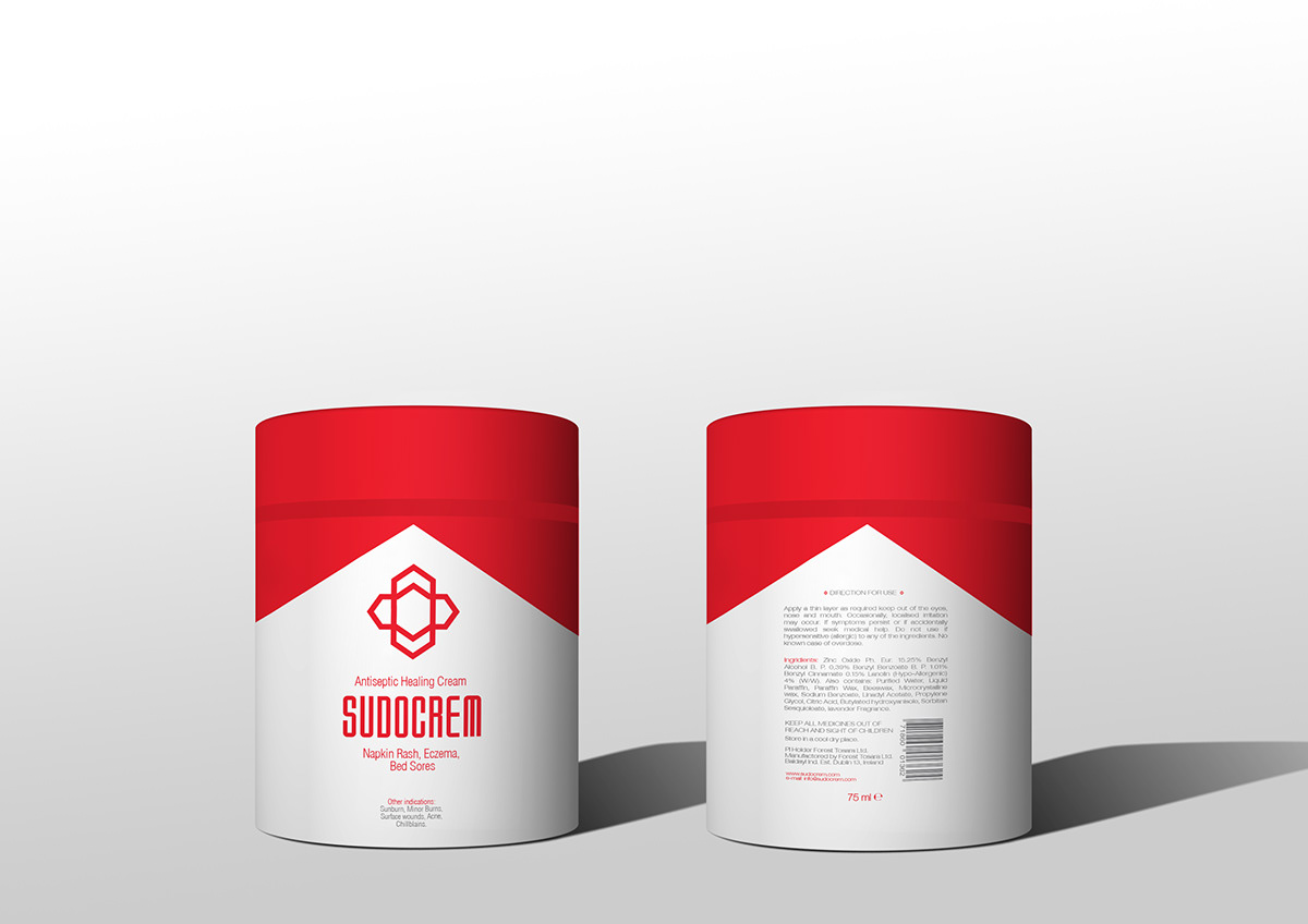
Using an hexagonal element as base, this turns away a little from the concept of skin and tries to look at the essence of Irish culture the high leaf clover. More synthesized, almost like a futuristic element, it shows the four strands that exist for the cream. Softness, protection and healing factor and most of all a cream for the family.


The advertising
Deviating slightly from what normally is seen on cream campaigns such as the use of babies, hands or skin. These ads, the first advertisign for the rebranding of Sudocrem had to be in my opinion differente, so i used typography. The campaign "So be it", a sign of acceptance and agreement, demonstrated the benefices of the cream on a a set of typographical links.


In a second phase after the publicity is a recognized trade
it is placed a person, a kind of portrait, so there wont be a leap
so large jump between typography and photography.

Thanks For Watching


