_BRIEF
The brief was to establish a brand, a name and a logo. The objective was to design a bottle label, primary and secondary packaging as well as promotional items for a new craft beer. Craft beer is enjoyed by a sophisticated niche market.
_CONCEPT
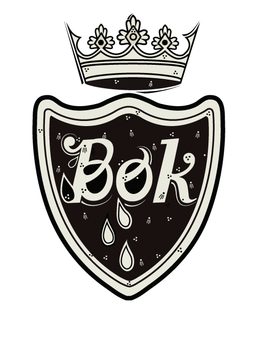
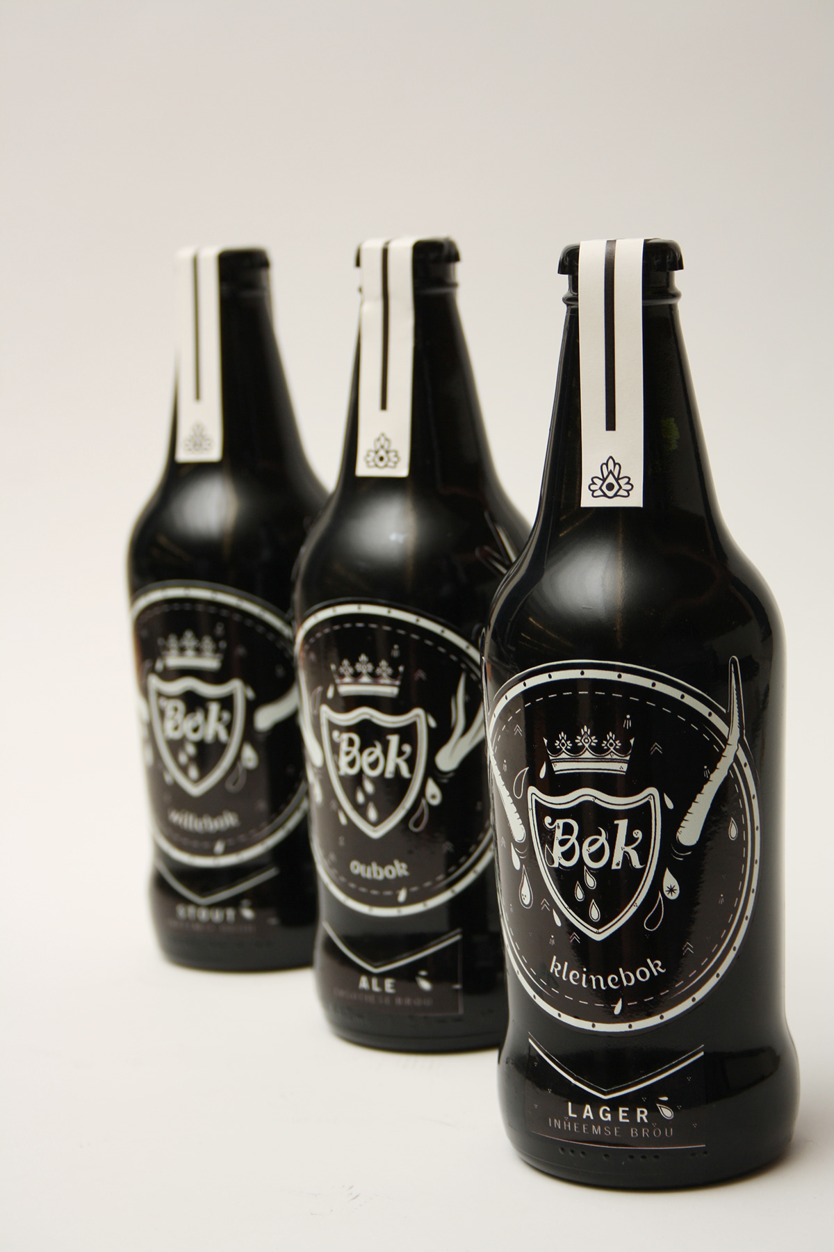
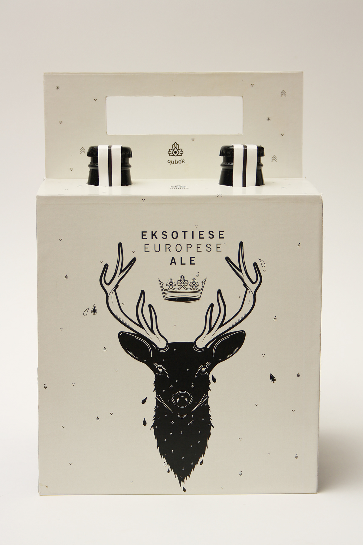
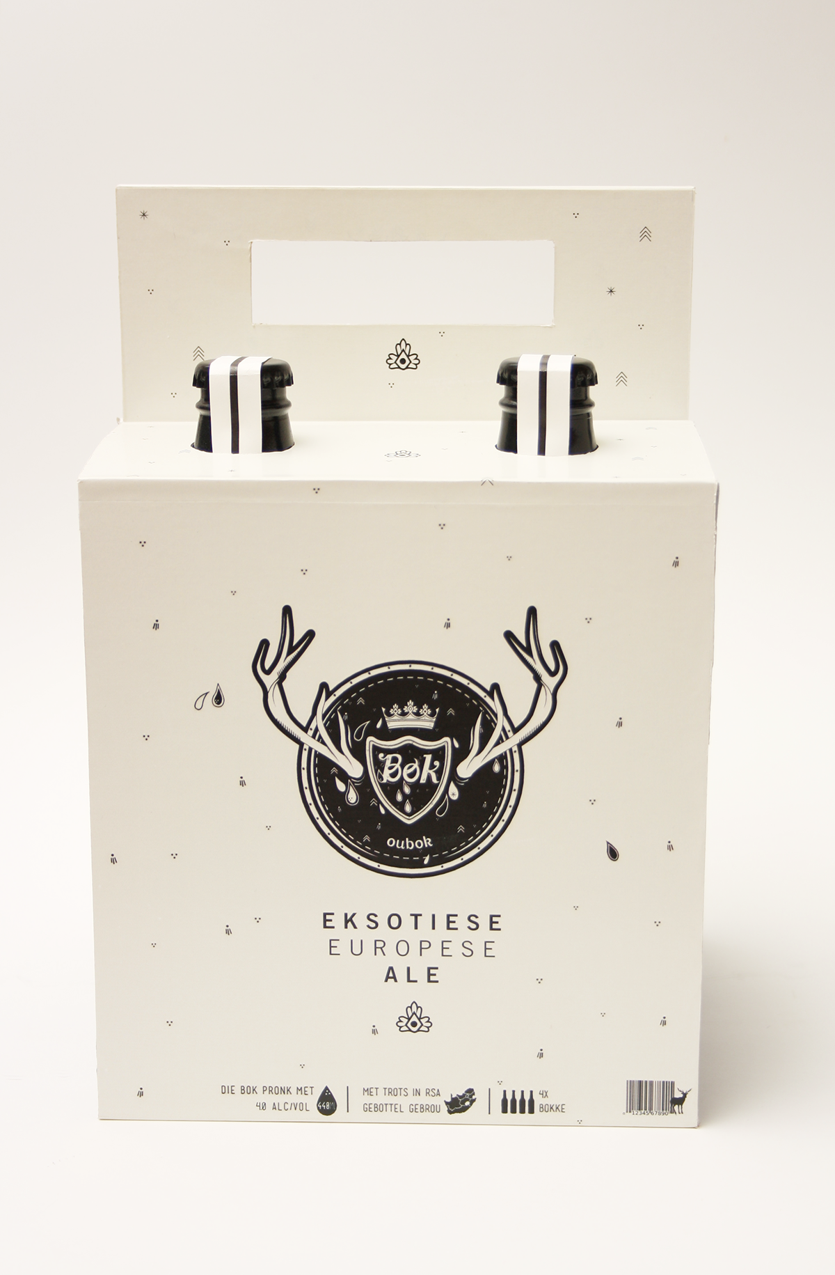
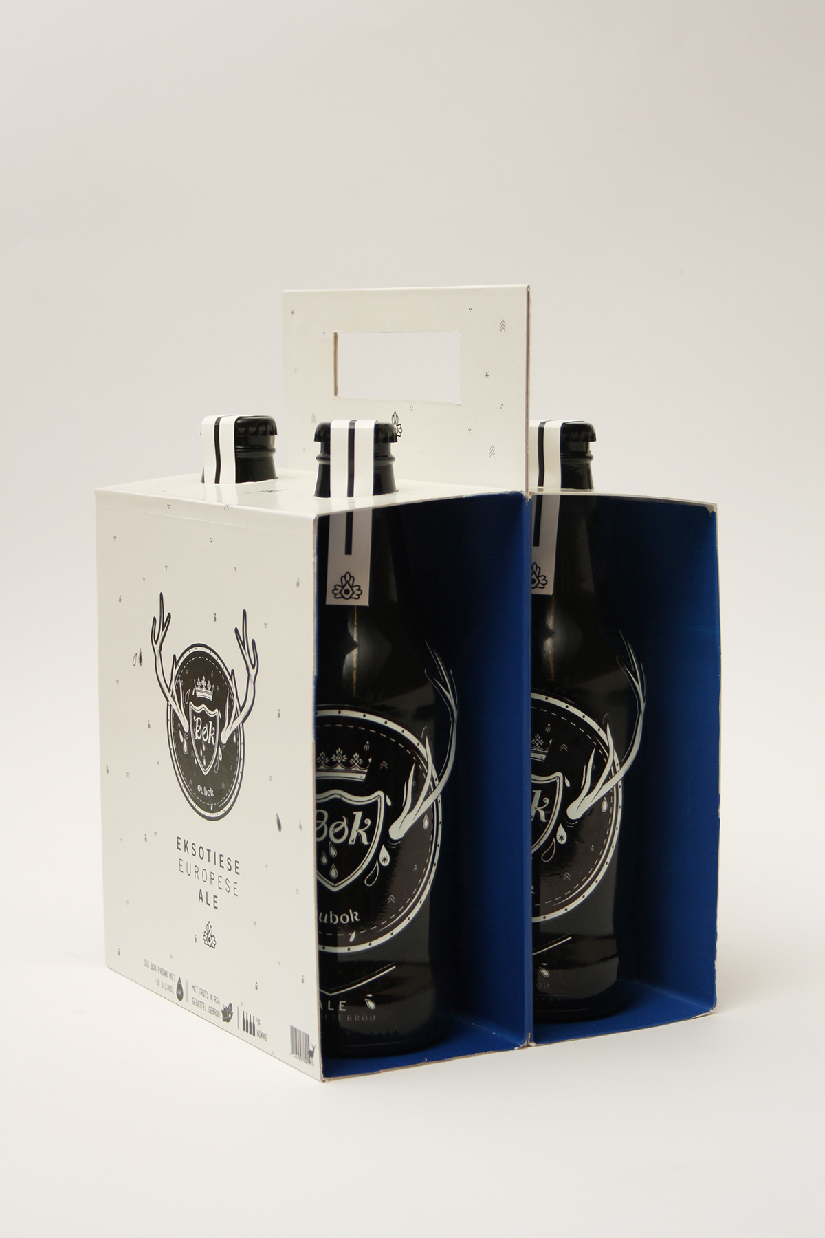
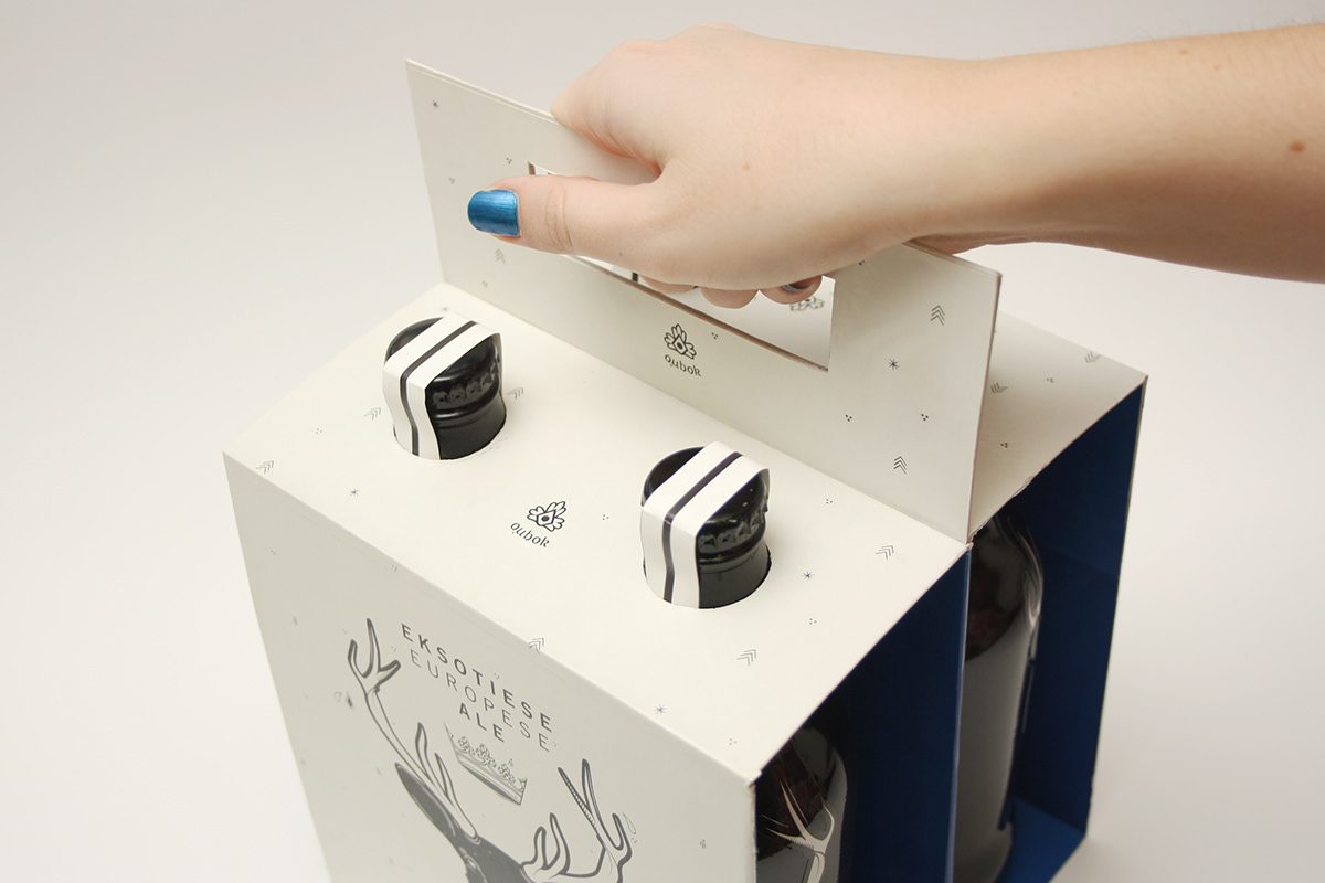
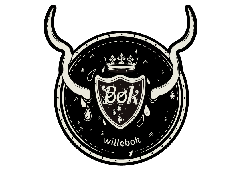
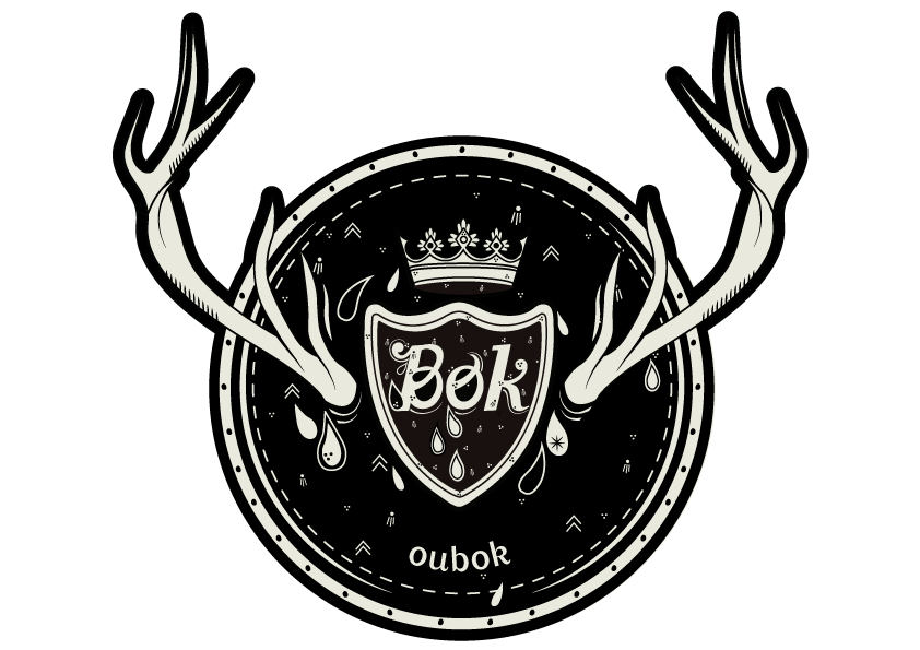
I decided to do an Afrikaans brand that is targeted on South Africans, The name of the craft beer is Bok and the concept is that the body of the beer is compared to the horns of the buck. The light beer can be seen as small horns where the full bodied beer has old and big horns. The idea behind this is that the spirit of the buck can be measured by the size of it’s horns which is the same with this beer.
_DESIGN
The beer has 3 variations, a ale, lager and a stout. The 3 variations can be sorted in two parts, firstly there is a local (inheemse) brew and then an exotic European brew.
LOGO
PRIMARY PACKAGING


SECONDARY PACKAGING
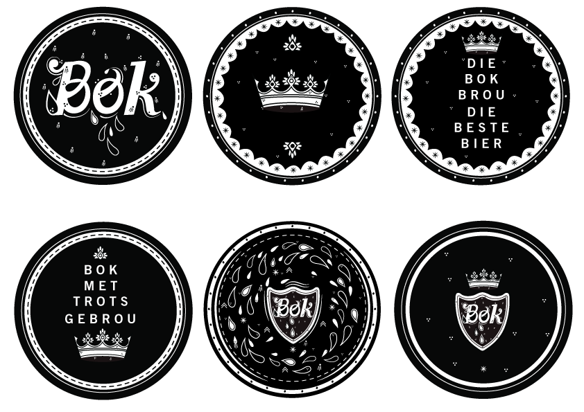
BEER LABLES

BOTTLE OPENER

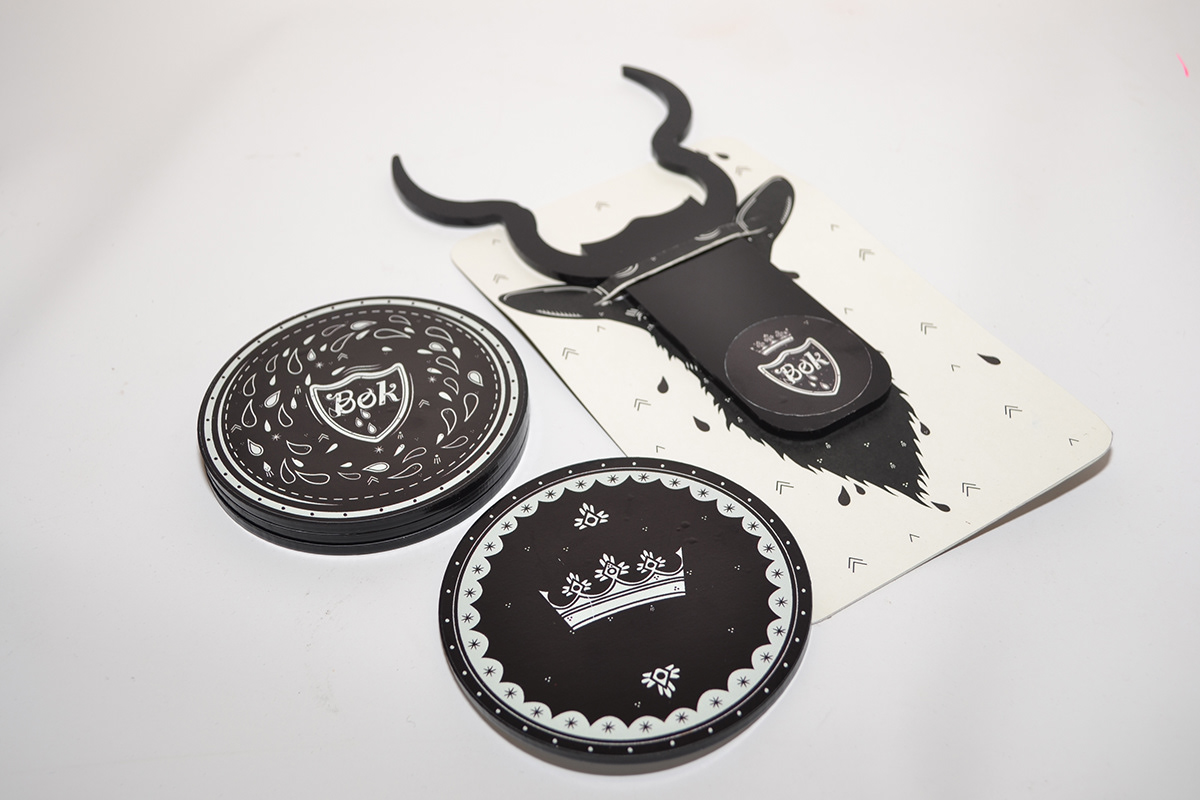
COASTERS
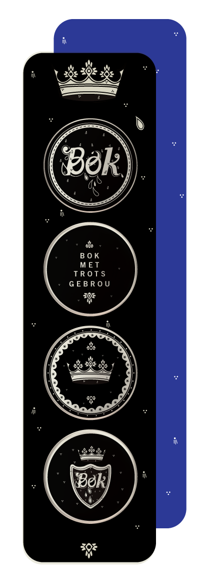
PROMOTIONAL BUTTONS
PROMOTIONAL SHIRT

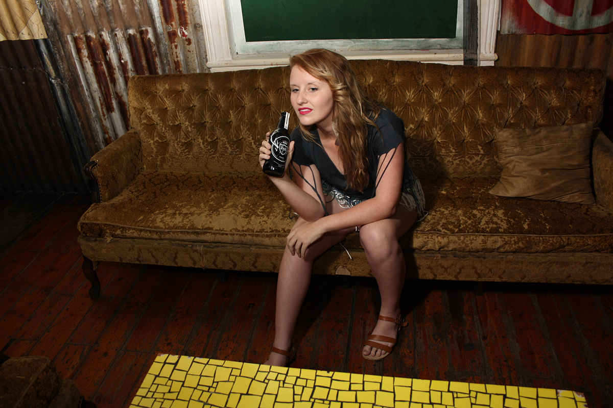
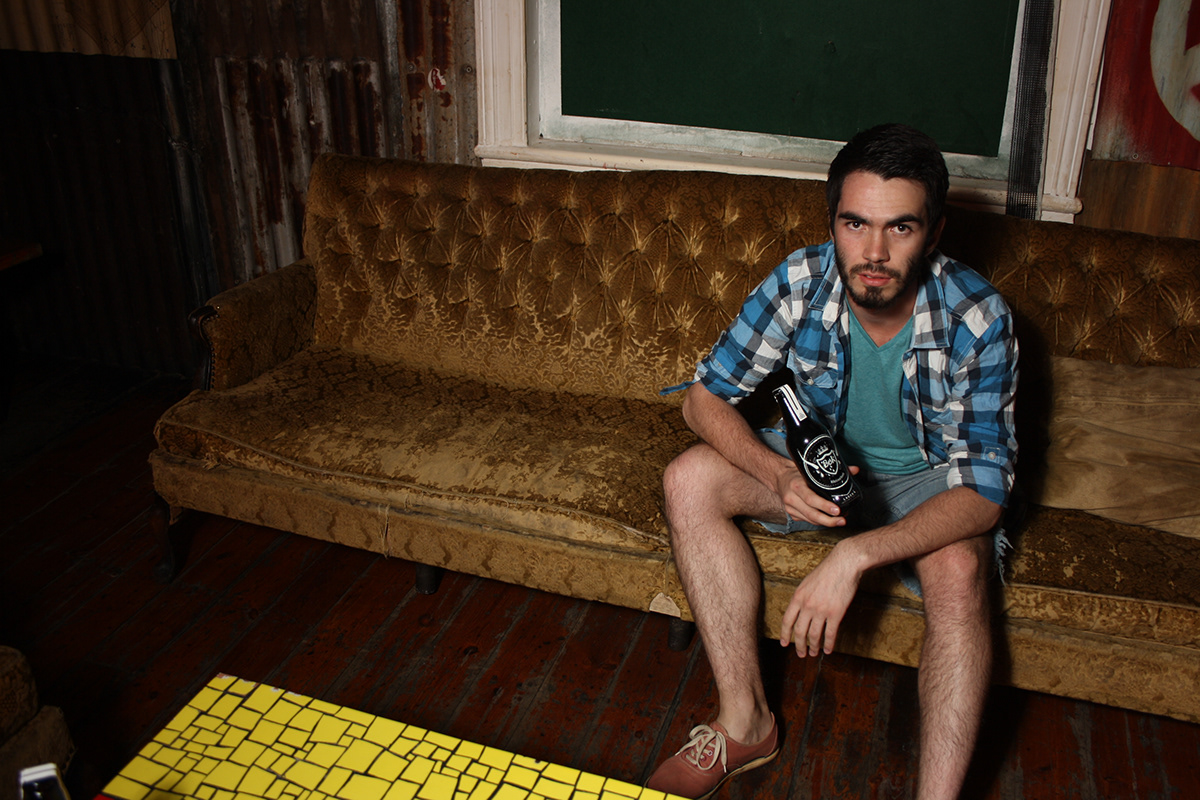
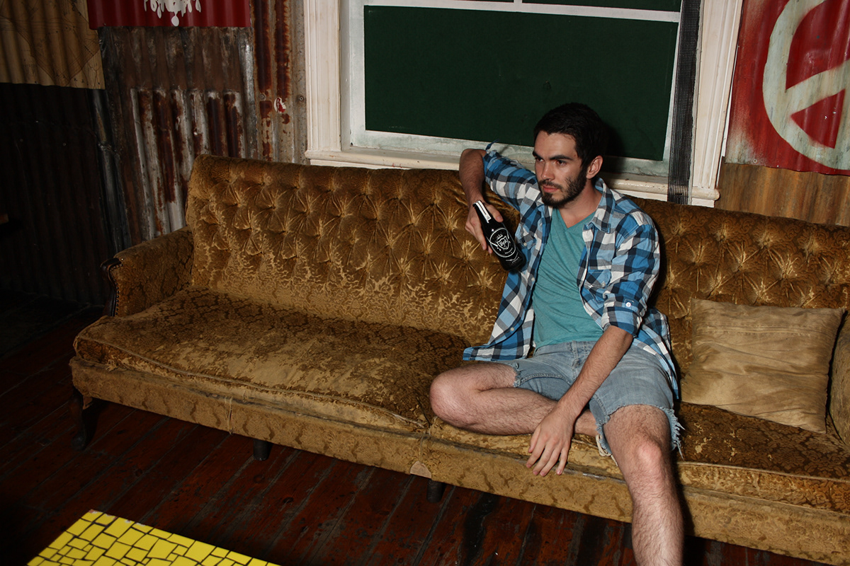
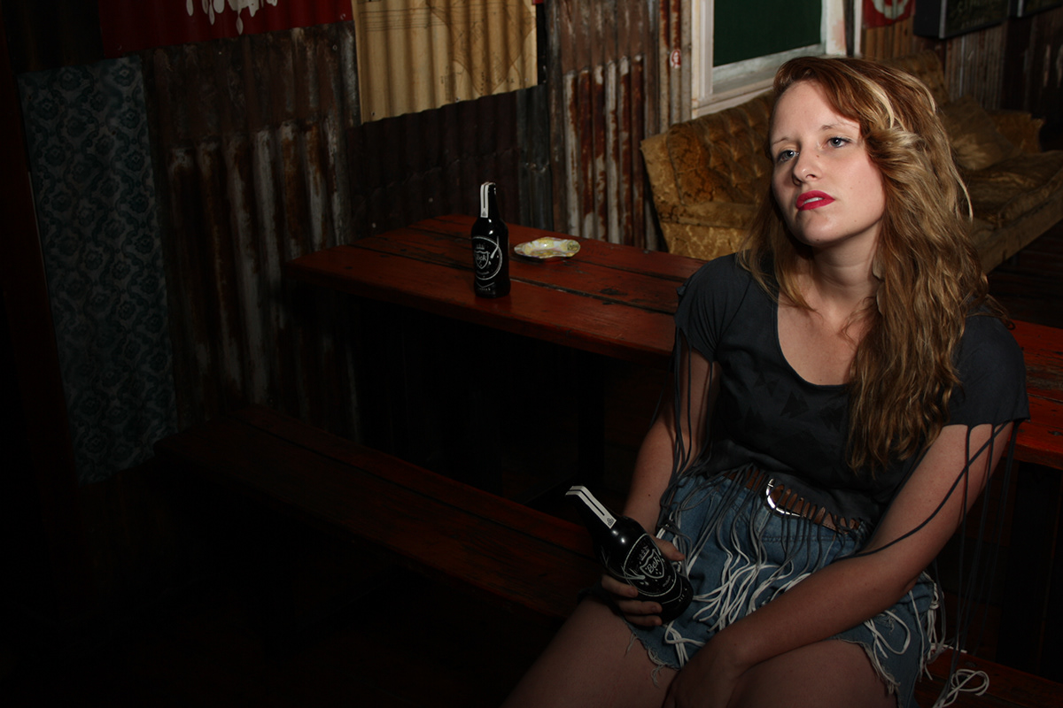
ART DIRECTION