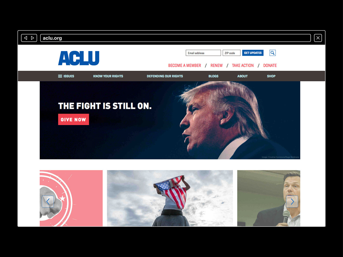
In 2016-2017, I was part of the team at Open to redesign the visual identity of the ACLU. We designed the ACLU’s new identity to help them reach the broadest possible audience. Their previous color palette of blues sent a partisan message. Our system was designed to be more inclusive. The ACLU is no longer just blue—and it’s not even red, white and blue: it’s “red, everything and blue,” as our ACLU Design Handbook says. Our palette of 14 colors allows them to rise above the culture of partisanship to reach more people with nuance, sensitivity and a spirit of inclusivity. The system uses 2 type families: one (GT America) for what we call their “activist voice” and another (Century, also used for all Supreme Court briefs) for their “informational voice.” A distinctive image treatment nods to both past and future by embracing both history and today’s technology. And the new logo presents their initials as a unified mark, symbolizing how we can achieve more when we come together.


Credits:
Creative Director: Scott Stowell
Producer: Clay Grable, Jason Jude Chan
Lead Designer: Martha Kang McGill
Producer: Clay Grable, Jason Jude Chan
Lead Designer: Martha Kang McGill
Senior Designer: Cat Kirk
Designer: Nicholas Lim, Maxime Gau, Steven Merenda
Designer: Nicholas Lim, Maxime Gau, Steven Merenda
Design Intern: Greta Huang Skagerlind
Logo Design: Tobias Frere-Jones
Logo Design: Tobias Frere-Jones


