
We partnered with People’s Beauty to bring to life their dream of an accessible, gender neutral, high-quality skincare brand for all.
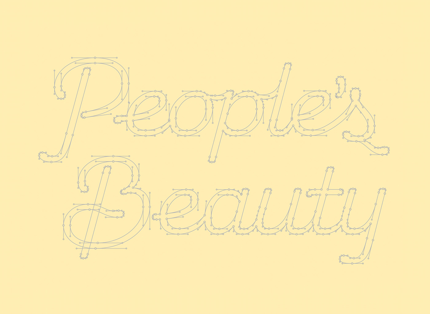
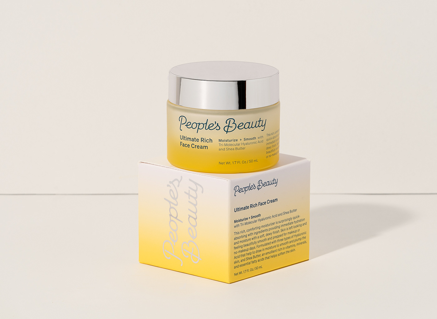
The brand logo, a custom drawn script logotype, celebrates the brand’s warmth and people-centric values by rejecting the trend of cold and impersonal sans-serif logos. This expressive signature serves as a sign of approval and trust from the People’s Beauty team that these products are the best they can be, inside and out. Inspired by the sunrise and sunset, the rest of the brand identity and packaging elements speak to the daily cycles that connect and shape us all, and reminds us to care for our skin. Minimal typography complements the bright color palette and expressive logotype.
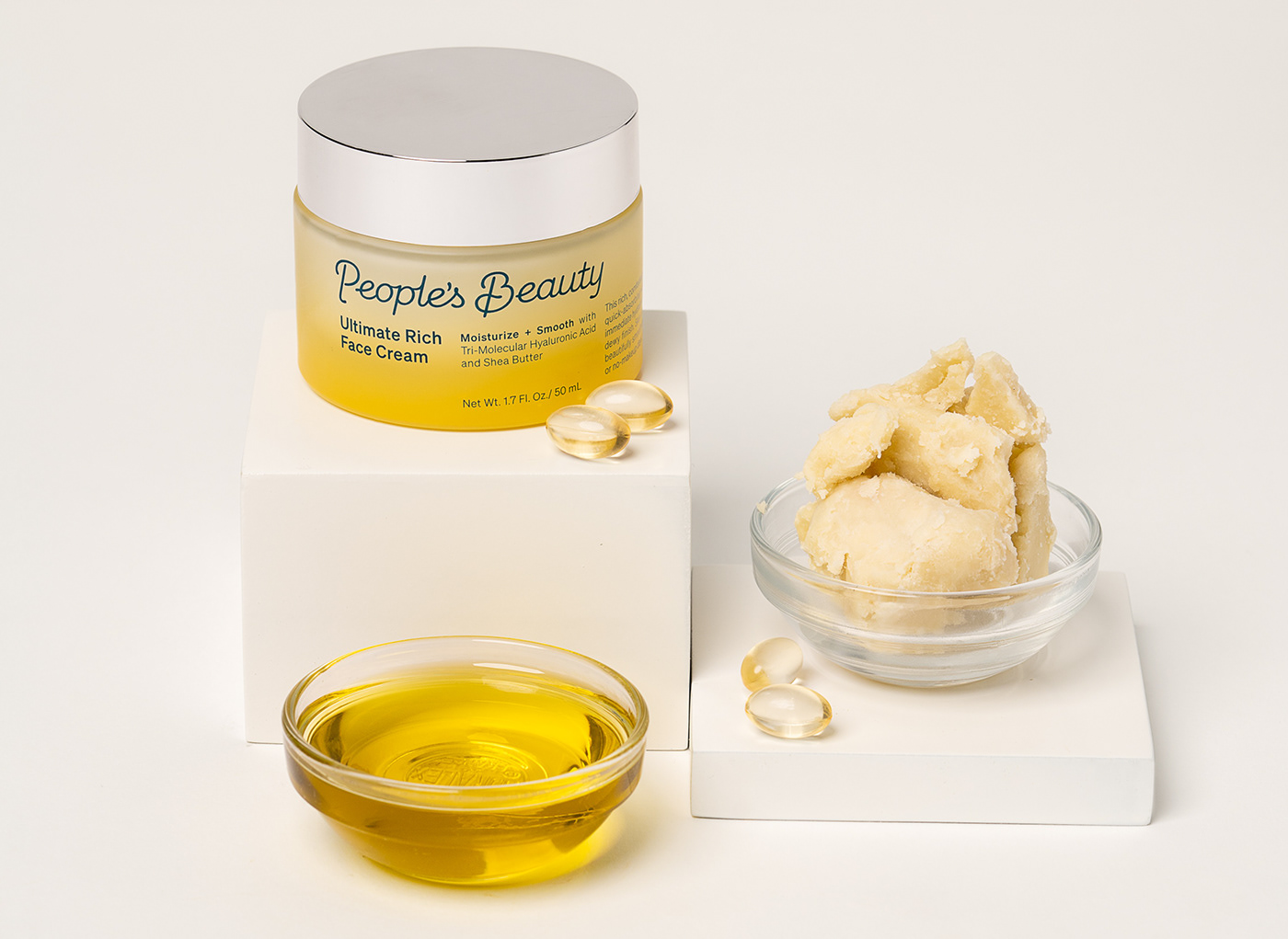
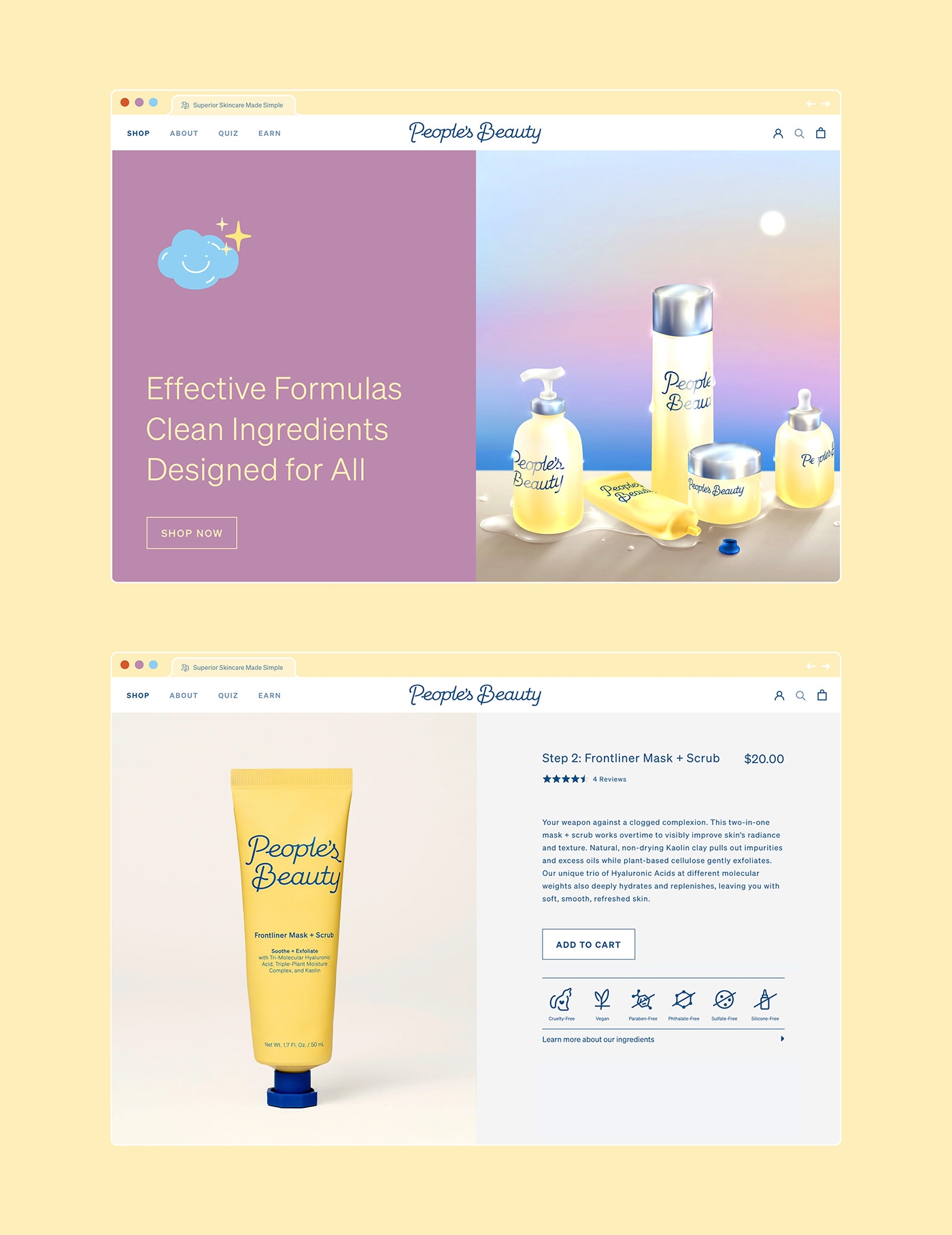
The website design encourages seamless shopping and product discovery, with a particular emphasis on highlighting the pro-grade, plant derived ingredients in each product.


Brand Identity, packaging, website design:
Custom logotype:


