St. Helena
Named after Saint Helena of Constantinople, St. Helena is an island of volcanic origin in the South Atlantic Ocean. It measures about 16 by 8 kilometres and has a population of 4,255. This brief was to rebrand the island with the aim of promoting its tourism.
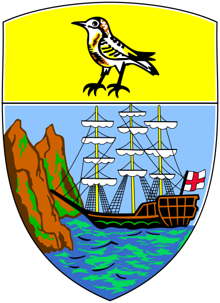
St. Helena's original island crest.

The logo I designed is simply a dot in the centre of the square, the reason for this being that it best represents the isolation you will find on the island.

This is the second iteration of the logo I designed. The type would fade in around the dot which remains central to the square it is contained in.


A map containing the custom signage that would be handed out to people on the 5 day boat trip to the island.

One angle of this branding campaign was the idea that you don't need much to enjoy yourself on St. Helena. The island is about getting away from routine and the day-to-day stresses that are brought about by so many things in people's lives whether they be big or small.
The above design would take the form of stickers and would be applied to things around busy city centres and places where people generally feel tired/bored/stressed out, therefore offering an escape. People could then order stickers for free from the website and apply them creatively to whatever they see fit, there would generally be no wrong answer for where to place them. The hashtag could then be followed through twitter, instagram etc. to see the results and promote the island more.
The above design would take the form of stickers and would be applied to things around busy city centres and places where people generally feel tired/bored/stressed out, therefore offering an escape. People could then order stickers for free from the website and apply them creatively to whatever they see fit, there would generally be no wrong answer for where to place them. The hashtag could then be followed through twitter, instagram etc. to see the results and promote the island more.


