


CONTRARIAN VENTURES VISUAL IDENTITY
Background and task
Contrarian Ventures is a venture capital fund focused on sustainable energy and emobility. As the name suggests, they like to go against the grain and challenge conventional thinking. They see it as their mission to create a breakthrough in the use of sustainable energy and to put an end to fossil fuels. However, the brave and forward-thinking nature of the fund was poorly represented by its brand and visual identity, which was lost in a sea of look-alikes. Contrarian Ventures commissioned a complete overhaul from the roots up. As a result, a brave and distinct brand emerged with a no-nonsense personality and a visual identity to match.
Approach
Our thinking was not only to help Contrarian Ventures stand out but to create an identity that would ultimately communicate a sense of urgency about the need to act on climate change. This required pushing the boundaries much further beyond moving away from the safe greys and blues of the industry.
Solution
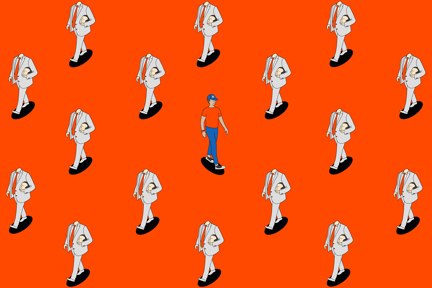
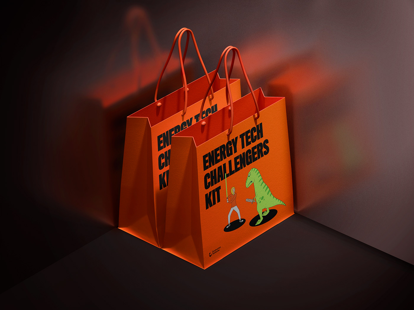
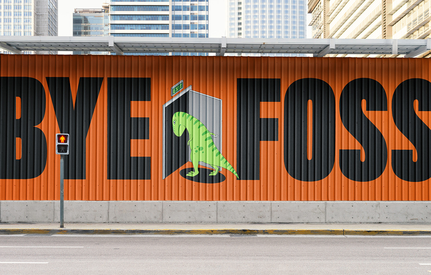
The Contrarian brand personality, visual identity and communications were completely reimagined with the introduction of a daring tone of voice, an illustrative and colorful graphic language. The illustrations are intentionally nonsensical, with a t-rex, ‘headless dude’, and a unicorn showing up at various points to act as the company’s proud mascots and to demonstrate the attitude towards fossil fuels and the energy industry.


2021 / DDB Vilnius / Contrarian Ventures


