Miel San Marcos
MSM (Miel San Marcos) is one of the most influential bands in Latin CCM (Contemporary Christian music).
The band consists of brothers Josh, Samy, and Luis Morales, who formed the group in 2000 at the Revival Tabernacle in San Marcos, Guatemala. The group's passionate shows earned them a huge fan following among Spanish-speaking audiences worldwide, and what began essentially as an outreach band has become its own pop ministry, capable of filling stadiums in Latin America, Europe, and the United States.
Project
The goal was to create a professional and modern brand that reflects their identity as best as possible.
The branding communicates this feeling. The face of the brand, the logo, shows three rectangular shapes that symbolise the three brothers who make up the band. The icon is also elegant and recognisable.
In the design you see a gate or staircase, but also the connection with the classical musical note.
Client: Miel San Marcos
Services: Brand Identity, Product Designs


Grid system


Versatility and scalability

Pattern
Movement, M-shape. Music


Primary colours

Typography


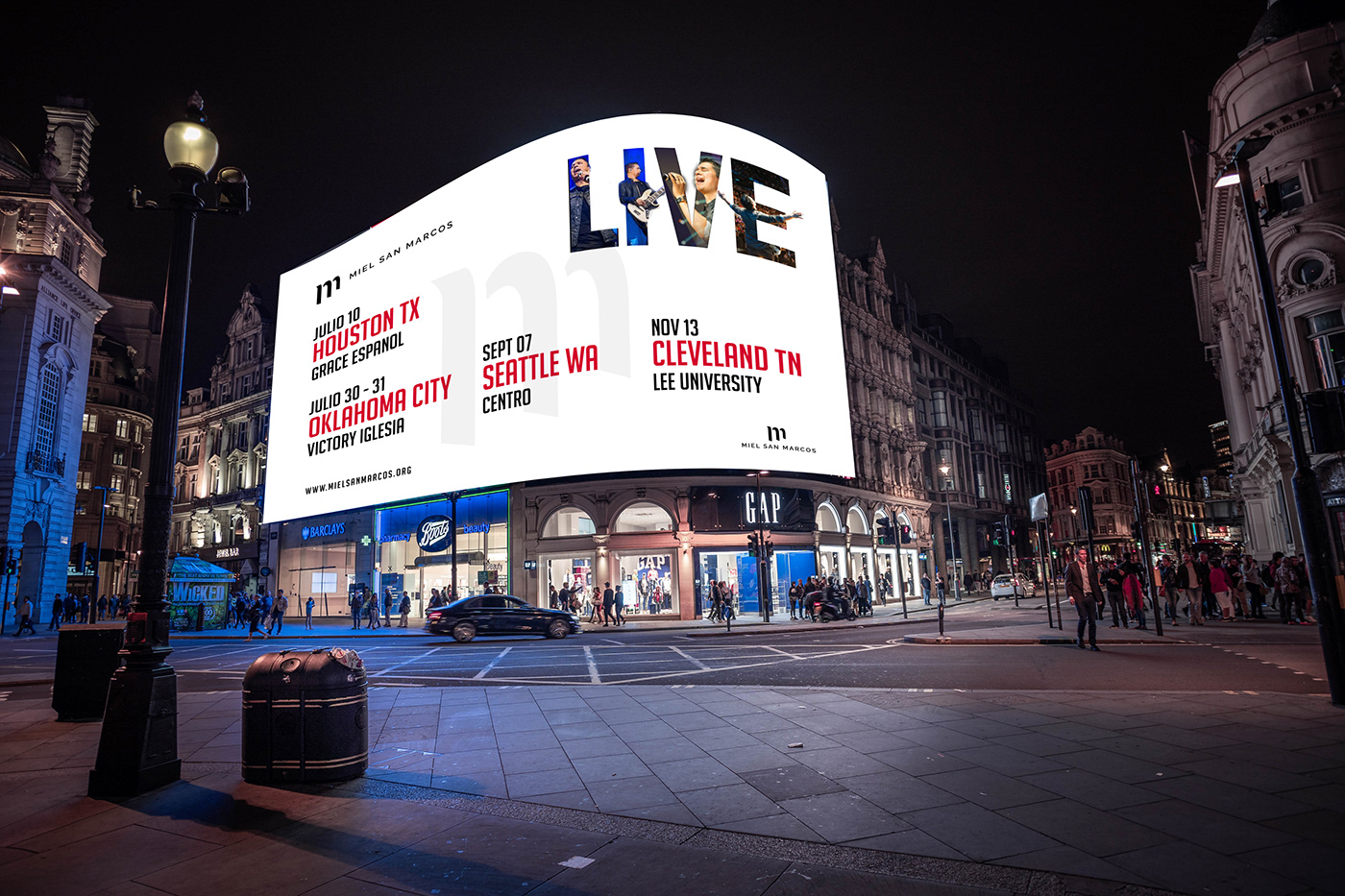
Events