The Flow Studio is a small therapy studio specializing in the healing and the recovery of the human body through mental and physical treatment and exercise. The creation of the brand identity took place just before the studio opened its doors in spring this year. The whole branding was created from the ground up and aims to reflect the core values of the studio, such as well-being, calmness, harmony, balance and a sense of flow. In this setting, the term flow refers to the flow of energies in the body which can be specifically targeted during a session in the studio.
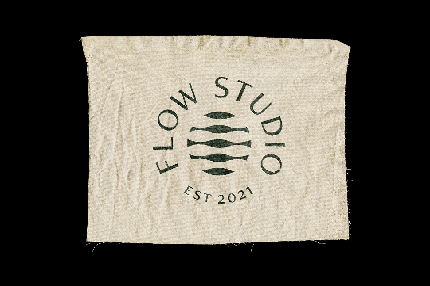
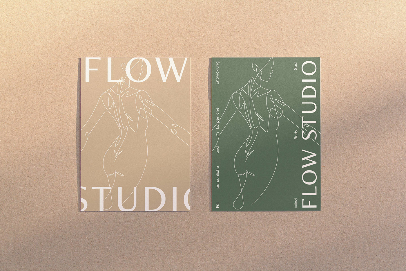
The use of type is held balanced and minimal, bringing the typefaces Freight Neo Pro and Object Sans to use throughout the identity. Besides the type, a minimal symbol was introduced to accompany the graphics and reflect the spirit of flow and balance. The goal was to create an identity that carries this spirit in a classy manner and sets the studio apart from other studios with a similar offering. Besides the horizontal and stacked versions of the logotype, a variety of badges was introduced to frame the symbol and ensure more flexibility when using them throughout different applications.
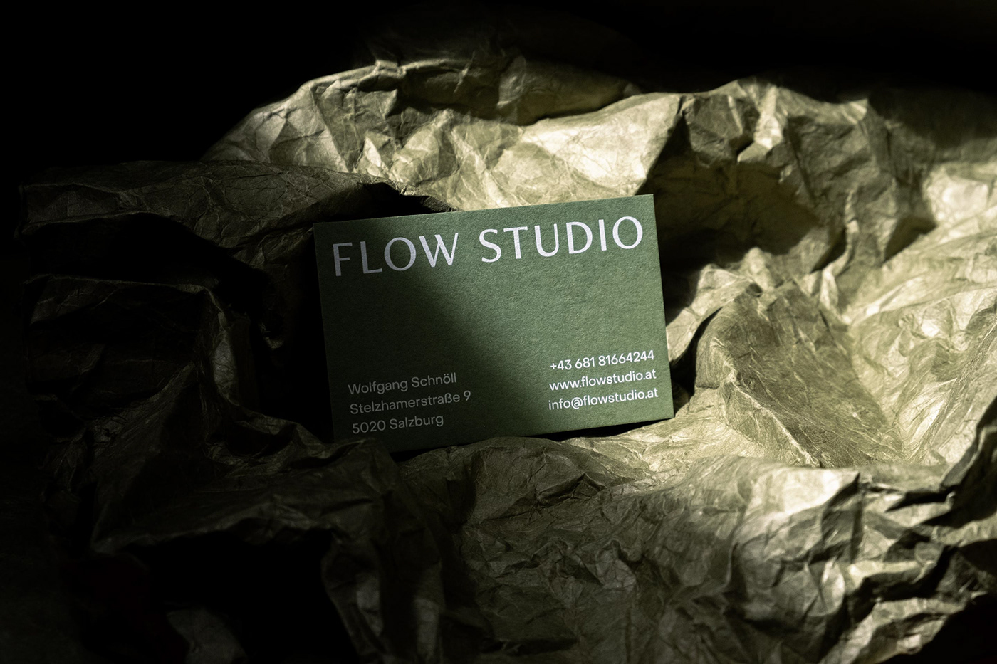
Business cards printed on Colorplan Plain Mid Green.
Typography: Phil's Fonts, Pangram Pangram Foundry · Case photography: Thomas Sturm
Produced independently in 2021.