


E-hailing platform UT
Brand identity development
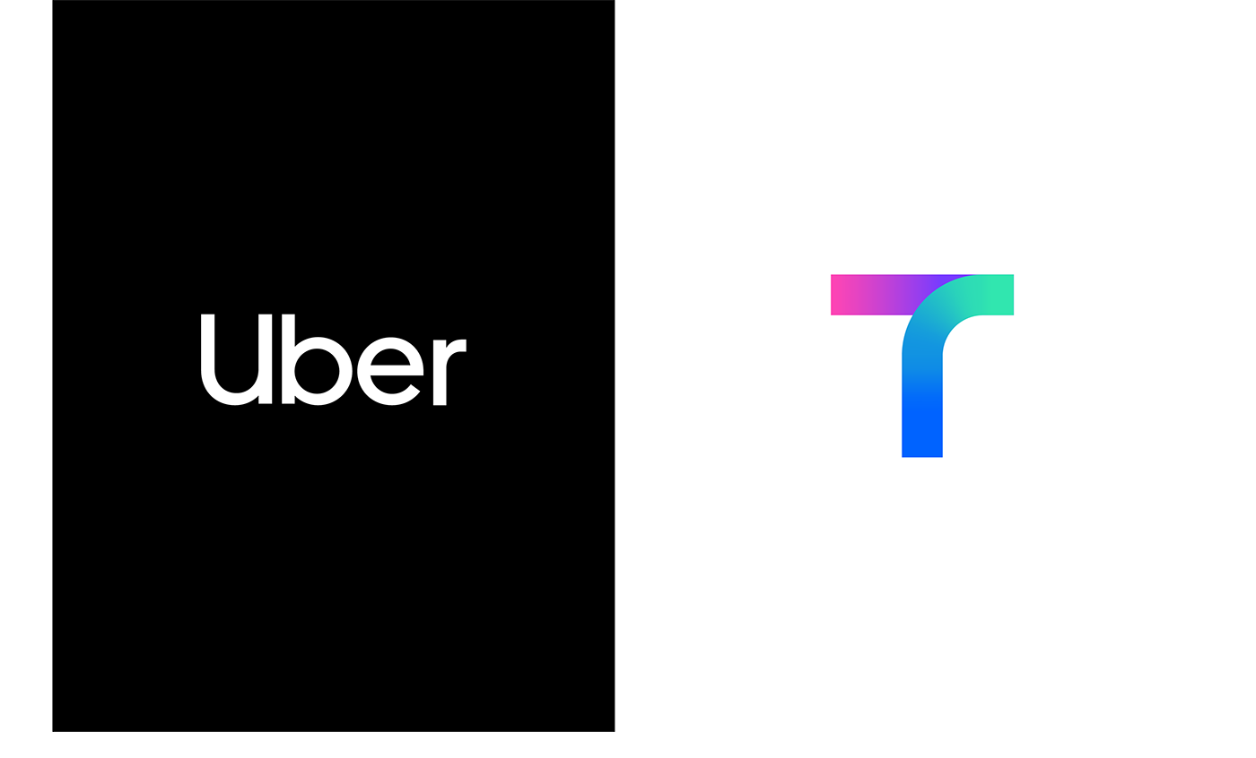
TMAP MOBILITY, a mobility brand under SK Telecom, and Uber, a global company, cooperated to launch a new data-driven e-hailing service. In order for the new brand to lead the innovation in the overheated domestic taxi market, Plus X suggested ‘reliable and fair’ values for both riders and drivers to experience boundless mobility service. Based on the brand values, we developed the brand name ‘UT[woo-tee]’ and the brand slogan ‘Our Taxi’ to inherit both companies’ heritage and intuitively communicate with customers. Furthermore, we designed a brand experience that emphasizes mobility expertise by utilizing visual assets that can be associated with the brand images of both companies.
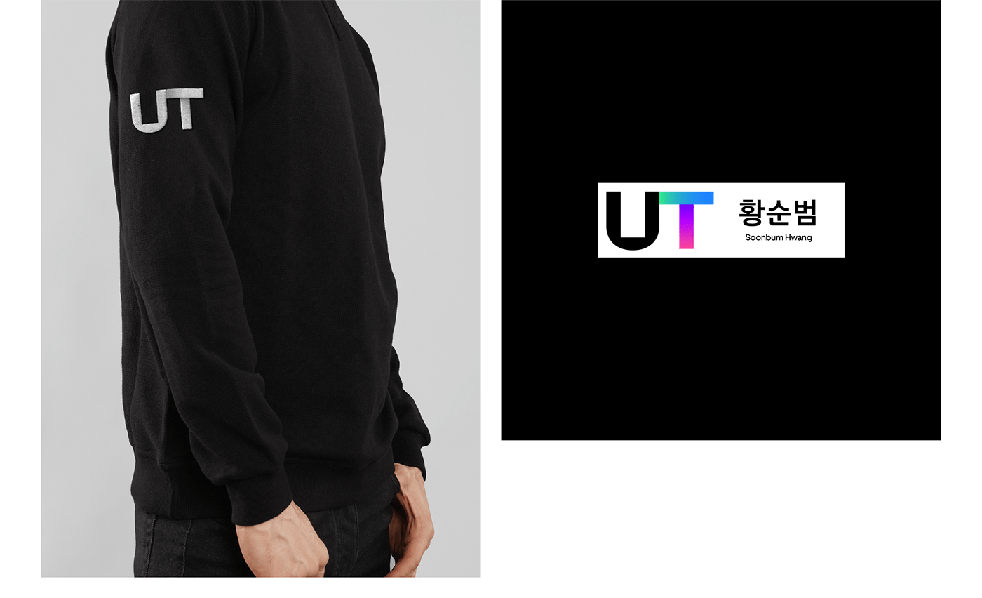
Brand logo
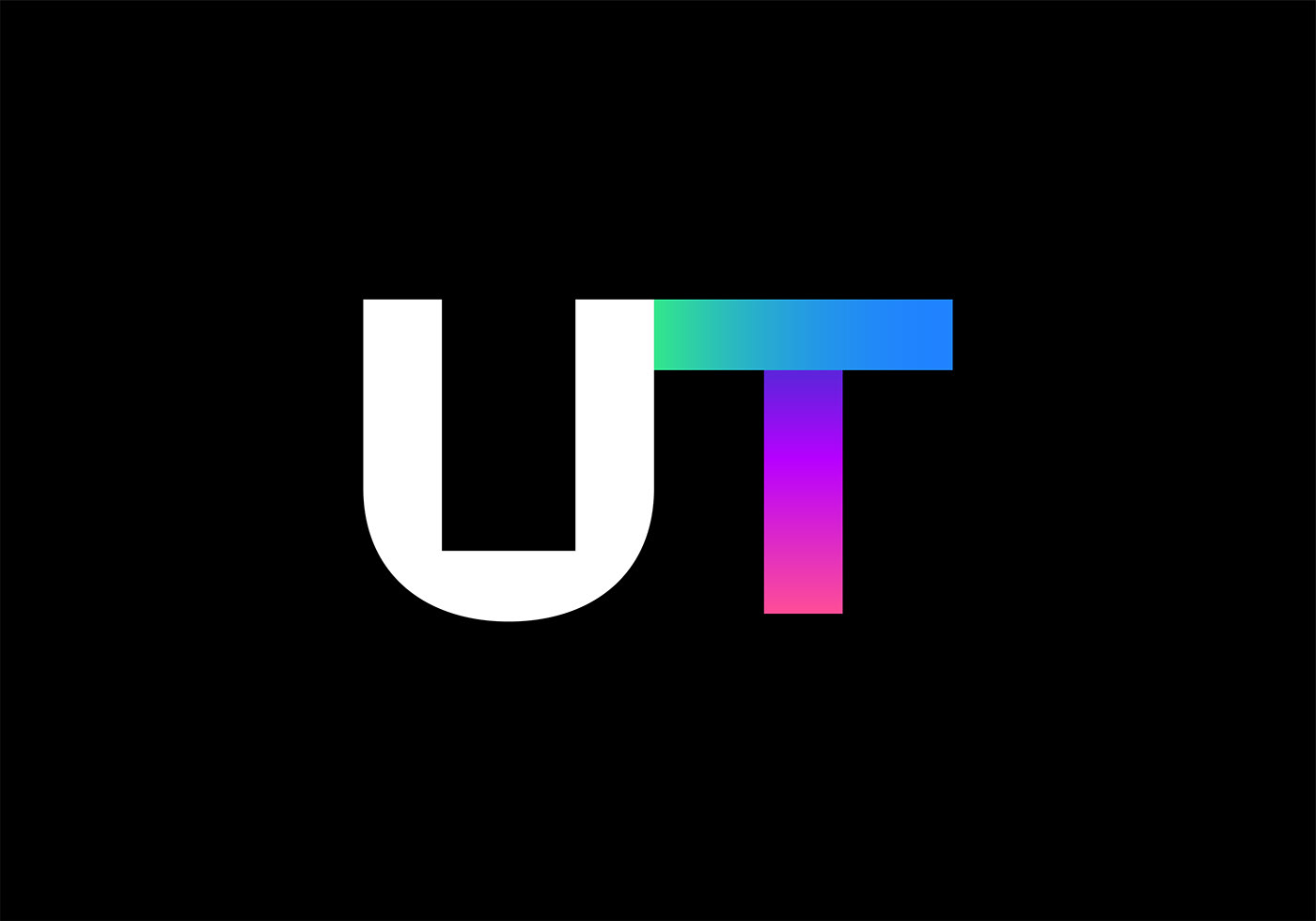
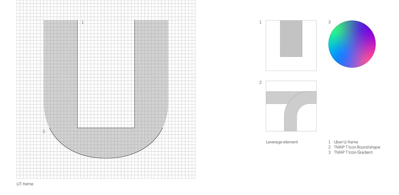
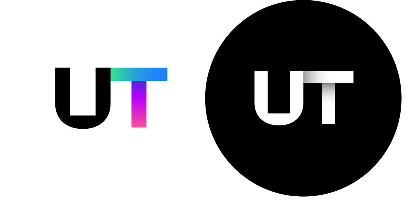
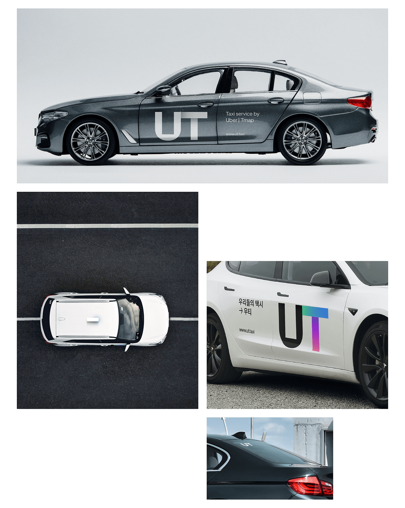
We designed the logo of UT by combining U-frame from Uber and a geometric shape from TMAP.
The negative space in the letter “U” means road, the space of movement, while the positive space means the fine mobility platform built by Uber and TMAP MOBILITY. Gradient also simply expresses “Travel”, and the contacted form of U and T means the coexistence of and the connection between drivers and riders, which delivers e-hailing experience comfortable to us.
Heritage-based design
For the service’s initial settlement in the market, we designed the logo with visual assets from each brand to leverage positive brand images; it has Uber’s U-frame and TMAP T Icon’s round shape and gradient. Also, as it is composed of only two letters, U and T, we carefully made visual corrections to increase its degree of readability and recognition in various contact points.
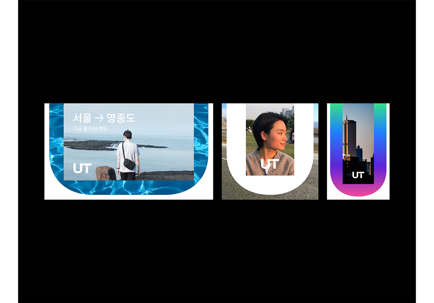
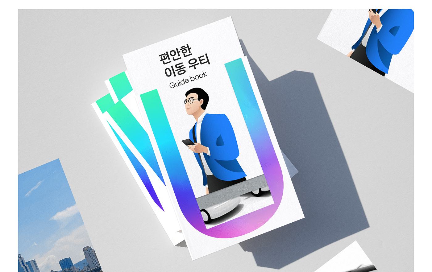
Key visual
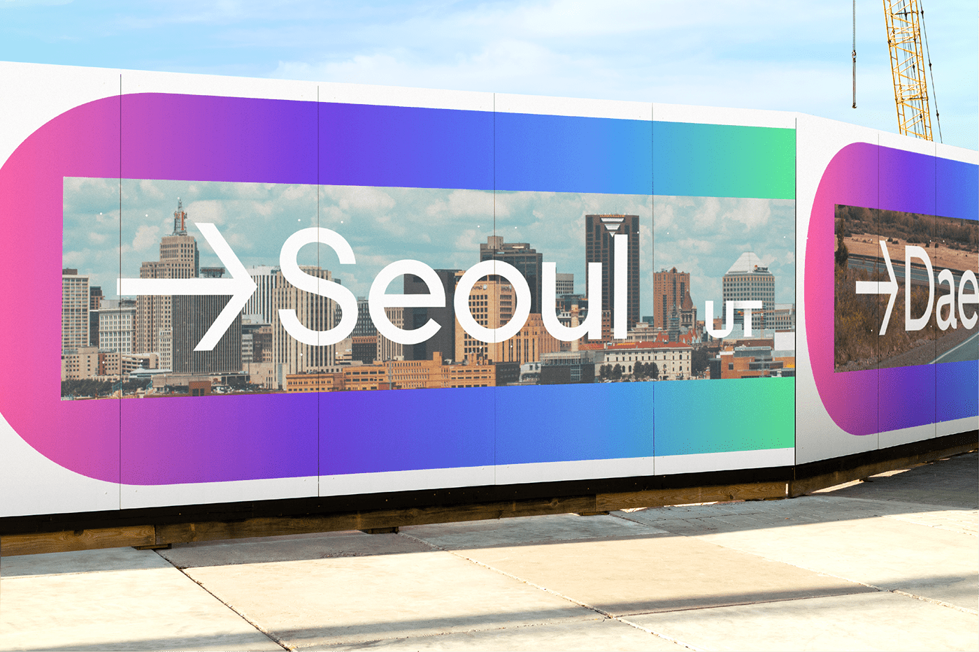
The width of UT-frame depends on the amount of texts, images, and other contents. Regular frame is for lots of texts; medium is for highlighting keywords; bold is for highlighting images; and solid is for both images and texts. The frame can be also extended vertically and horizontally, which is helpful to deliver the consistent brand identity in a variety of contact points.
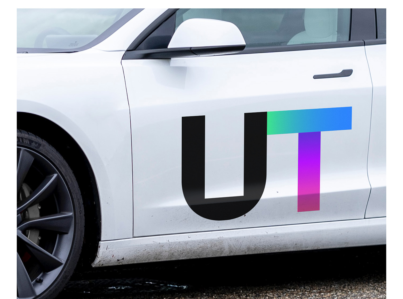
Brand color
UT took Uber’s White and Black as its main color to build simple and professional brand images while TMAP T Icon gradient gives the brand lively images as a point color. Each color is used in the different points under the delicate regulations on usage ratio, telling the exclusive values of UT which always makes a great effort to provide the better journey.

Typography / Iconography
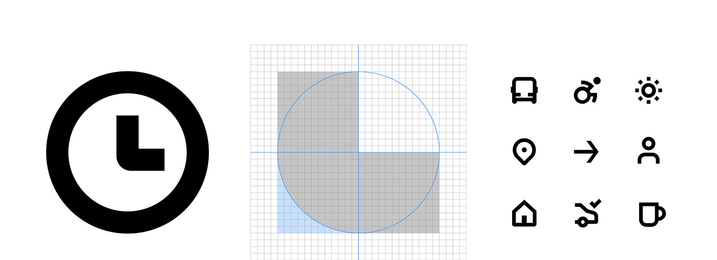
Uber Move is a very clear and simple font, which has a high readability in on- and off-line environments and brings up the image of the shape of road, the space of movement. Favorit Hangul is a UT’s designated Korean font which has the similar formative features with Uber Move—the contrast between geometrical curves and lines. We designed UT’s own icons with the logo’s the formative feature that the lines and the curves are harmonized based on Uber’s simple and intuitive icons optimized at the digital environment.
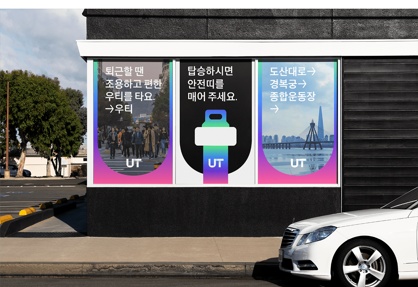
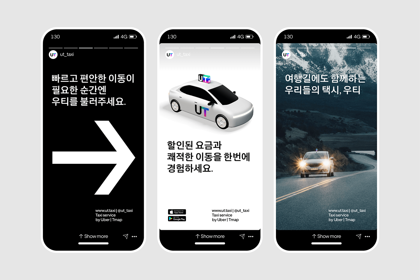
App service
With the easy and clear user interface, we designed high quality app service based on UT’s brand identity for consistency. The point color, gradient, easily delivers the feature of UT’s service to offer the relaxed moving experience with professional technology and effectively shows the information on every procedure in travels from call to the moment to get off.
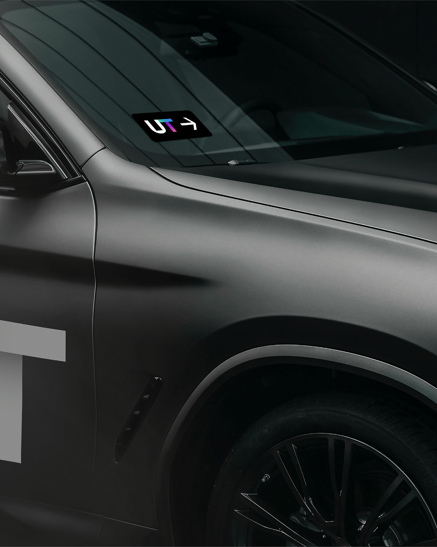
Application
Application is the widest contact point to showcase UT. The impact and consistent brand communication becomes possible through the proper allocation of the intense visual assets and simple, clear messages in all points of contact from online banners to offline commercial advertising.


E-hailing platform UT
Brand identity development
Dec 20 - Apr 21
Plus X
BX Director: Tyodi Hyojin Lee
BX Team Leader: Bohyun Kook, Sungeun Lee
BX Strategy: Phoebe Seo, Sunyong Kim
BX Designer: Heejae Jang, Sieun Baek, Hwan Kim, Sunyoung Park
BX Team Leader: Bohyun Kook, Sungeun Lee
BX Strategy: Phoebe Seo, Sunyong Kim
BX Designer: Heejae Jang, Sieun Baek, Hwan Kim, Sunyoung Park
Client services: Jeeyoung Song, Minhee Jo
UT - A joint venture between Uber and SK Telecom
Project Lead: Soonbum Hwang
Steering Committee : Lucinda Barlow, Sanjay Gupta, Tom White, Vishnuvardhini Sreenivasan
Project Lead: Soonbum Hwang
Steering Committee : Lucinda Barlow, Sanjay Gupta, Tom White, Vishnuvardhini Sreenivasan
© 2021 Plus X Co.


