


Defining The Brand
Shinendo is, perhaps, the most complicated project we have ever tackled. The challenge lies in finding the right way to convey the historical and artistic value of an acclaimed tableware brand from Japan to audiences from other regions.
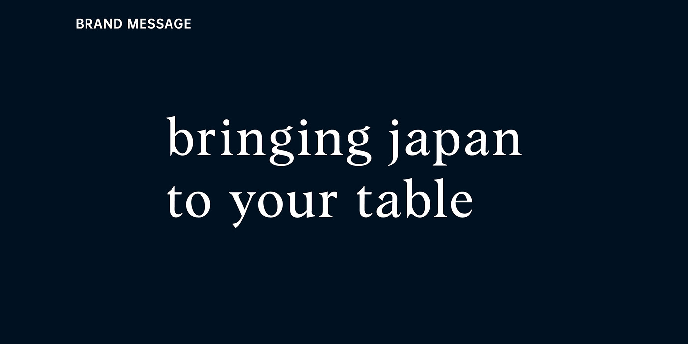
Our team first conducted research and interviews to identify the core value and message that Shinendo wanted to convey to its audience. From the interviews, our team identified the three keywords, which are also the core values Shinendo cherishes: Authenticity, Naturalness, and Artistic. Based on these keywords and the image that Shinendo presents, our team came up with the message concept: "bringing Japan to your table." We then drafted and developed an identity that would best represent the brand in foreign markets based on this message.

Drafting The Logo
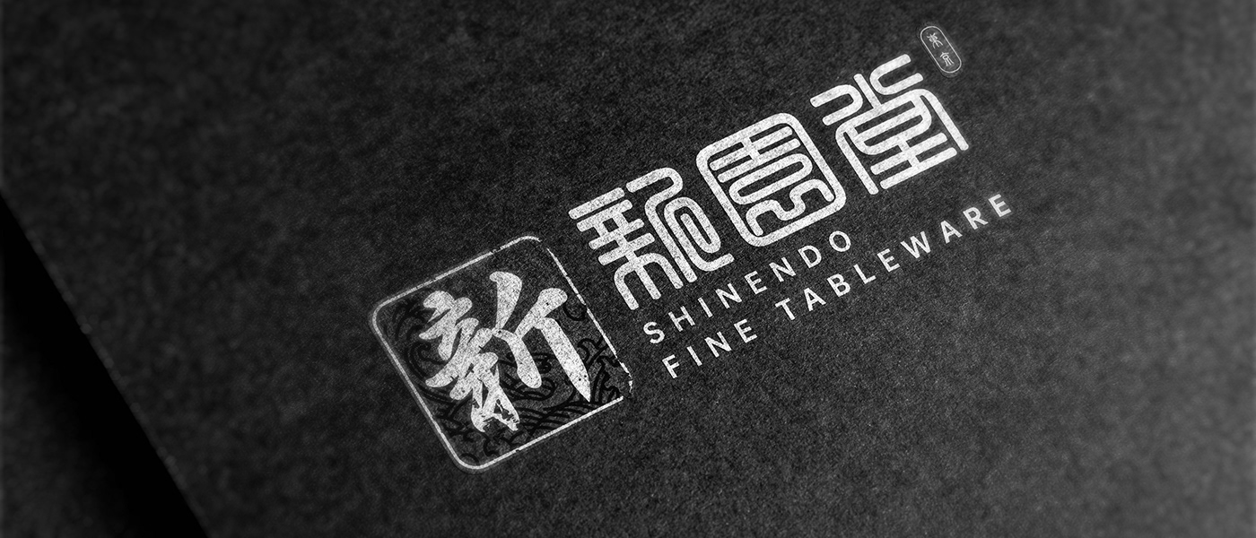
Moving on, our team attempted to come up with a new logo to represent the brand as it expands into other markets. The new logo must retain Shinendo's historical value while representing the brand as a representative of Japanese values. Furthermore, the logo must be designed to also present Shinendo as a select shop chosen to be the tableware provider for the Japanese royal family.
Our team relies on the traditional Japanese art elements, including the traditional Japanese elements from the Ukiyo-e (浮世絵) - a well-known art genre beginning from the 17th century, to tackle this challenge. The final symbol mark was created ty combining the image of the royal seal, the simplified image of the great wave drawn by Katsushika Hokusai (葛飾 北斎), and the first letter of the brand's name: 新(Shin, meaning New)written in the traditional calligraphy style. On the other hand, the type mark employed modern East-Asian typography to add more abstraction to the brand's image while using a serif font to create a modern feeling.


Identity Development
A brand's identity cannot be completed without a dedicated color palette and font selection.
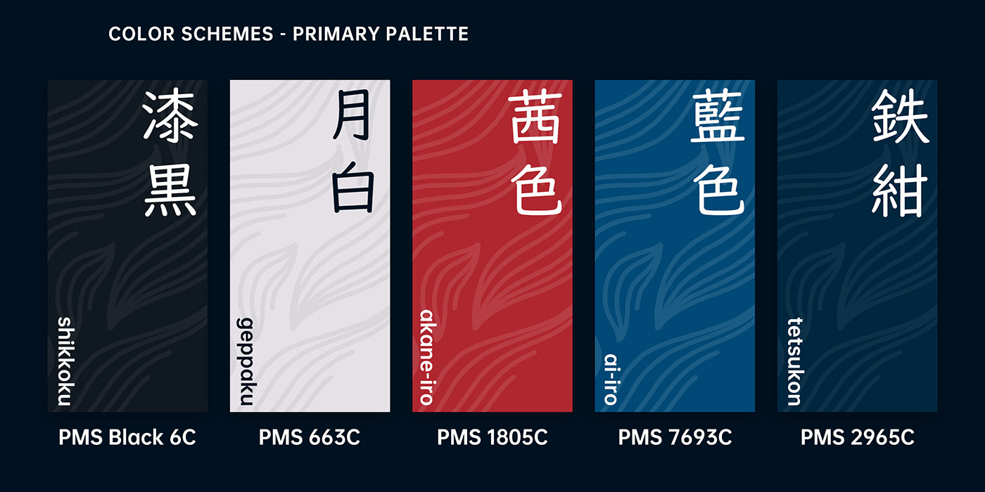
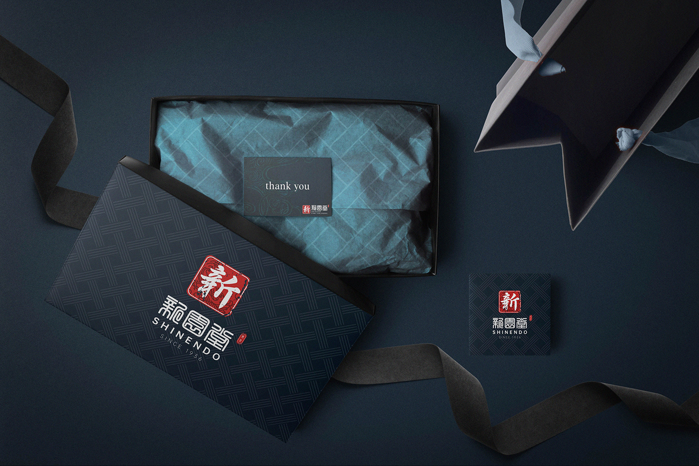
As Shinendo deeply connects itself with traditional Japanese values, our team turned to the traditional Japanese colors for its palette. After thorough discussions, our team chose the three colors: 漆黒(Shikkoku - Deep Black), 月白(Geppaku - Snow White), 茜色(Akane-iro - Crimson Red)in addition to the two tones 藍色 (Ai-Iro - Light Blue) and 鉄紺 (Tetsukon - Deep Blue)from the traditional Japanese indigo hue palette (藍染 - Aizome)as Shinendo's official color palette.
For the font selection, based on the brand's core value, our team chose the three fonts: Roboto, Albra, and Noto Serif JP as the brand's primary font selection.

Expanding The Identity
Through regular meetings, the stakeholders at Shinendo express their wish to have a new identity system and a new packaging system that helps Shinendo stand out and complement the products that Shinendo has been bringing to its audiences. The stakeholders wish to create a packaging system captivating enough such that every single product could be viewed as presenting Japan's culture.
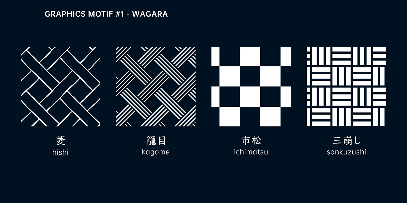
Considering the brand's core value defined in earlier stages, this request from Shinendo pushed our team to create a unique solution. After discussions, our members decided to fall back to the traditional Japanese art elements to create a unique system for the brand. Eventually, our team chose elements from the 和柄(Wagara - traditional Japanese pattern)and from the 侘び寂び(Wabi-sabi - a philosophy that focuses on simplicity and imperfection)movement for our design.


Thank you for your interest!
Project Name: SHINENDO - Brand Identity Development
Client: Shinendo (Tokyo, Japan)
---------------------------------------------
Design Agency: LNM Production


