HC Spartak Retro Match
Moscow, 2020
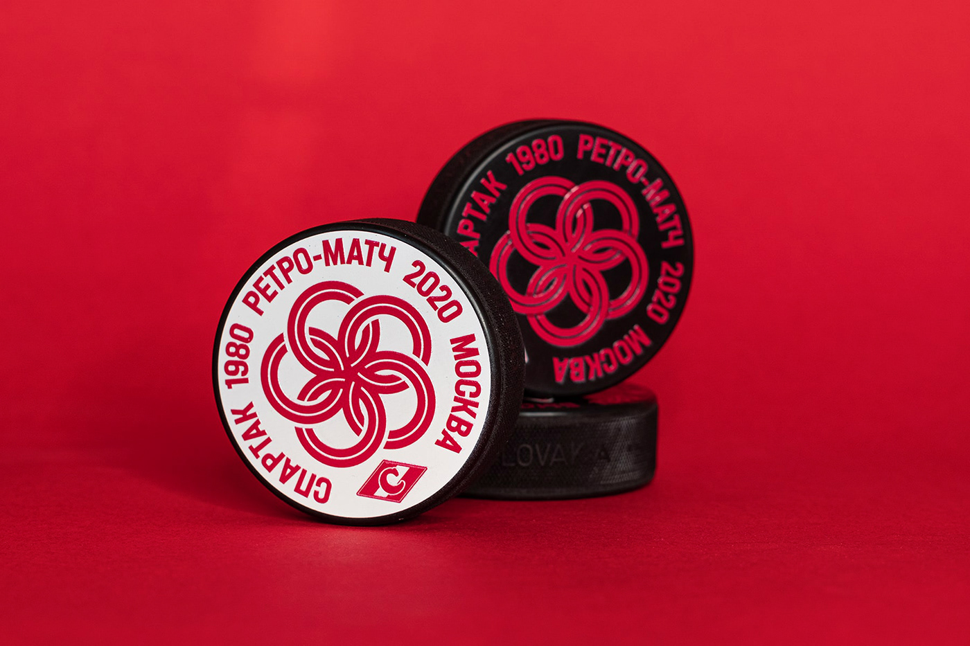
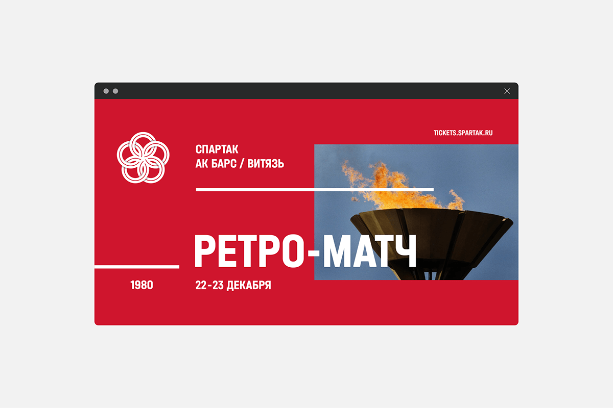
In 2020, for the first time Spartak held a retro match two nights in a row. The 80s were chosen as the key era of the long-awaited event. The first day was dedicated to the 40th anniversary of the Moscow Olympics, the second - to the Friendship of Peoples.
The core task was to recapture the sporting spirit of the age, to emphasize the leitmotif of Friendship of Peoples and to maintain the link to the Olympics - one of the most important events of that decade. A retrospective of using the Olympic rings in the past Olympics’ logos shows that they have always been the very symbol of this large-scale sporting event. A text wrapped around the circle is also typical for some logos of the Games of previous years, like those of 1936, 1948, 1952, 1956.
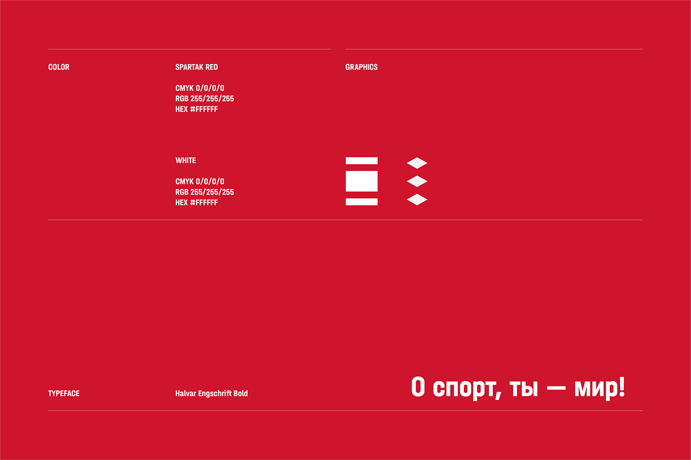
The rethinking of the classical Olympic rings made it possible to bind together the sporting spirit of the age and the Soviet people's unity. The symbol showing five rings, intertwined with each other, is supplemented by a distinctive circular inscription and a vintage Spartak logo. For the inscription, a narrow closed Grotesk was chosen, referring to the font design of the USSR national team's hockey uniform, which had a similar type and proportions.
Designer: Sergey Sukhov
Typefaces: Q10 (Quberten), Halvar (TypeMates)
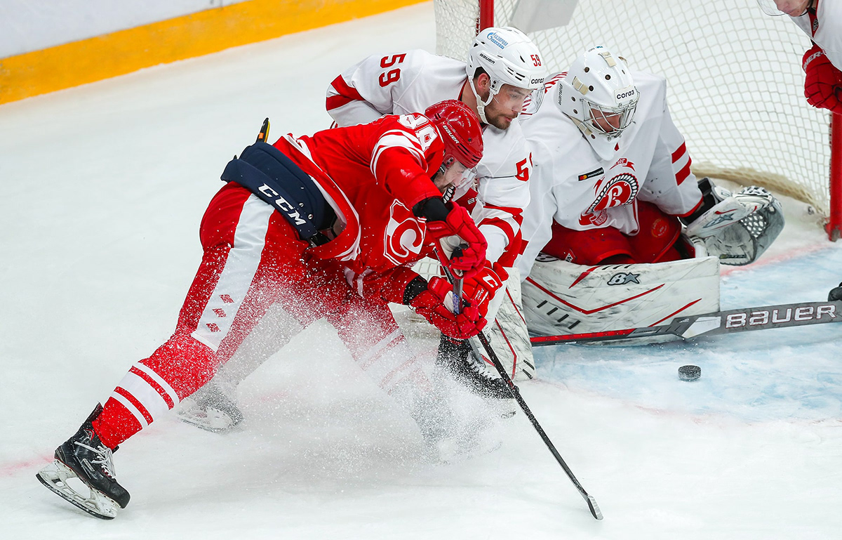
Photographer (Retro): Sergey Kirvin