


BRAND OF VARNA
This was the project that introduced me to graphic design, the project that would define my style of work from then on. It was my pride and joy, it got featured on two of Behance's curated galleries and on several design galleries, it's still my most appreciated project. Time flew, I got to work on bigger and more complex projects and so BOV got left behind. Now 2 years later I begin to see the many flaws and mistakes in this design. It would be just such a pity to leave things like this so I desided to go back and start all over.
But why Varna?
But why Varna?
I was born in a small town near Varna. Every day I got to spend there was special, there was just something special about it. Now I study and live there and I'm absolutely in love with the city, the people, the places.
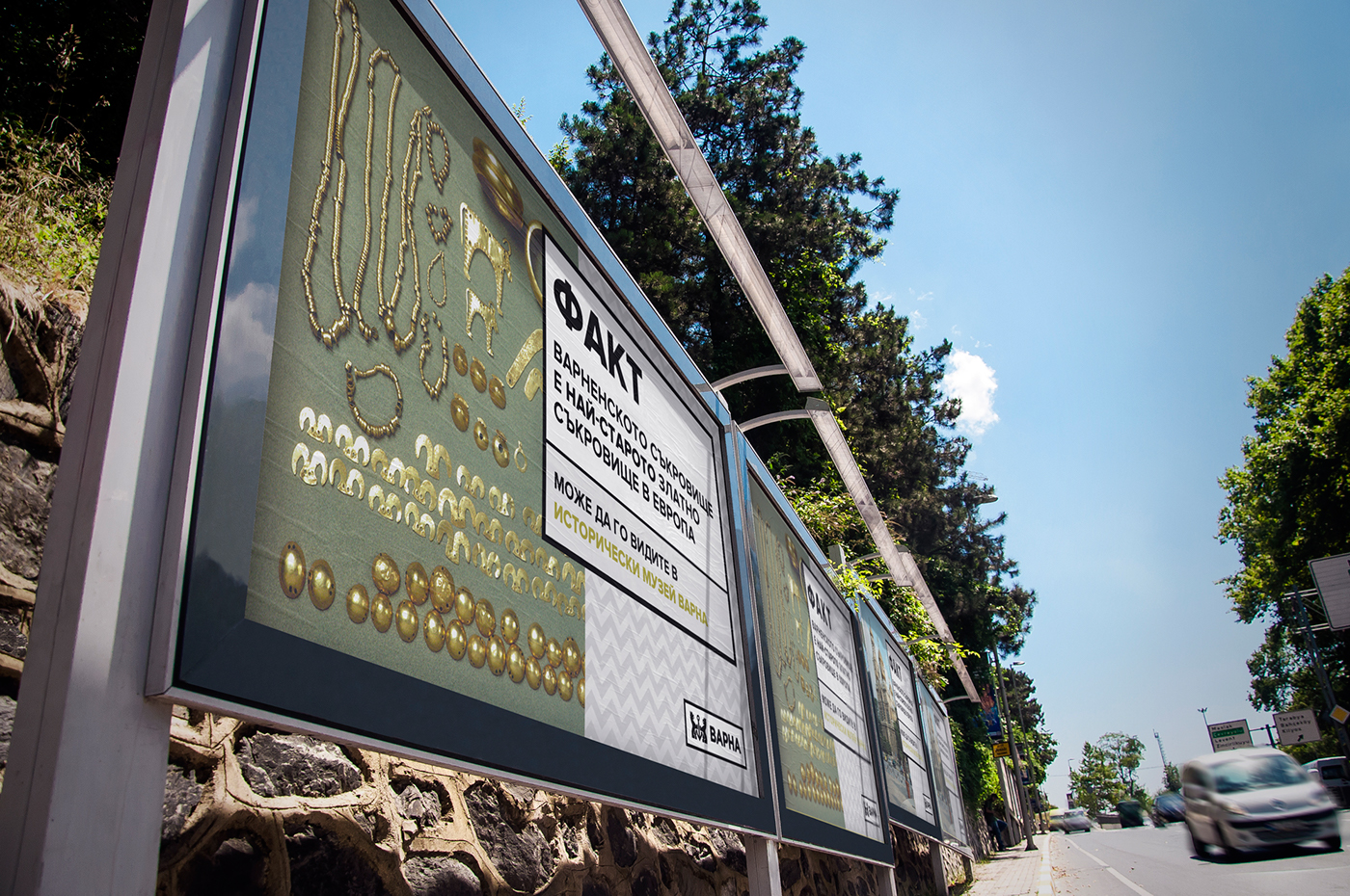
Varna is the third biggest city in Bulgaria and the biggest city on the Bulgarian Black Sea Coast, home of the biggest port in Bulgaria, thus the nickname "The marine capital of Bulgaria". It's a major tourist site that atracts thousands of tourist each summer, but don't let that fool you that Varna is a young city. Archaeologists have found an ancient golden treasure that dates back to 4000 B.C. - the oldest in the world!
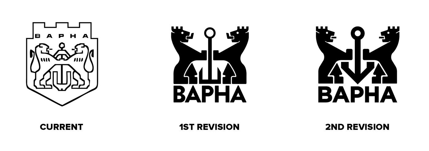
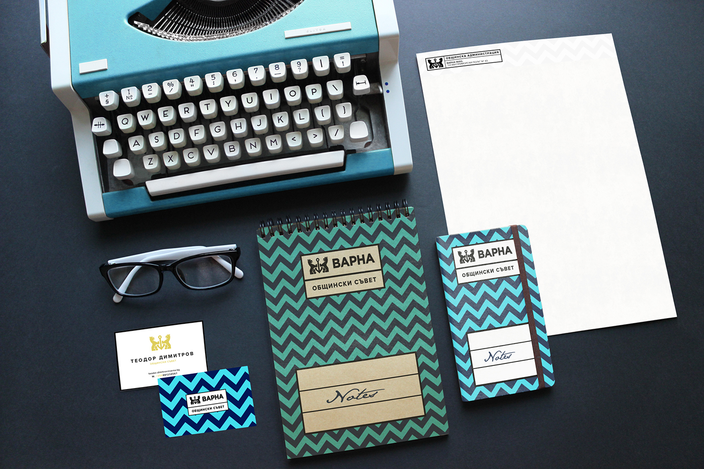
The current seal of Varna was designed more than 40 years ago and it's more than evident that it looks outdated by now. My primary goal back then was to create a visual eye-candy, without giving too much thought about it's usage in the branding materials. It was all done in photoshop, without any guides and way to many mistakes - lines out of angle, wrong curves, wrong typo. In this second attempt I tried to make the lines even cleaner - the only real curve now is the one on the lions back, everything else is built by straight lines. The anchor was also redesigned. It was too plain and got lost in the overall composition when it should have been the center of the seal. This one is bolder, more noticeable, it stays true to the original source and incorporates "V" as a basis for it's shape.
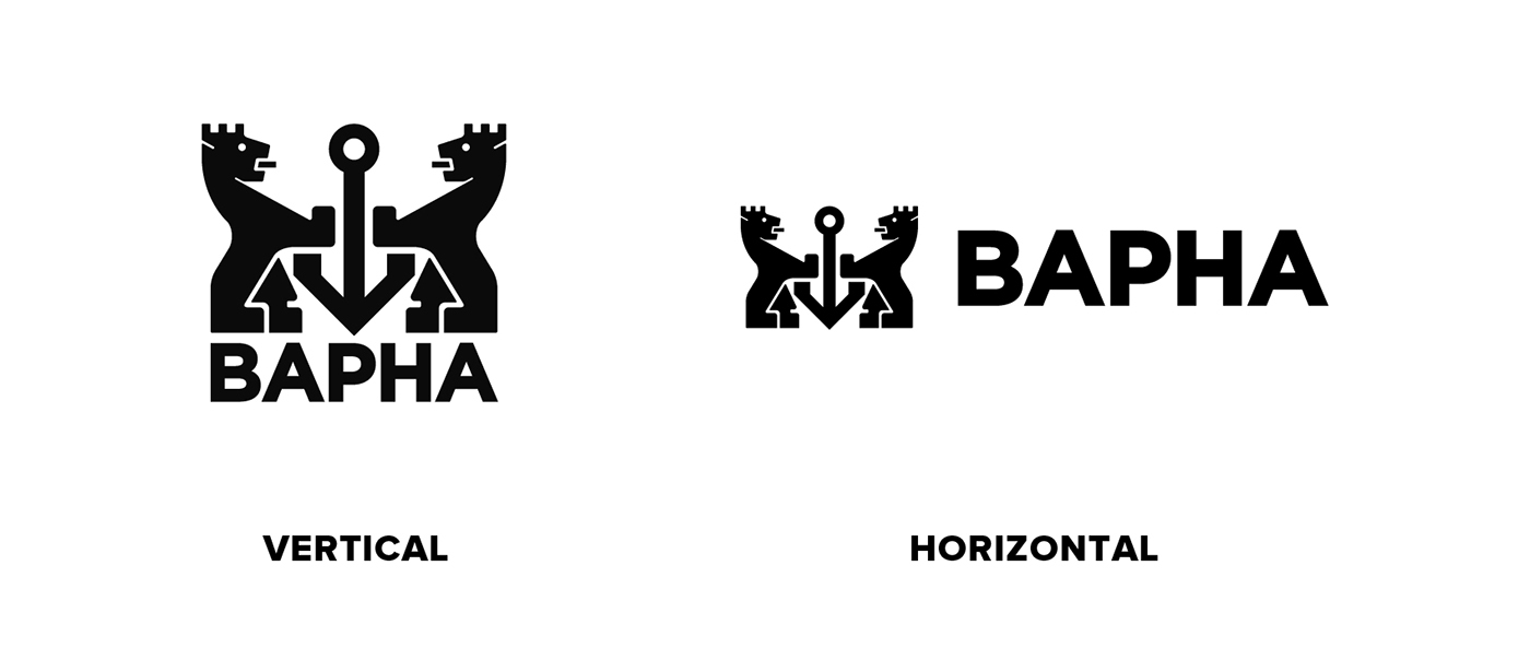

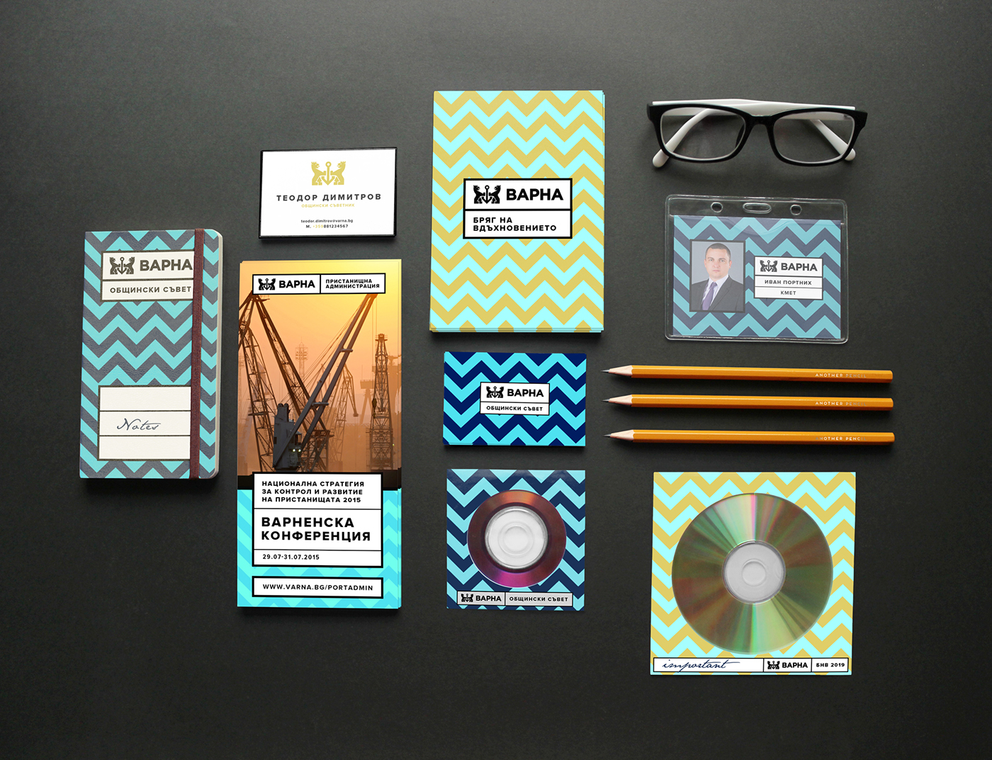
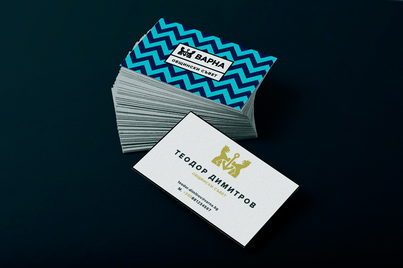
The toughest part was putting all of the components in a whole brand. This was always the problem with me - I always go all the way to make the perfect logo and just leave the branding part behind. Like the original I used a geometric wave pattern that can be used in a wide variety of color variations that can suit the corporate branding as well as the other initiatives supported by the municipality. But there was one something missing - the logo lacked visibility when put on the pattern. Then I came up with a rather symbolic idea: Varna is on the eastern border of Bulgaria - the one that runs along the whole Bulgarian Black Sea Coast - then why not use a border to make the logo stand out.
Thus the BRAND OF VARNA was (re)born.
Thus the BRAND OF VARNA was (re)born.


Thank you for watching!
FOLLOW ME ON: FACEBOOK


