
Wordpress theme creation for the personal website of Kelly Brogan MD. All rights reserved © 2013 - Arancia.
Project Type: Adaptative website design implementation
Client: Arancia
Design: Cecil Mariani
Production year: 2013
Scope
The project consisted on creating and developing an adaptative Wordpress theme for the personal website of Dr. Kelly Borgan MD, an holistic psychyatric specialized on the treatmen of women across the life cycle, including pregnancy and post partum, located in the city of New York.
The Challenge & Goal
The real challenge when designing for the mobile platform, comes when trying to provide a consistent and easily accessible experience across different types of devices. Fortunately, this goal can be achieved by creating an adaptative desing from the start, that would fit and change under certains (and specific) screen resolutions.
Smaller screens mean less pixels, and less pixels mean less space to work with.
But instead of leaving the original proposal to be rendered as an "scaled down" desktop version of the website on the mobile browser, a much simpler adaptation was created in order to priorize what's important: the content (mostly articles).
While desktop versions will usually allow the designer to create a much more complex layout (in terms of UI elements) that may include sidebars, custom controls or grouping content into different columns and/or sections, the mobile version (specifically the phone version) will usually provide a much simpler layout that on narrow screens and in most cases, will end up stacking things up.
Having a pile of content isn't a very good "hierarchy approach" and practice, wich means that besides reareanging elements and creating new hierarcies, the desing would also have to compromise certain parts in favor of the goal of the proposal.
Kelly Brogran's website is mainly a blog, a virtual space for her to write and reach her community. That is why this adaptative desing proposal focused mainly on one thing only: reading.

Differences
The idea of using only one layout that will adapt itself under different scenarios, forces the designer to think again about the way the information will be displayed into different situations, which basically means to consider 3 basic things before starting with the visual proposal: screen size, aspect ratio and orientation. Not all devices are held in the same orientation and some may or may not have fixed screen sizes or resolutions that could change drastically, the way the website is being displayed on the screen.
A tablet is ofently held in landscape mode compared to a phone whose default orientation (determined by the speakers and mic) is noticeably vertical/portrait. This problem does not exist in the desktop enviroment but, compared to the mobile platform, desktop computers allow the users to change the screen resolutions which is fixed and non changeable (width x height) on a mobile device.
A tablet is ofently held in landscape mode compared to a phone whose default orientation (determined by the speakers and mic) is noticeably vertical/portrait. This problem does not exist in the desktop enviroment but, compared to the mobile platform, desktop computers allow the users to change the screen resolutions which is fixed and non changeable (width x height) on a mobile device.

Screenshots of the actual build of the website
Blog home and Article View in both portrait and landscape orientations
UI Changes & Compromising
Along with the rearrangement, several of the UI elements had to be modified in order to fit the new layout: An example of this, is the navigation top bar that allows the user nagivate through the website and its different sections. The original control located at the top of the screen, was replaced by a clickable icon that represents a list of items that expands/collapses upon tapping (right screenshot).
While the desktop version of the main menu displays the options aligned next to each other in an horizontal bar that reveals other (sub)options upon hovering certain items, the mobile version of it, shows a traslucent overlay that fits the entire screen, making the options (buttons) bigger and its hit area more accesible to the user, that otherwise would be difficult to interact with, due to its minimal size.

Screenshots of the actual build of the website
Main menu overlay on Home section
Main menu overlay on Home section
This simple change, removes the needing of zooming the screen in order to look for the right option, and not hit the wrong link on the main menu. Also 2 more elements were added at the bottom of the overlay in order to keep them at hand all the time and that were not present at the same location in the desktop proposal: The Newsletter Signup link (which redirects the user to the client's MailChimp subscription form page) and the Search input, used to search for specific articles on the website.
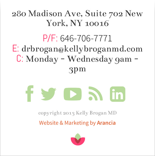
The footer of the page on the mobile version (image above) was simplified in order to show only important contact information and copyright legends, compared to its desktop version, that holds extra info, like the Search bar and Recent Comment sections as well as the Subscription Form.
The Desktop Experience
browsers and also capable of rendering almost anything, each of the platforms require the user to behave differently.
browsers and also capable of rendering almost anything, each of the platforms require the user to behave differently.
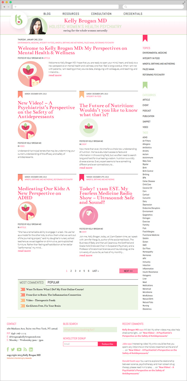
That is why the desktop version of the website offers the user a different, bigger and much complex layout, that makes a different use of fonts sizes and weights, images, animations and columns.
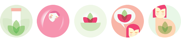
The image above shows the list of icons created to illustrate each article's Topic, when a thumbnail (uploaded picture) is not specified at the time of writing the entry of the blog. Since these images have a complementary use and function, they were removed from the mobile adaptation in order to create a cleaner, more simple and text-oriented layout.
Screenshot of the actual build of the website
Full capture of the Blog Home (desktop version)
Full capture of the Blog Home (desktop version)
(Fav)icons
The "fruit" element, an extremely meaningful concept found inside the logo created for the blog, was used as the main shape for creating the different favicons and webclips for both platforms (desktop and mobile).
