Grace
洁丽雅
—
Refresh a 30-year time-honored brand by inheritance and innovation to discard dross and refine the essential.Founded in 1986, Grace is the first brand in China's towel industry. Grace hopes to create a younger, more modern and more diversified brand image in the new era. The strategy for rebranding is very clear; that is, inheritance and innovation. The brand with a history of more than 30 years has established certain brand recognition amidst a large population of consumers. Rebranding cannot be realized without reduction of complexion, absorption of essence and removal of dross. It is necessary to delete the old and vague cognition and highlight the clear core cognition, so as to build a more focused and clearer brand image in the new era. One of the most intuitive and most important elements in grace’s brand asset is the rose flower logo in rose red. But the existing flower logo is mainly framed with English font “a” from its previous English logo which is no longer used.
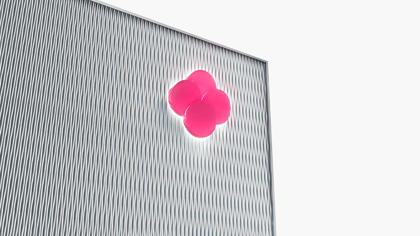
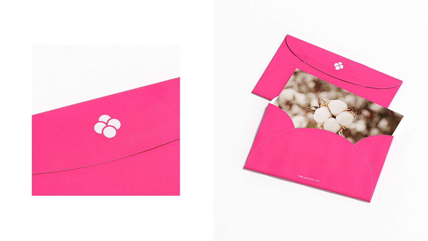
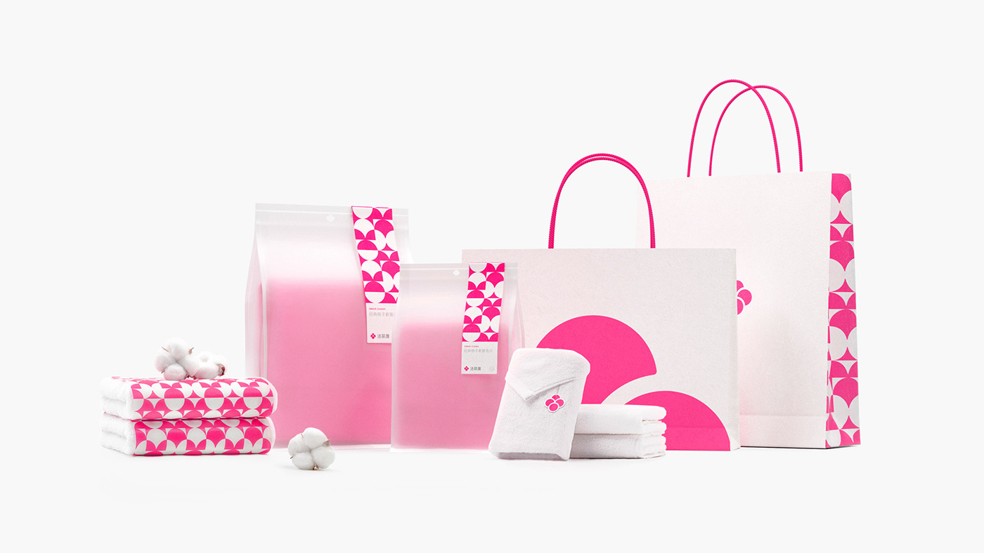
Therefore, such an English graphic has lost its meaning as the core symbol of the brand with the abandonment of the English logo. In addition, the structure of the graphic is relatively complex and irregular. To reflect the concept of inheritance and innovation, the new design, on the one hand, maintains the flower outline that is the core element of the brand, and on the other hand, presents a more intuitive and clear cotton graphics for the brand. The cotton is an important identity of brand products, and the only embodiment of product quality. The entire graphic of cotton is composed of four joint basic circles, and each circle is endowed with four different meanings, echoing the four new core values of the brand, namely, family, quality, creativity and vitality. In this way, the brand has been remodeled to realize the out-from-within and the blend of the form and the meaning.
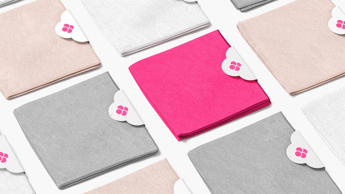
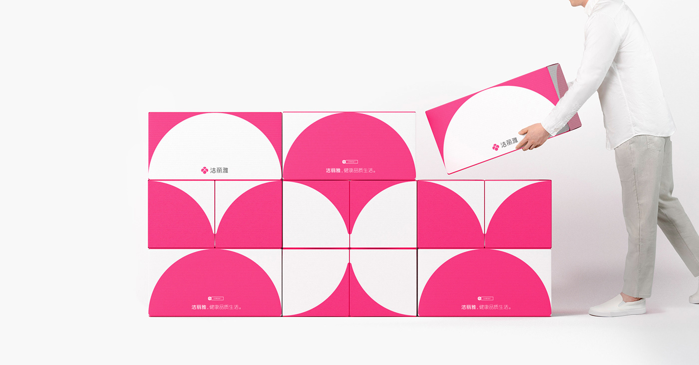
The overall application of the brand continues to talk the unified visual language of the new logo, in parallel with rich possibilities through different dimensions and various combinations, realizing the young and diverse image as the brand appealed. Within the visual system, the design builds a complete brand visual system through brand graphics, patterns, and layout segmentation, so as to match the kaleidoscopic and diverse scenarios in the future and guarantee a unified and definite expression of brand image.
—
洁丽雅品牌创立于1986年,是中国毛巾行业的第一品牌。洁丽雅希望在新时代下塑造更为年轻当代,更为丰富多元的品牌新形象。
在洁丽雅的品牌资产中最为直观的也是最为重要的元素之一即品牌的玫红色和其花型的logo,而现有的花型标识中所呈现的是早前品牌英文标识中的字体a,而此英文已不再使用,这样的图形作为品牌的核心符号已失去了意义,同时图形的结构相对复杂且不规整,秉承继承与革新的理念,全新的设计一方面保留了品牌核心的花型轮廓,另一方面为品牌赋予了更为直观且明确的棉花图形,棉花是品牌产品重要的识别,同时是产品品质的唯一体现,整个棉花的图形由四个基本圆形拼接而成,设计分别赋予了每个圆形四个不同的意义,呼应了品牌全新梳理的核心价值,即家庭,品质,创造和活力,设计也以此为品牌实现了表里如一,形意融合的品牌重塑。
—
