品牌:minoo
项目:logo与包装设计
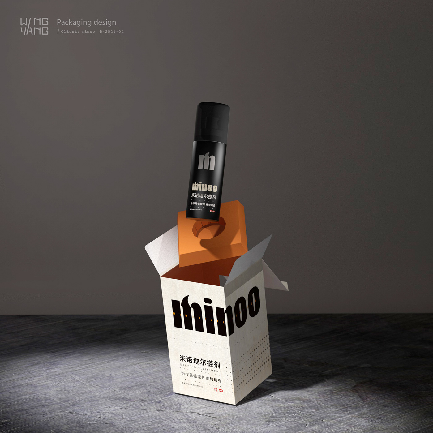
品牌针对男士的脱发问题,为客户提供脱发和固发专业的搽剂。
项目:logo与包装设计
品牌针对男士的脱发问题,为客户提供脱发和固发专业的搽剂。
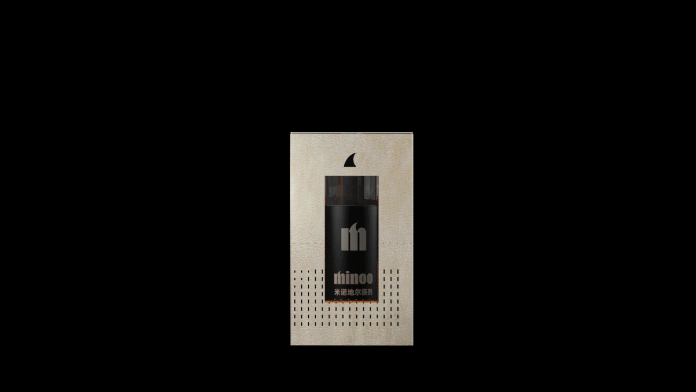
创意概念:品牌名的设计是以突出一个小勾勾为亮点,有趣地象征着头发。包装细节上我们选用粗细的点到线之间的变换,代表规律有效的生长期待。整个包装是以直线视觉打造一贯男性品牌的风格。
设计师:wingyang杨颖
Brand: minoo
Project: logo and packaging design
The brand provides professional hair loss and hair strengthening applications for men with hair loss problems.
Project: logo and packaging design
The brand provides professional hair loss and hair strengthening applications for men with hair loss problems.
Creative Concept: The brand name was designed to highlight a small tick as a fun symbol of hair. The packaging details we chose to change between thick and thin dots to lines to represent the regular and effective growth expectation. The whole package is a straight line visual to create a consistent male brand style.
Designer: wingyang