

Aksara Swara
This is my thesis project, titled "The Adaptation of Gamelan Sunda's Characteristic and Rhythm into the Experimentation of Variable Fonts and Kinetic Typography". The inspiration comes from the ability of letters to convey meanings visually. How far the visual feature of letters can convey meaning? Can it be used to represent something that is intangible like sound? Moreover, I also want to explore typography in the digital media context through variable fonts and kinetic typography.
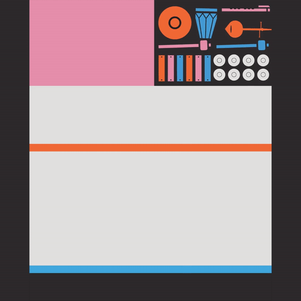

Usually, in type design, we get inspired by the things we saw. But what if we take some inspiration from something that we hear? From a sound? From a beautifully arranged sound like gamelan?

It took monthsssss (long miserable months) to finally find a suitable method to translate the musical characteristic of Gamelan into visuals. But after some research and consultation, I found that semiotics is the most suitable approach. It's also the thing that binds Gamelan and Typography together.

As an experimentation project, the core idea is about how to make typography to be heard and Gamelan Music to be seen.

Long story short, I came up with 3 variable fonts based on the categorization of Gamelan's Musical instrument. Pamurba Lagu, Anceran Wirahma & Raraga Gending. Each of them is representing the characteristic of the Gamelan’s instruments. The visual feature of the letters is determined by the translated musical characteristic (through semiotics in music) into the distinctive feature of a letter (semiotics in typography).
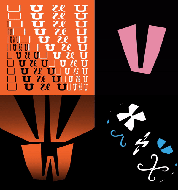
#1 Aksara Pamurba Lagu
Inspired by the musical characteristic of Rebab and Gambang as the melodious instrument in the Gamelan Sunda ensemble. It has vocal, dynamic, and continuous quality.

It has 3 axes, 8 masters, and resulting in 12 instances


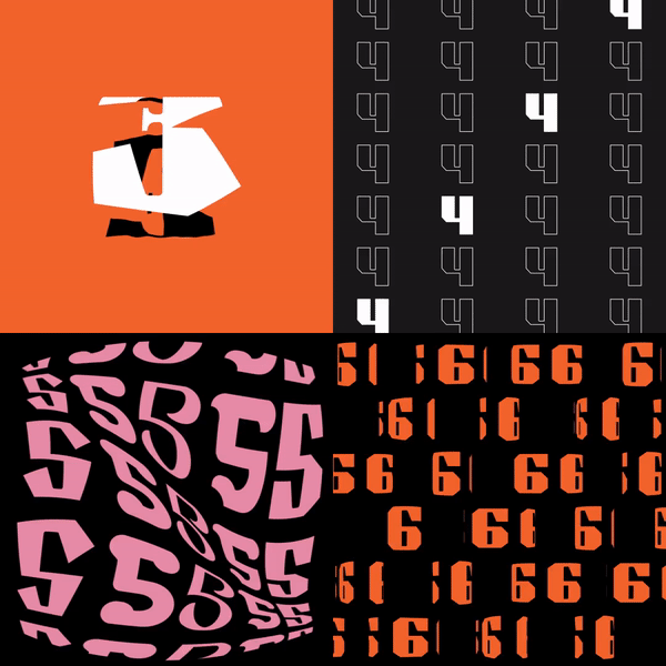
#2 Aksara Raraga Gending
Inspired by the musical characteristic of Wilah and Peclon as the rhythmical instrument that gives 'body' to the Gamelan Sunda ensemble. Wilah and peclon are played in a certain rule that gives structural and melodious quality at the same time.


It has 4 axes, 8 masters, and resulting in 12 instances


#3 Aksara Anceran Wirahma
Inspired by the musical characteristic of Kendang as the rhythmical instrument that acts as the guide and main structure in Gamelan Sunda ensemble. It has a very bold, strong, and sturdy quality.


It has 4 axes, 8 masters, and resulting in 12 instances


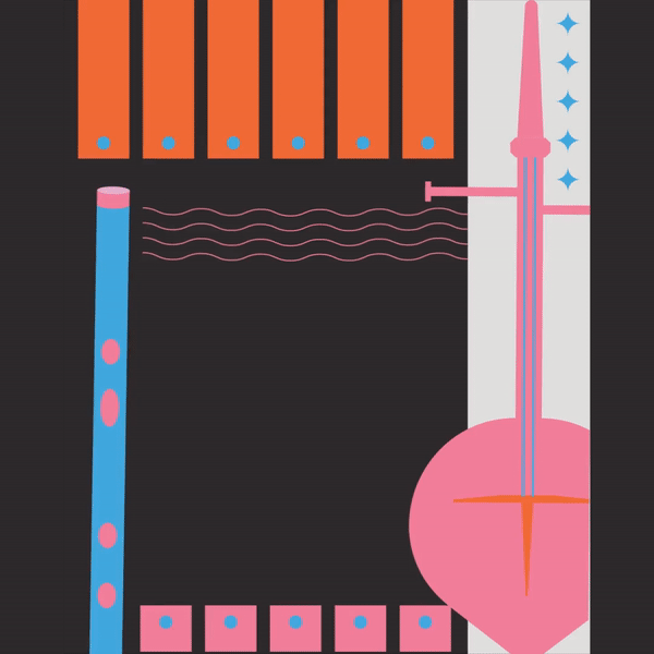
Besides variable fonts, I also made some experiments in kinetic typography. And here's a sneak peek from animated posters I made.

For this project, I didn't make any type speciment. I made this showreel instead, as the showcase for the letters I made for this project :)


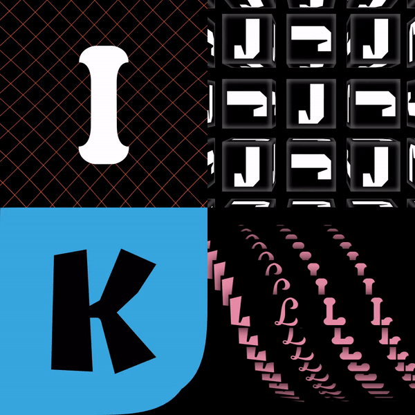

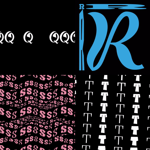


This is a very experimental journey for me. It is very exciting to see that there are unlimited possibilities to play with variable font. There are so many characteristics that we can put into a single font file. Then as the development of type in digital media, kinetic typography is a very promising field. It such an amazing playground to explore typography not only textually but also visually, and see how type can be transformed into something that is intangible at the same time.


