


SHADOW and LIGHT
I have chosen to create a typeface that plays with the positive and negative space, based on Gestalt’s principle of figure and ground. Taking the south Indian script Kannada and incorporating it with my theme of positive and negative space.

Kannada script
Three dimensional, creating a depth and paper thin effect. The way linocut carving works small strokes peeled away leaving space for the negative and positive zones.


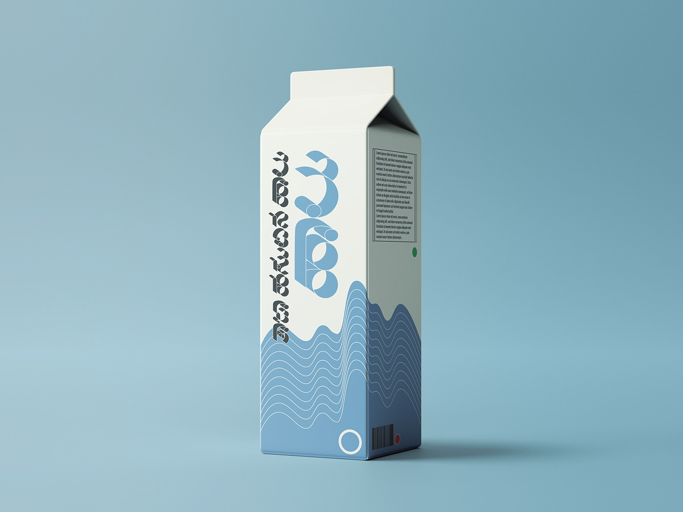
Milk carton mockup

Chewing gum mockup
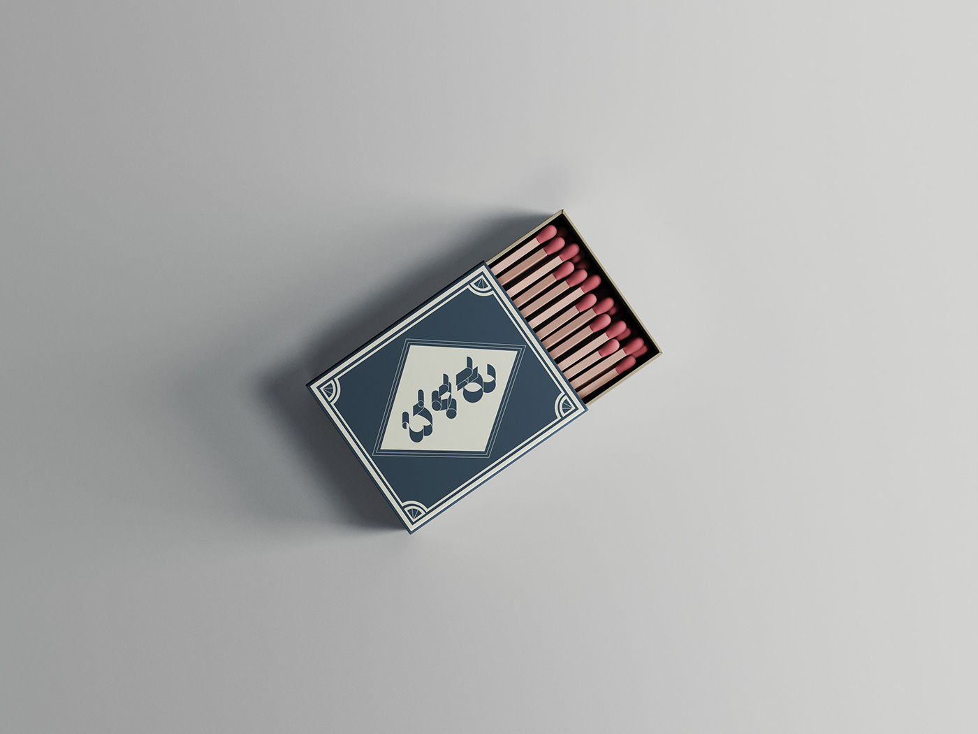
Matchbox mockup

Vinyl record mockup


Process creation of typeface
Thank You.


