
Untile has been developing digital products since 2009 under the name NQDA. In order to show a new vision and its strong internal culture to the market, the company sought to develop not only a visual identity, but also a new concept and a totally different vision for the brand, more representative of its values.
Based on this, a new 360º vision was developed for the entire company. The new identity had as its central focus the unique sense of project development, whether through the technical side or in the human sphere. It is as a reflection of this that Untile emerges. An integral part of a greater whole.
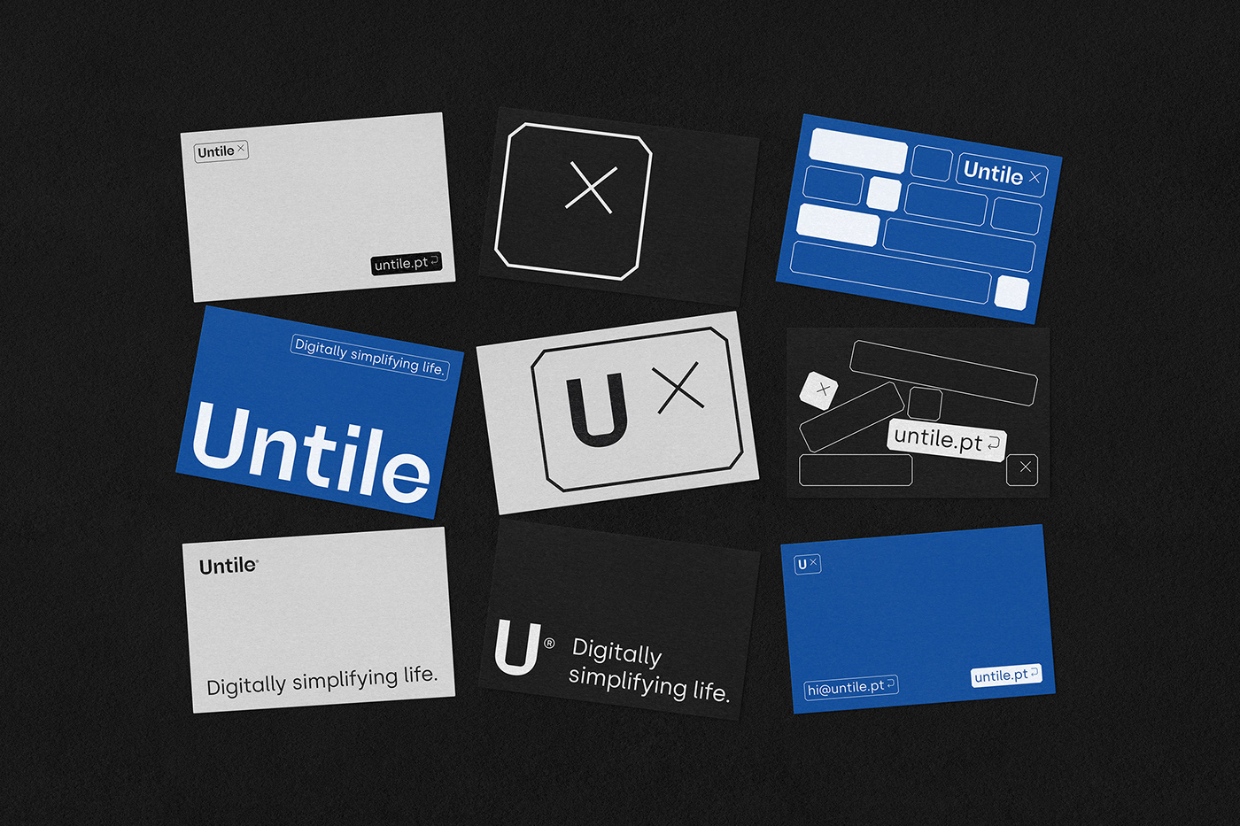
In this sense, it was our purpose to build an identity that would have a double visual interpretation and that would wander between a more strict image, associated with more technical areas, and a more dynamic one, markedly more visual. Always respecting the idea of puzzle/tile, where the singular builds the image of the whole. Basically, the identity suffers from a dichotomy between the main version of the logo, which is more urgent and direct, and the second versions, more tailored to the unfolding of the visual pieces.
The result is a shifting identity that represents Untile's strengthened positioning, embodying the city's legacy that underpins the brand. Thus, we create an image that deconstructs the tile/grid and adapts its dimensions and different elements to the technical and visual context.


Art Direction Another Collective
Design Bruno Soares / Eduardo Rodrigues
Design Bruno Soares / Eduardo Rodrigues
Copy Ricardo Barbosa / Pedro Tavares / Rúben Moreira
Photography Álvaro Martino / Adalberto Duarte
Client Untile®
Year 2021

