


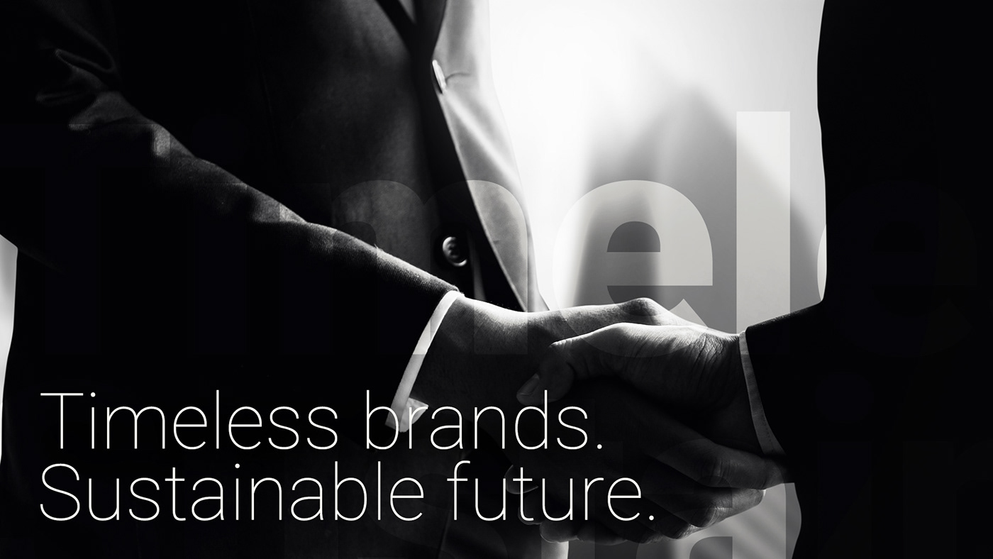
Timeless brands,
sustainable future.
Crane & Turtle Co. is a young and contemporary creative agency whose focus is on creating and supporting young brands from Japan and worldwide. Centering around the three keywords: "Creative," "IT," and "Global," Crane & Turtle Co. aims to provide a complete solution for young brands to establish and expand their businesses toward a larger audience.
まだ若い株式会社クレインアンドタートルはクリエイティブなアプローチで日本国内に限らず、世界中の若いビジネス及びそのブランドの開発・サポートに専念している。3つのキーワードである「クリエイティブ」「IT」「グローバル」を自社のビジネスの軸に、クレインアンドタートルはまだ若いブランドにそのビジネスをより多くの顧客に届けるよう、総合的かつ完全的なソリューションを提供している。

Dynamics, trust,
and modernity.
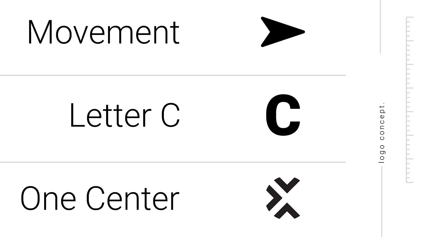
Being a young creative agency, the logo for Crane & Turtle Co. must present the brand's dynamic movements, while building a bold, yet modern image. Combining with the three keywords from the company's philosophy, the company's name and the images behind them, we chose to employ the symbol of a forward arrow as the brand's logo.
クレインアンドタートルのロゴは会社のダイナミックス、大胆さ、そして現代性を表さなければならない。また、会社の理念に用いた三つのキーワード、会社名、そしてそれらに関連するイメージから、本プロジェクトでは我々は矢のアイコンを使用し、ブランドのロゴを作成した。


Blue,
The ocean and the sky.
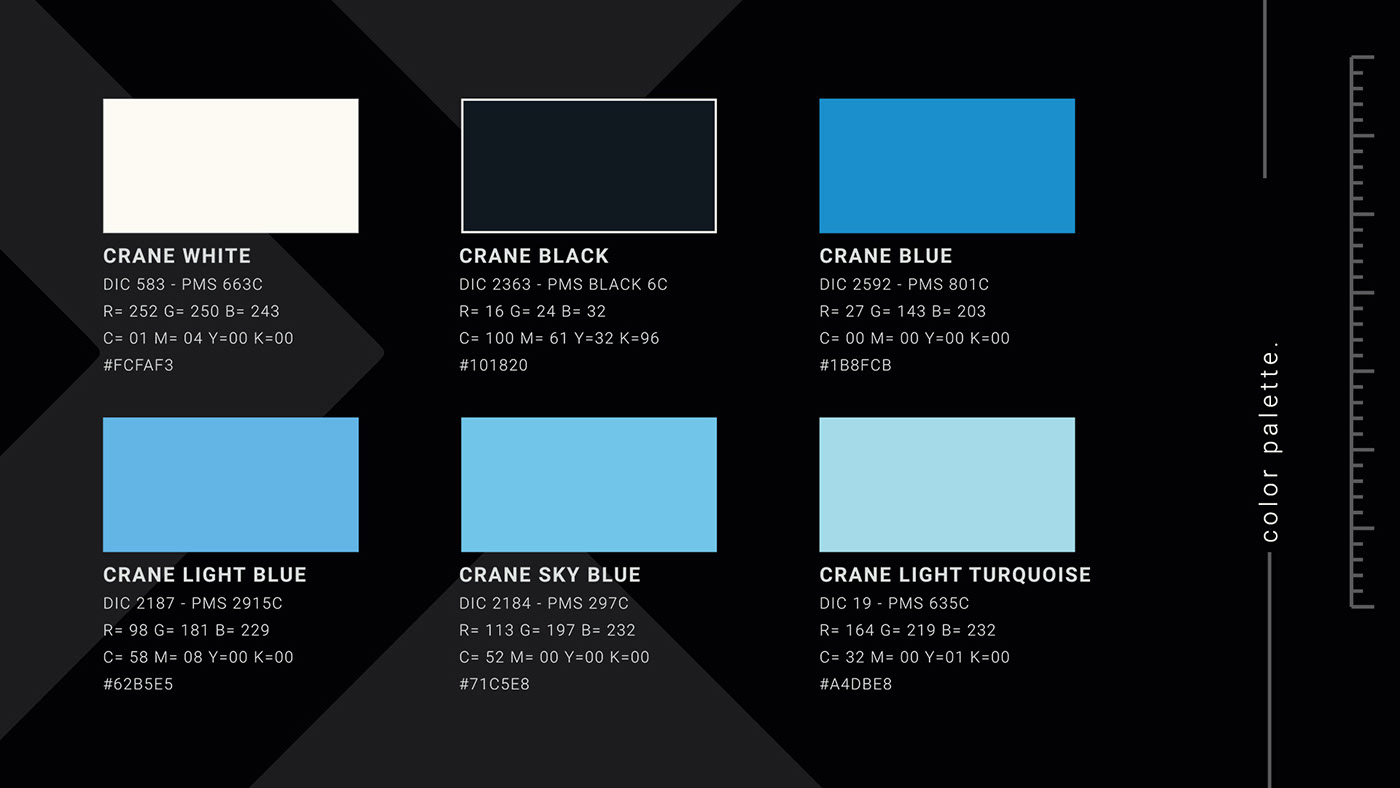
Inspired by both the color of the sky and the color of the ocean, or the natural habitats of cranes and turtles, we chose different shades of blue as the primary color spectrum for Crane & Turtle Co. In addition to staying true to the brand's name, these shades of blue create confidence and trust for our partners, while the lighter shades give off a youthful, energetic feeling.
鶴及び亀の生態環境であるそら及び海洋からインスピレーションをもらい、クレインアンドタートルの標準配色として青色を選んだ。この配色の選定はブランド名を大切にする他、青色は信頼性も作り出せるため、自社のパートナーとの繋がりを一段と強く結べる。また、明るい色の選定により、若さ、そして大胆さのイメージも作り出せる。
Classic,
with a modern touch.
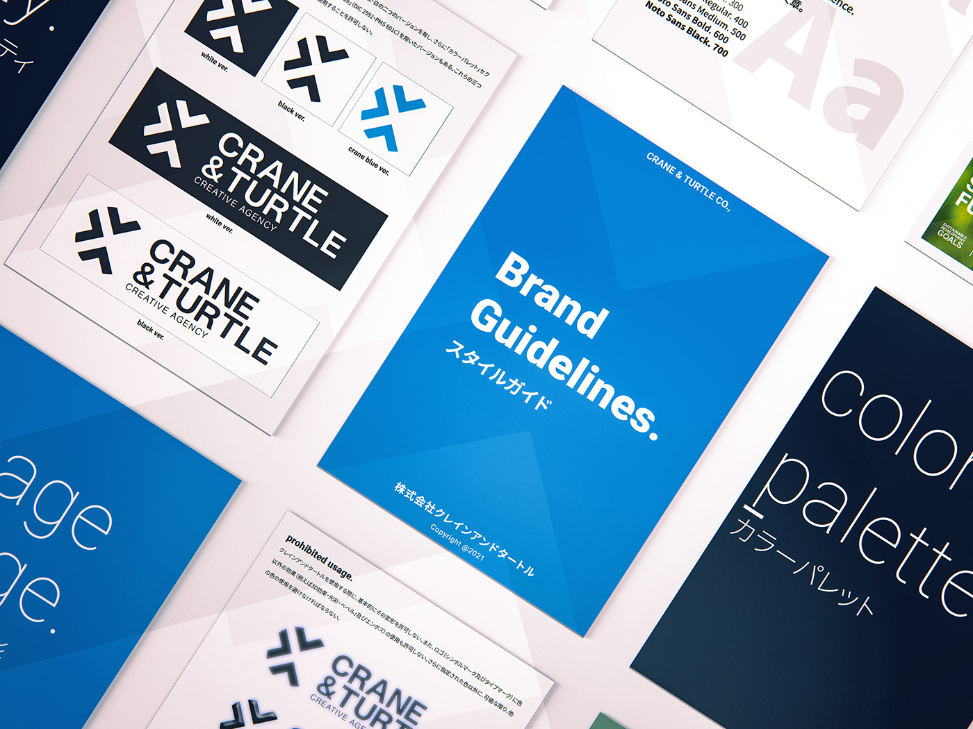
Following the brand's image, we chose the font "Roboto" as well as the Roboto Condensed and Roboto Slab font families as the brand's primary fonts. For the Japanese typeface, we chose the Noto Sans JP to match Robot's weight and modernity.
ブランドのイメージを基に、我々は会社の基本フォントとして「Roboto」及び「Robot Condensed」「Roboto Slab」を選んだ。また、「Roboto」のイメージマッチさせるために、我々は日本語フォントである「Noto Sans JP」をブランドの基本日本語フォントとして選んだ。


Crane & Turtle Co., Rebranding Project
Creative Director: 前田慶介
Lead Designer: Nhat Minh Ly (LNM Production)
Animation & Motion Design: Nhat Minh Ly (LNM Production)
-
Project Manager: 中村早季
ⓒ Crane & Turtle Co., Ltd. All Rights Reserved.


