Recently, cases of casual information visualization (Stasko et al., 2007) have become increasingly common in public places such as physical bookstores, museums, art galleries (Stefanie Posavec recently made a gallery of phisical installations on visualizing.org). In these situations you can find examples of digital signage installations but also physical, and since the public they serve is very heterogeneous, access to information is structured in an immersive and engaging manner, rather than an analytical and professional one.
Within this context took place our research, with the aim of exploring the different modes of interaction and storytelling used.
- Presence of data visualization;
- Usability in a physical space.
- Usability in a physical space.
The research made has led to a final heterogeneous collection of samples, consisting of cases of different nature ( virtual / real , interactive / static ) useful in defining an overview of the issue data visualization / exhibition although not representative of the totality of existing cases.
The analysis of the case studies for obvious reasons could not be based on the effective interaction with the installations, but through the study of the material provided by the authors (video, reports, descriptions) and retrieved from the web.
The first step of the analysis was the definition of a categorization based on existing taxonomies in this field, together with original aspects referring to these specific installations.
As a result, we have built a matrix to cross and group the selected cases in order to discover connections and relationships between the various categories, interpret recurrent patterns or highlight shortcomings.
All the results have been represented in the following visualizations.
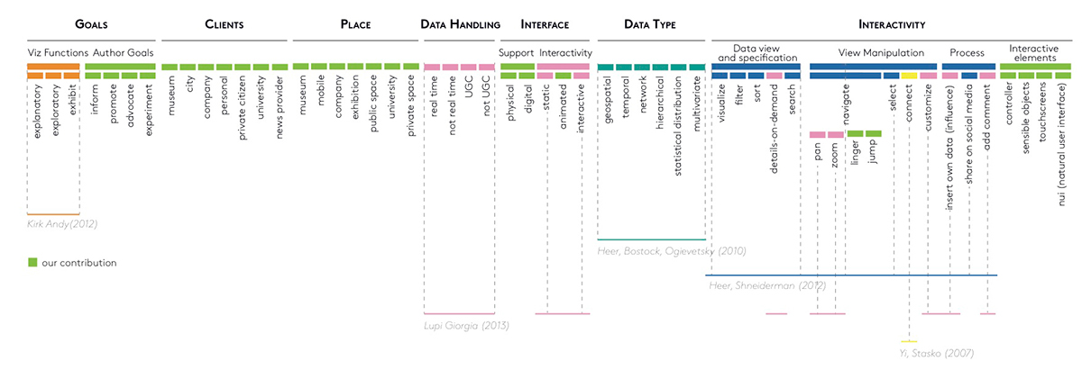
Taxonomy used to analize case studies
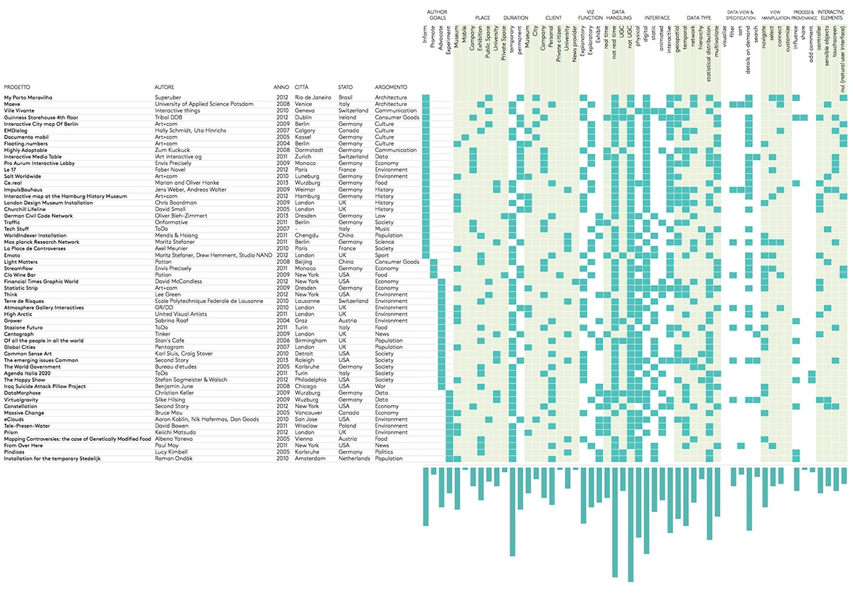
Matrix filled with case studies and their analysis
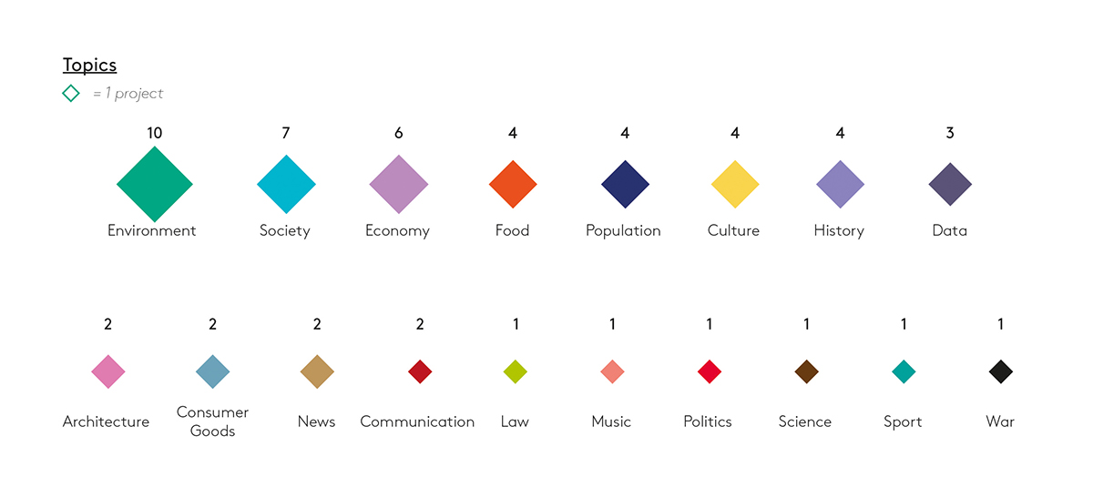
Topics color-coded
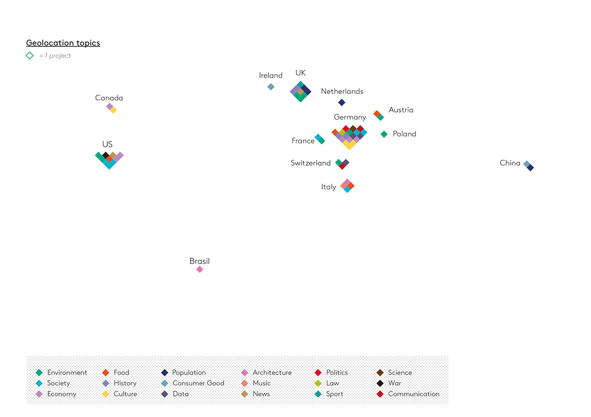
Projects localized on a map, and color-coded by topic

Matrix of places where installations took place and topic they dealt with.
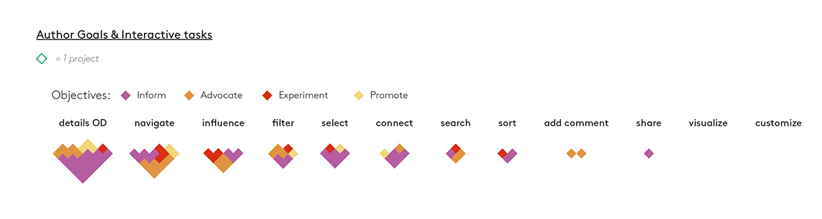
Grouping of projects by interactive task and author objective
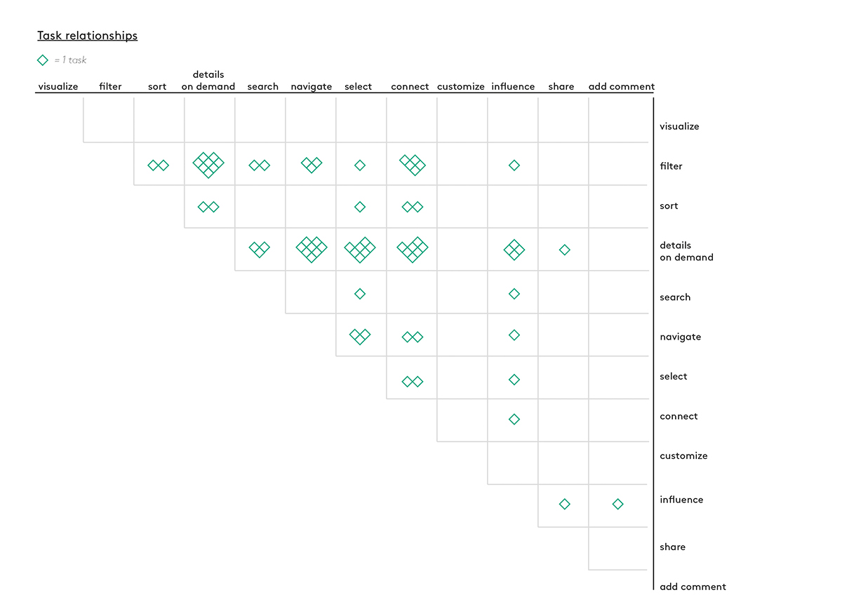
Matrix that shows the frequency of combination of tasks
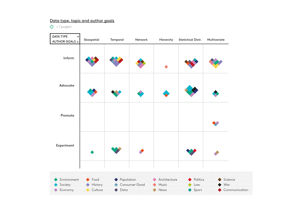
Relationships between data type and author goals, color-coded by topic
Authors:
Marco Bernardi
Stefania Guerra

