Packaging design: Barbara Design
CGI artist: Daniel Quaresma
Client: Gocase
Gocase is an extremely young, lively and intense brand that, in 2021, decided to expand its horizons and intensify its operations in physical stores. For this, they entrusted me with the mission of developing the packaging that would help to market their cases for cell phones.
The biggest challenge of the project was to design a packaging from scratch that could involve its products and embrace all its varieties of categories.
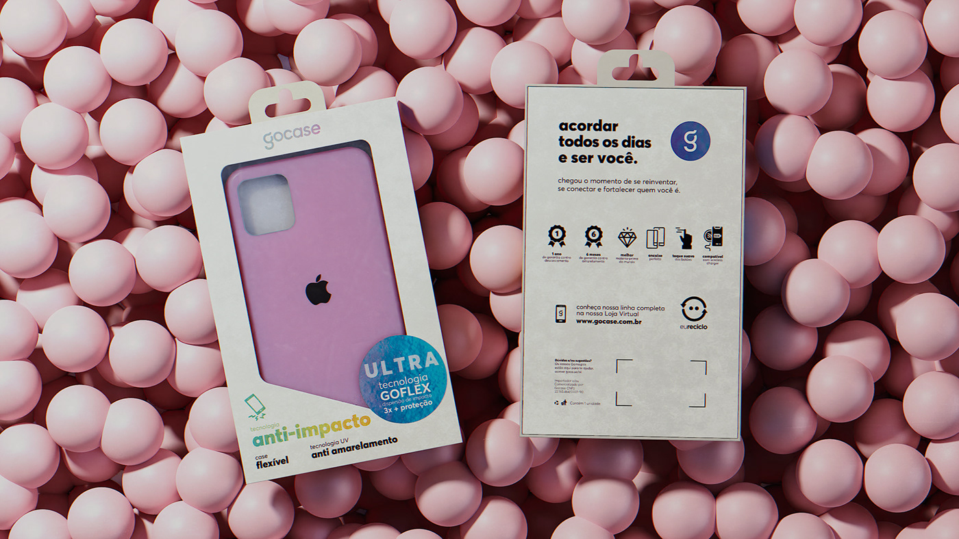
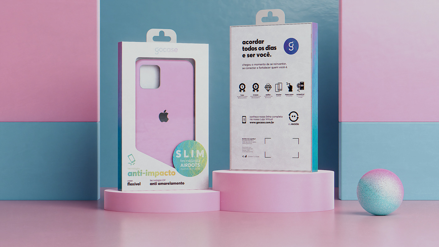
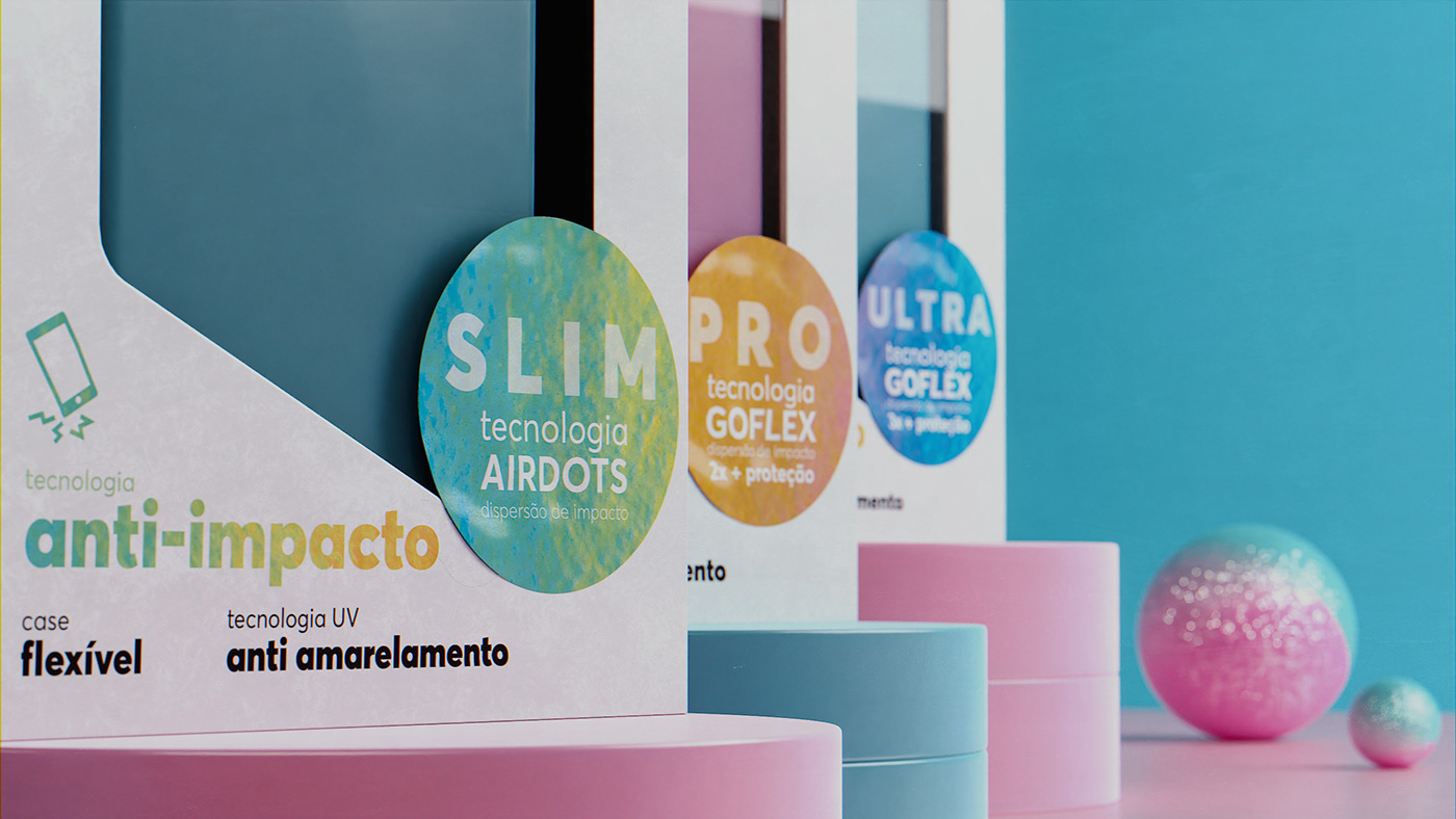
Today Gocase works with covers for Android phones and iOs, and among this division, there are options that intensify the protection of the device, being named as the lines: Slim, Pro and Ultra.
The biggest challenge of the project was to design a packaging from scratch that could involve its products and embrace all its varieties of categories.
Today Gocase works with covers for Android phones and iOs, and among this division, there are options that intensify the protection of the device, being named as the lines: Slim, Pro and Ultra.
A Gocase é uma marca extremamente jovem, viva e intensa que, em 2021, decidiu expandir seus horizontes e intensificar sua atuação nas lojas físicas. Para isso, eles me confiaram a missão de desenvolver as embalagens que iriam ajudar a comercializar seus cases para celulares.
O maior desafio do projeto foi desenhar do zero uma embalagem que pudesse envolver seus produtos e abraçar todas as suas variedades de categorias.
A Gocase trabalha hoje com capas para celulares Android e iOs, e dentre essa divisão, existem opções que intensificam a proteção do aparelho, sendo nomeadas como as linhas: Slim, Pro e Ultra.


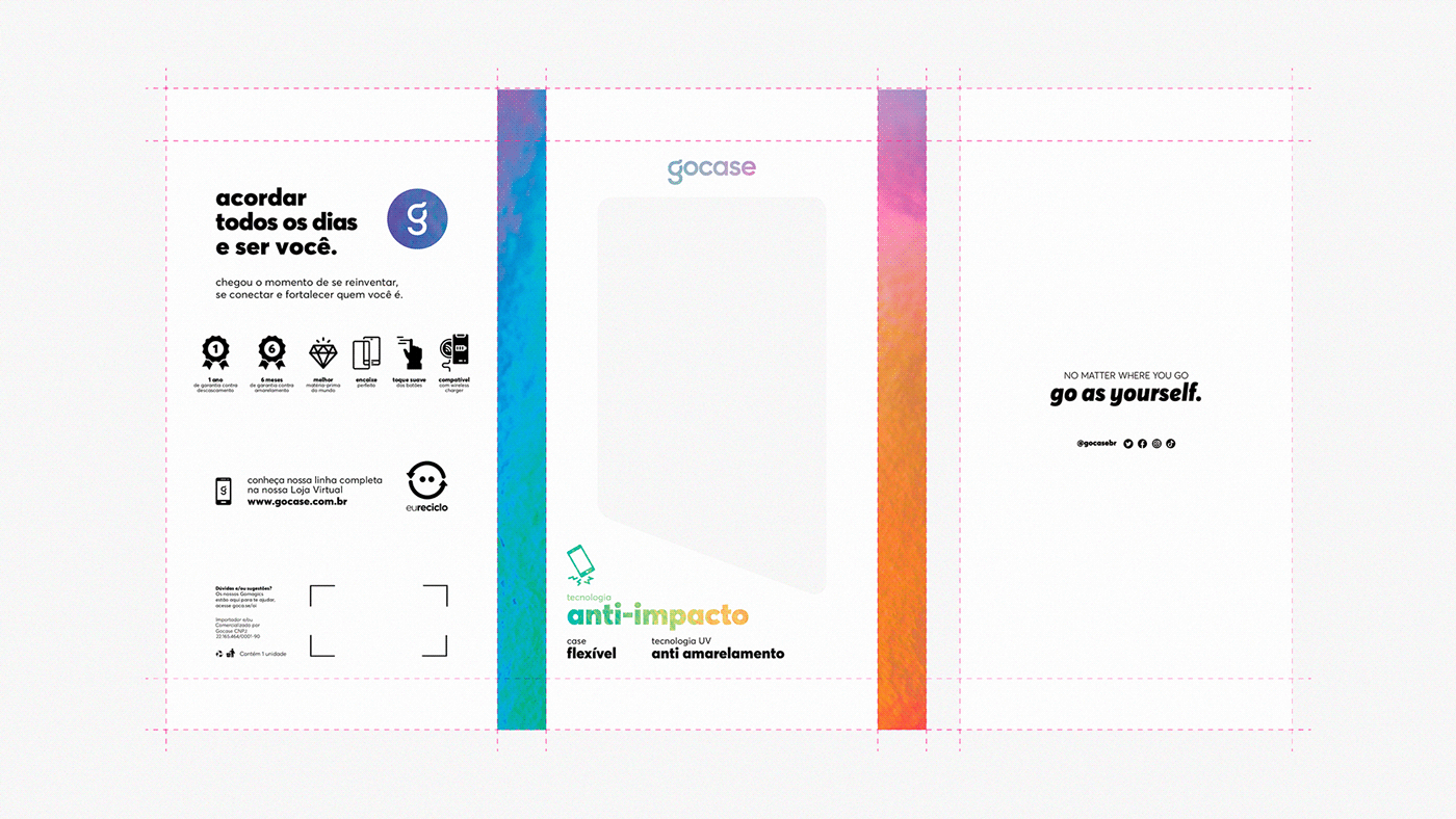
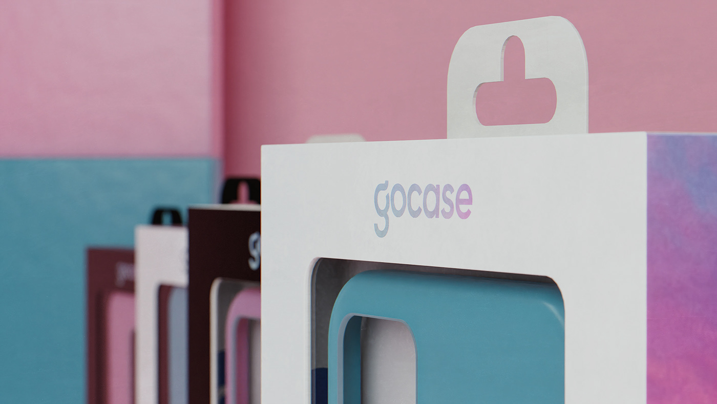
The project started with the design of an exclusive knife that had a window in a special format, to show the product in the foreground and, during the development, we noticed that we would need to optimize the cost of identifying the lines, since printing a model cash flow for each category would be above the available budget. Therefore, we decided to produce informative stickers that could show the consumer what the exact category of product he had purchased and its benefits.
O projeto começou com o desenho de uma faca exclusiva que contava com uma janela em um formato especial, para mostrar o produto em primeiro plano e, no decorrer do desenvolvimento, notamos que precisaríamos otimizar o custo da identificação das linhas, visto que imprimir um modelo de caixa para cada categoria ficaria acima do budget disponível. Sendo assim, decidimos produzir adesivos informativos que pudessem mostrar ao consumidor qual a exata categoria de produto ele tinha adquirido e seus benefícios.
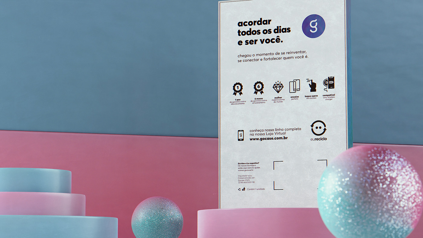


Thinking about the balance between the color, so present in the brand, and the clean aesthetic that would be necessary for the highlight in the POS, we arrived at the validation of the idea of using holographic lamination as the main finish, being applied only in some information and on the sides of the box, and finally, the packaging would use only black and white to fulfill the role of elegance and minimalism so sought after.
Pensando no equilíbrio entre o colorido, tão presente na marca, e a estética clean que seria necessária para o destaque no PDV, chegamos na validação da ideia de usar laminação holográfica como acabamento principal, sendo aplicado apenas em algumas informações e nas laterais da caixinha, e por fim, as embalagens iriam utilizar apenas do preto e branco para cumprir o papel da elegância e do minimalismo tão buscado.