


We went the extra mile to improve our in-app experience & redesign the post order experience for our customers. This is the story about how it all unfurled and how it came to fruition.
---
The Dunzo app has had a fair share of changes in its UI/UX over the course of the past few years, and we’ve always tried to improve the experience of our customers on the product. One thing that we have observed is how there is a sense of uneasiness the customers feel after an order has been placed.
“Has the partner been assigned?”
“Has she/he picked up the items?”
“Why is there a delay?”
“Should I give the partner a call?”
Let’s be honest, it’s always a better experience when customers know what is happening with their delivery, and it is pretty much standard for a delivery app to do so these days. But they are still eagerly waiting for an update, and are constantly tracking their order.
Delighting users is in our DNA, so we began to wonder if there was something we could do to humanise this interaction; is there a way to improve this?
We realised that there is a certain sense of coldness in the way most products behaved and spoke to their customers. Yes, it inherently did a good job of getting around the chores, and communicating with the user about what is happening, but by no means does it inspire empathy from customers.
Here’s a proposition
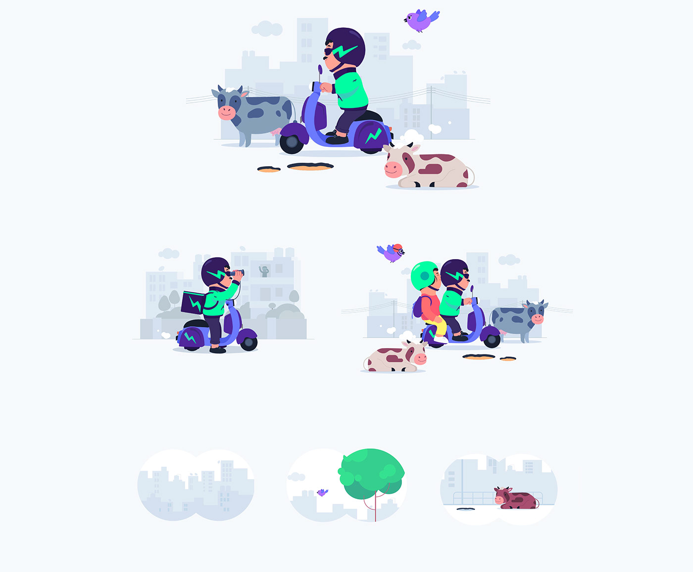
When you live in one of the most populated countries in the world, it carries with it a number of uncertainties like traffic, cows that block the road to long waiting lines. It is not easy to be a delivery partner in India and we wanted to make the experience of using Dunzo more human and relatable.
We wanted to make sure that our customers are not worried about their order and there was a pleasant way to update them about the status of their delivery.
It was an interesting proposition, but we had to find a shovel and dig deep for a solution.
Your epiphany is getting packed
It didn’t take long for us to conclude that we had to redesign the order tracking flow on the app.

The earlier version of this felt more like a template and hence did not add any warmth.

But giving it a facelift would not solve the issue at hand, it needed to be interesting and relatable; moreover, it had to resolve the anxiousness the user faced and yet maintained a transparent line of communication and updates for the user.
Dunzo has built a warm connection with the customers on social media, and we thought about how we can translate that to our product. The answer lay in the cute chubby fingers of Dunya & Harri; our mascots.
The Duniversal Solution
We are a multi-faceted app, and we realised that our primary mascots Dunya & Harri who were our Delivery Partners could only represent a part of our community, which also included Merchants & Customers.
Last year, we expanded our universe and included mascots to represent our customers and merchants, along with our partners- and so Duniverse was born!

#VarietyMakesUs has been a running theme for us, and we’ve tried to imbibe this in spirit when we set out to create the Duniverse. Each of these characters had a personality of their own, was distinct from another, and broke some of the stereotypes that we often choose to ignore.

And so when the discussion to add warmth to our product narrowed, we knew that it was time to induct our characters into the app.
. . .
How to put ‘Desi’ in Design
While we had a good plan in motion, it felt like there was something missing in the mix. Something that made it relatable, amusing and added a bit of quirk to the whole project. So we decided to dip the project in a secret sauce — ‘Indian-ness’.
If you are trying to be relatable to an Indian audience, you have to speak their language; or in this case their body-language.
For instance, let’s take a look at the point where the customer is waiting for the store to accept the order:

We find Shelfali talking on the phone, and then she looks up and shows the hand gesture we have seen a million times in our lives- “Give me one minute…”

Or how she puts the pencil behind her ear after checking the list of items, while the store is packing the order.
It was the little things; a head-nod here, a familiar hand gesture there; it made all the difference. It felt like we were interacting with these lovely & amicable characters we have met in our own lives.
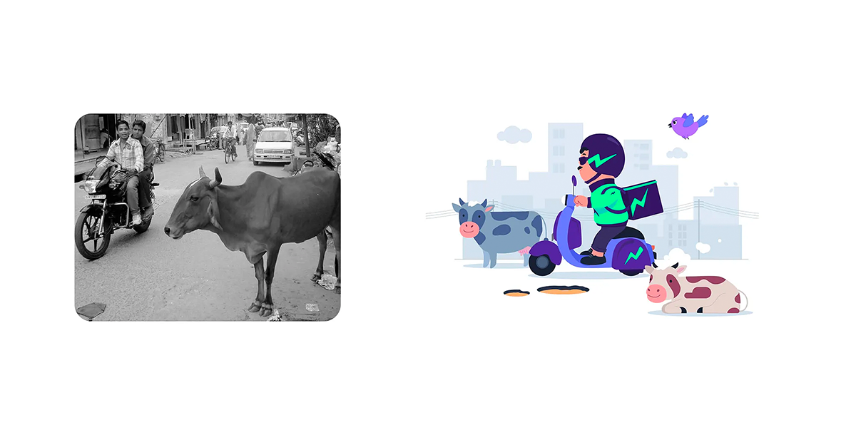
It also inspired us to add additional characters like the cows that blocked the path, and potholes on the road that Harri & Dunya had to dodge along the way.
But the subtle icing on the cake was adding the blue bird into the animation. At first, it was just another layer to create some depth in the animation, but then we started playing with the idea- what if this bird was in constant competition with Dunya & Harri?
So if you observe closely, you would notice that the first time the bird appears is when we are looking for a partner to assign the order; from then on, it races with the partner, and even waits with them as the store is preparing the order.
The bird gets uber-competitive and wears a goggle & a helmet to help them go faster and beat the partner in the race.
Oh, the bird even tries to confuse the partner and send them the wrong way just to win the race.
. . .
You want Indian-ness, eh? Copy That!
When you walk the walk, you’ve got to talk the talk.
It wasn’t enough that the app had visual narratives that were doused in Indian-ness,
we also wanted it to talk the way Indians do.
How many times have we heard someone tell us that things are in ‘tip-top condition’ or that it is going ‘first-class’? If you’re Indian, you could almost imagine the hand gesture when someone is saying this; and we felt that using these slangs would complete the experience.

But it wasn’t an easy task either, because we had to write communication that would be understood by someone who lives in Jaipur and Chennai alike- so it couldn’t be something that is too colloquial.
“Please keep it simple to understand, yaar”
We agreed, “Don’t take tension. We are putting it!”.
(PS: Although, a colloquial copy would definitely be the next step to improve the experience)
Order flow
Animations


Cute as they come
When we created Duniverse, we wanted to make sure that the style of illustration that we chose would be unbearably cute and adorable. Their body proportions are not life-like, and intentionally so; the head slightly bigger, a stub of a nose and their tiny hands that make you go, ‘Awwww’.
Design Elements


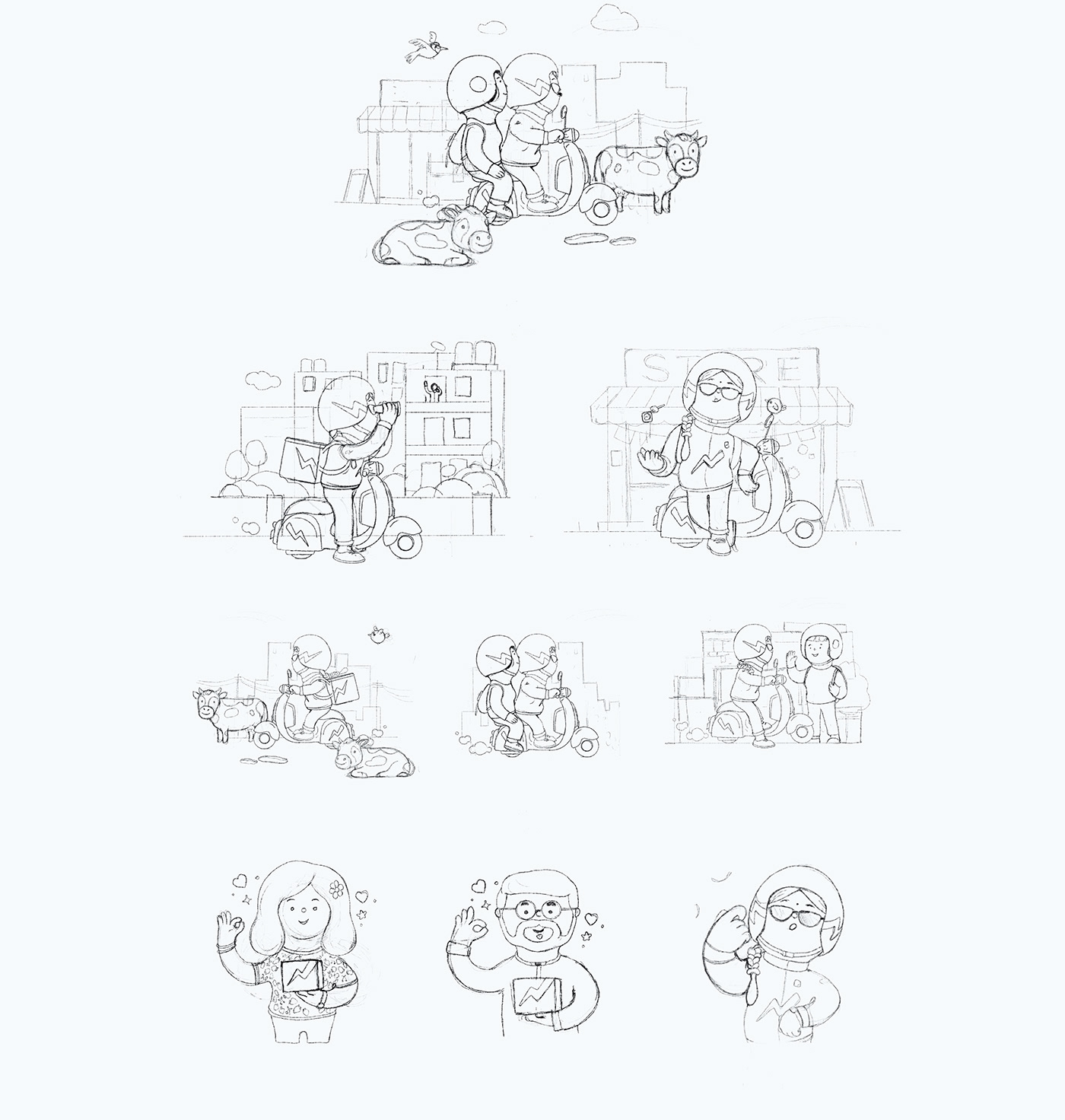
The obvious task at hand was to create 2D versions of these characters without taking away from their cuteness.
When we began creating Dunniverse, we had created the characters in 3D and adopting that style to the product was going to be difficult. We knew that it would make the app heavy and slow things down for our customers.
So we called in our illustrators and gave them the brief to recreate these characters into 2D, followed by a skeleton of the different states involved for each category when an order is placed.
Progression

A whole Lottie love
We’ve had multiple discussions about moving to Lottie animations on the product for a while, but this project was the perfect reason to make the switch.
Animations were much smoother and the file sizes could be optimised as per the requirement, and it made a big difference overall aesthetic and functioning of the app.

Once we had the storyline and the sketches in place, the team started building the flow, and there was no turning back. The files were light and animations were seamless; it almost felt like you could hear the sax section on George Micheal’s Careless Whisper when you watch the animations.
We rolled out this project in phases, with only 50% of the users getting access to this update. Apart from rigorous testing that happened over the course of the project, we took feedback from our user groups and made adjustments to ensure the final release was impeccable.
Gyan we tell you something interesting?
The central thought behind reimagining the Order Tracking experience was to give the customer reassurance that her/his order was in progress and ease them off any qualms they had about their delivery.
While we did solve this in the process of this project, we asked ourselves, how can we engage our customers better?
So we decided to create a small pocket of information that would appear along with order tracking, a section called: By the way

This section had a set of cards that would show tidbits of information varying from useful life-hacks that would come in handy, some of the amusing orders Dunzo has done over the years, and some very interesting trivia about Dunzo that no one knows about; until now.
. . .
So what did our customers think of the latest update?

Empathy in the time of automation
It goes without saying that not every delivery goes as smooth as the brand would want it, but we are always trying to reduce friction in the process. What we fail to understand is that our delivery partners are the point of contact for our customers. From the app crashing, to delay in delivery due to traffic, the partner might face the brunt of it all; and perhaps a cold transactional message on the app doesn’t do justice to diffuse the situation.
What we hope to do is create an environment that adds a touch of Humanness to every stage of the delivery, from the point the order is placed, until it is Dun.
---


