


KUMA OKASHI
www.facebook.com/kumaokashitw
__
Branding Design across 10 years
The branding revamp is to celebrate the 15th anniversary of Kuma Okashi ─ a traditional Japanese biscuit store. This is the second re-branding in the past 15 years. The first one, which was implemented 10 years ago, generated a 20% increase in revenue.
Until this year, with the simultaneous expansion of the baking line, the second re-branding design brings an approximately 100% increase in yearly revenue. Clients are pleased by the new look of the brand and more willing to order the biscuits as festival gifts.


Design Challenges
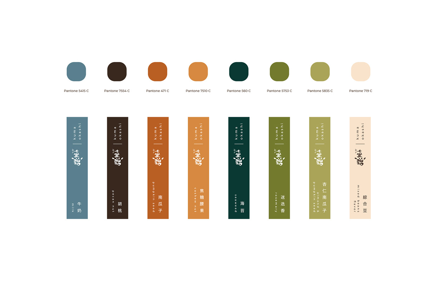
With the increase in sales, new demands for design appeared. As the biscuits are often bought as gifts, a gift box design was urgently needed. Also, the increase in daily sales demanded an easier and faster way of packing the biscuits.
The biggest challenge of the overall design is the small scope of the brand. In this case, it's crucial to have limited items but still fit the needs of packaging. To solve these issues there are two solutions, a well-considered plan for the packs and a dual-function gift box. The strategy decreases the space needed for storage, and reduces the cost of the packaging as well.


