

_
Bello: As sweet as chocolate
Font Promotional Poster
_
In this project we had to design a promotional poster for a font of our choice. The design of the poster should illustrate the formal qualities of the type, making reference to his historical context and evoking the essence of
his design.
_
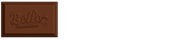
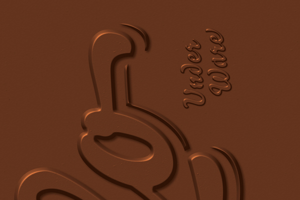
The font family I chose to develop this project was Bello by Underware. After some research, I noticed that Bello is frequently used in food and drink (specially candies) packaging and advertising. This didn't really surprise me. Indeed, Bello looks so sweet and appealing. In my poster design, I wanted to capture this delicious, sweet and desirable side of the type, so I presented it as if it were a chocolate bar, under the slogan “As sweet as chocolate”, but with a contemporary and cool touch, very characteristic of the Underware work.
_
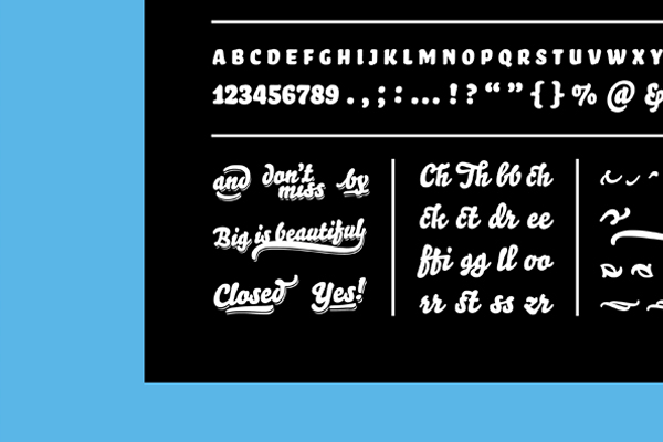
Bello is a brush typeface for headline point sizes – it's big & beautiful! That's why I decided to use, for the small text, Sauna, also by Underware, and considered by them a typographic mate of Bello.


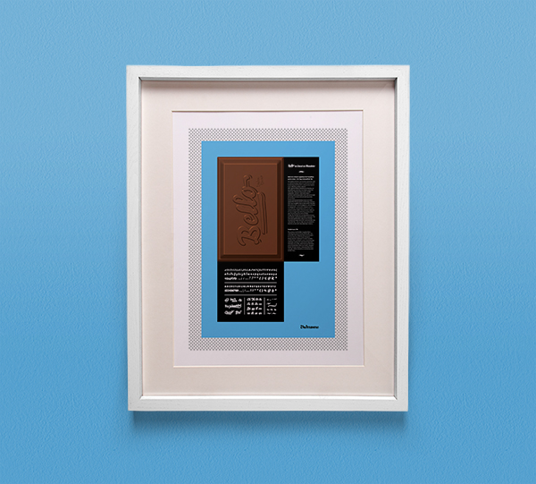

Bello: As sweet as chocolate, 2013
Academic and individual project
Done at ESAD under the orientation of teacher João Martino (Atelier Martino&Jaña)


