ABOUT THE PROJECT
At KOPA, it all begins with a client’s interest: even small print runs here deserve big attention. Every project is accompanied and closely monitored by the printing house, from an inquiry to a result handed over. And that is why we decided to represent this client-first principle through KOPA’s fundamental identity asset - logotype.
DESIGN VALUE
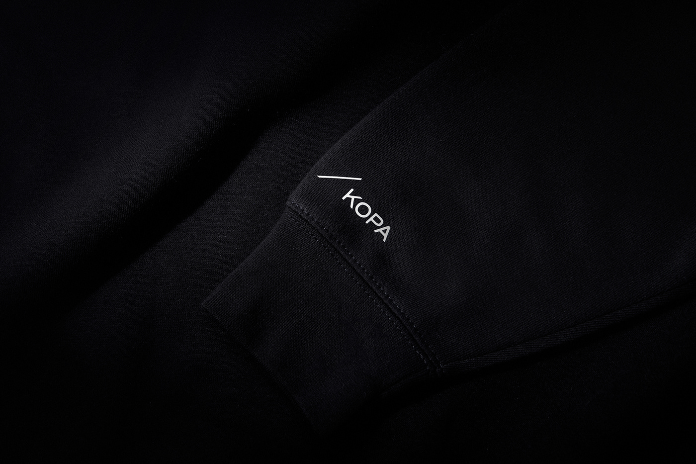
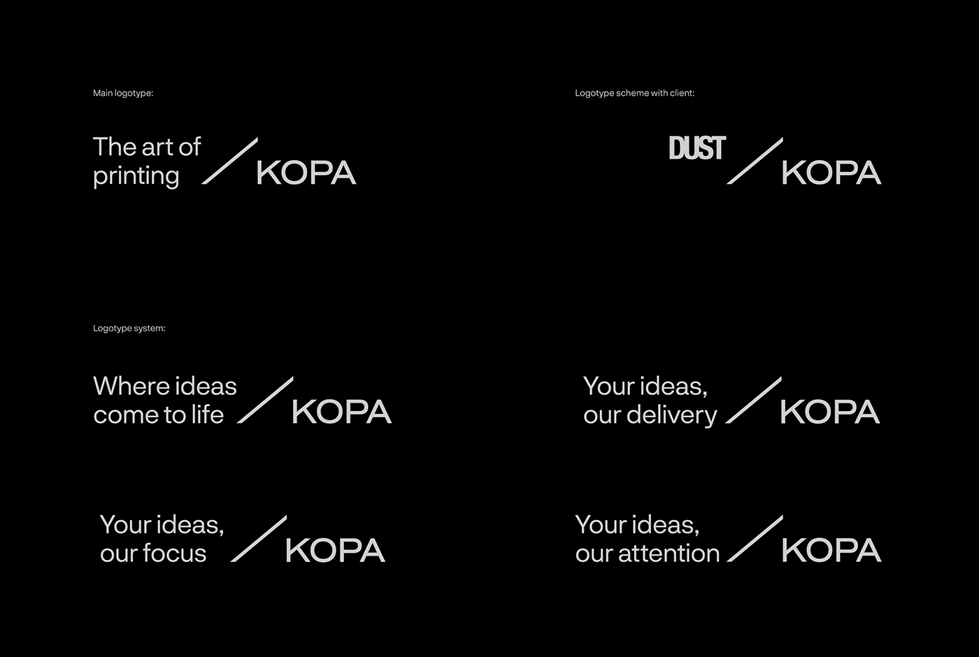
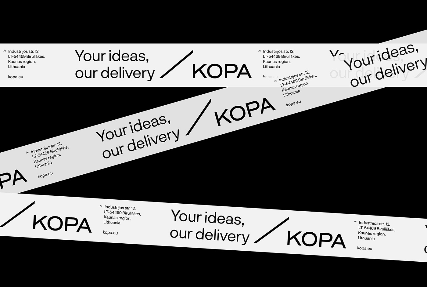
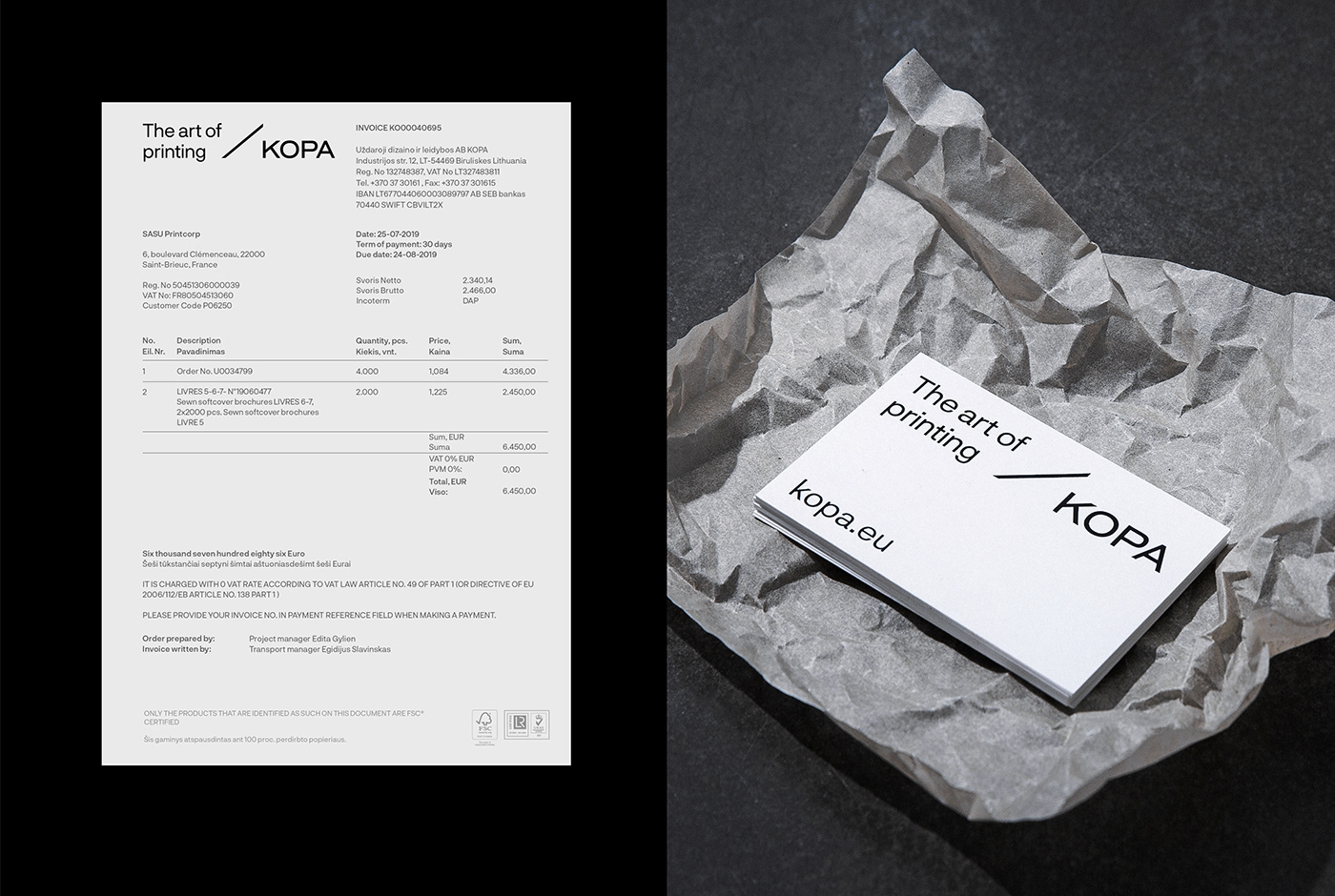
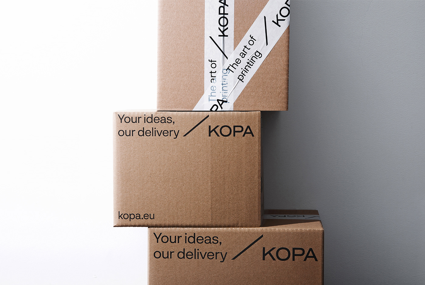
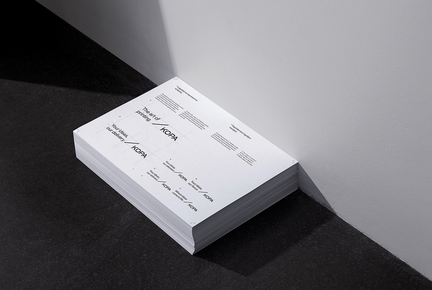
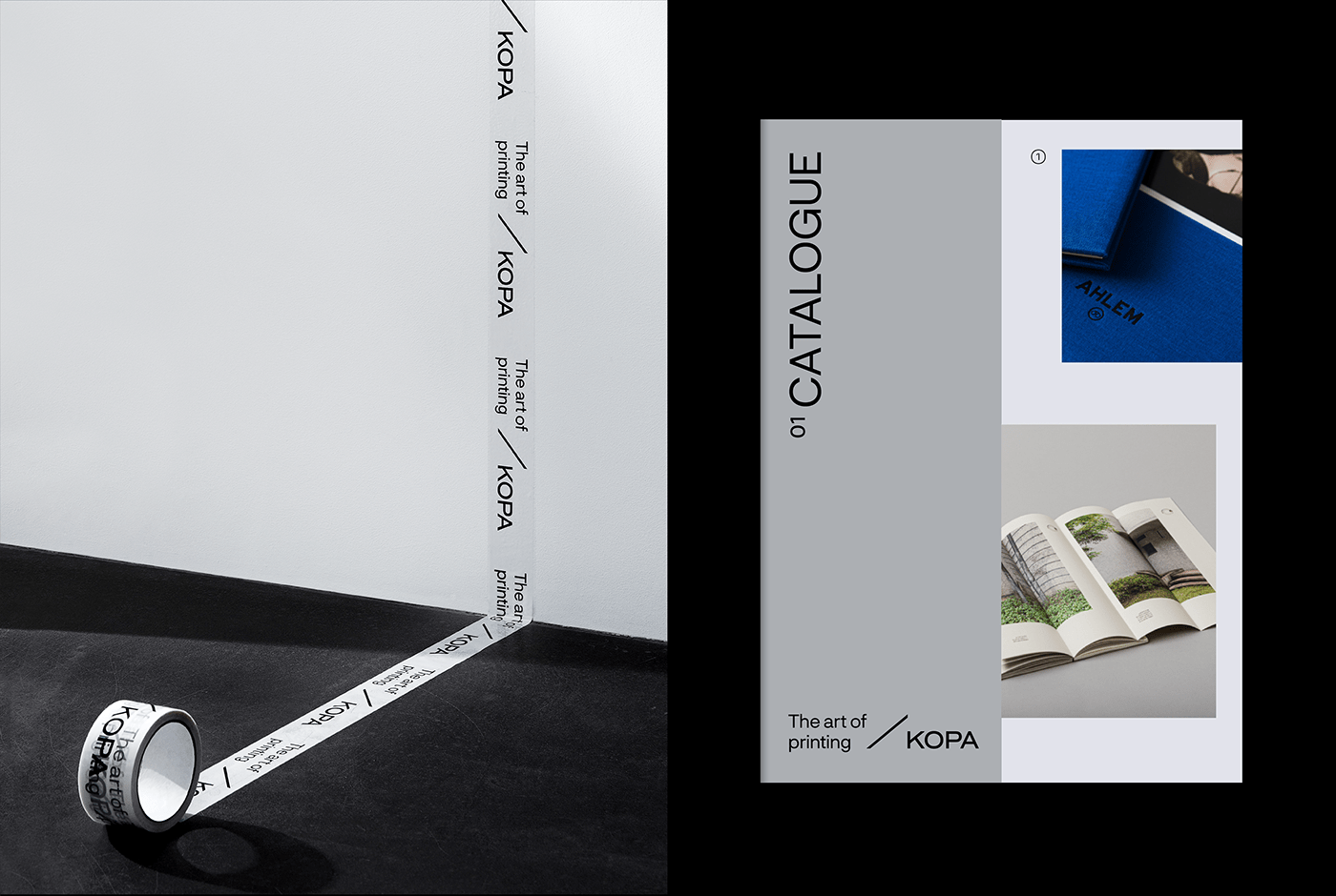
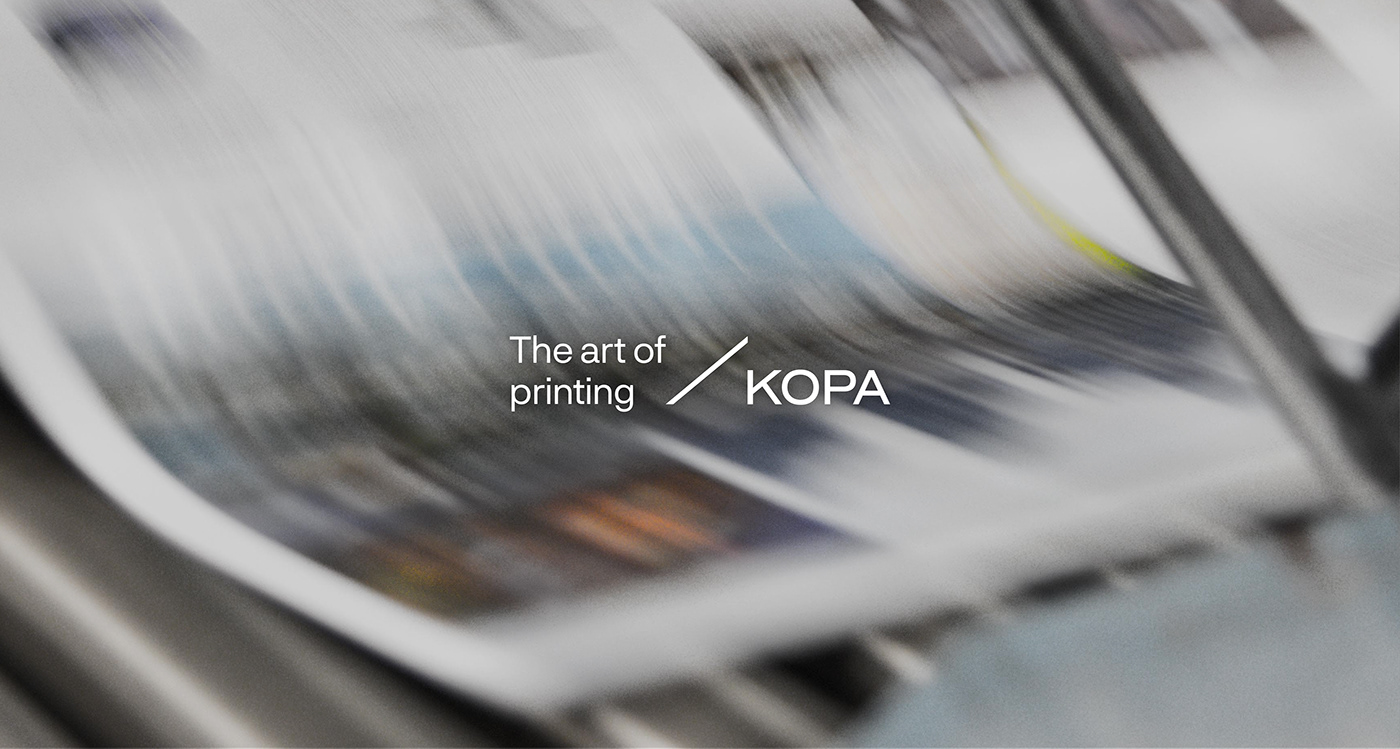
The logo translates into a few meanings. First, it combines a sense of guaranteed quality with an exclusive printing experience that is now modern, digitalised but still holds the ancient traditions of making a print while communicating highly professional service. Hence, the slash is a nowadays printmaking “edition” portraying where the print is done. Additionally, it is a sign of connection between KOPA and a client. The logotype appears to be with the custom-font company’s name aside and a white space remaining on the left. Of course, it is done on purpose - as we read in sequence from the left side, noticing the first word uppermost, KOPA leaves this significant space for their clients, their future ideas, and new collaborations that are equally crucial to both parties. Thus, from the very earliest acquaintance with KOPA, everyone knows that clients are always at the front.
DELIVERABLE: BRANDING SYSTEM / COMMUNICATION DESIGN / STATIONERY DESIGN / PACKAGING DESIGN
-
2021
© &ANDSTUDIO