ADVENTURES IN SIGN PAINTING
Category
Municipality, Real Estate
SERVICES
Custom lettering | Messaging + Narrative | Social media | Production | Photography | Architectural detail | Signage | Social activation | Sign Painting |
A NEW ERA OF HAND PAINTED SIGNAGE
As difficult and uninspiring as 2020 was for everyone, many creatives decided to use the long lonely days of lockdown as a chance to develop their skills. None of us at Traffic Design became a yoga master (well maybe one team member), but we sure did learn a bit of sign painting. This flexible and forgiving technique became a testing ground for many lettering styles, allowing us to freely play with colours, shapes and lettering effects.
Some of the signs were created as a part of our long-term collaboration with The City of Gdynia, focusing on elevating the aesthetic quality of the city’s public spaces. Others were commissioned by a building owner, who was concerned with the overall look of their property.

MAGIEL / LINEN PRESS
For the municipality project, we asked the citizens of Gdynia via social media to volunteer and vote on the shops that needed an instant makeover. Amongst many beloved places mentioned in the comments, we chose a linen press shop located in one of the backstreets — an old school establishment in dire need of a sign. We designed a somewhat traditional, serif letter in blue & white to match the soothing smell of fresh laundry coming from the mangle, with a board size and shape to suit the architecture.


MIĘSNY / BUTCHERS & PIEKARNIA * CUKIERNIA / BAKERY * PASTRY SHOP
The final sign painting project of 2020 consisted of two boards located on the same facade. The property owner’s request was to improve the overall aesthetic of the building, so we set on creating two achromatic designs. The distinguishing feature is the highly stylised lettering: juicy, heavy-weight design for the butcher’s, and a dainty, elegant lettering spelling out — BAKERY * PASTRY SHOP —.


OGRODNICZY / GARDENING SUPPLIES & FIRANY / CURTAINS
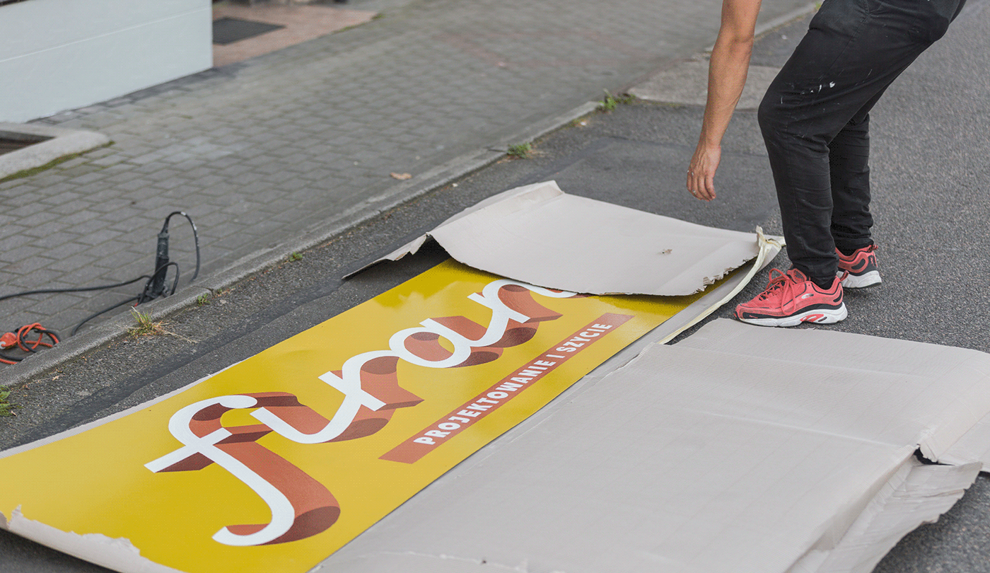
While scouting the city for more places to transform we spotted two shops along one of the city’s main arteries — a gardening store and a lace curtain design & repair business. The former inspired us to experiment with a contemporary lettering style, combining upper and lower case into one word, complimented by a funky illustration. The latter was designed to elevate the atmosphere of true craftsmanship, drawing inspiration from retro Italian signage.


