
KEY VILLAGE
naming, branding & web
-
Proposal for a sports centre specialized in tennis lessons.
Key Village is the key point for each athlete that wants to stand out in their own discipline. Athletes preparations in the village are "key players", players who stand out for their technical skills and their preparation . The key term can easily be used with the intent to indicate the No. 1, the one who comes before the other in a given area. It is this reading with which the village wants to stress and propose itself to the market: the ability to be key point in the athletic progress of its customers. Finally, the "key" is a tool to achieve something, of which before you knew only the existence and he was never able to hold the keys. The choice to use an english term is again dictated by the international vision of the center, as well as the necessity to use a term with a sound easy and pleasant. Finally, the term " key" is combined with the word " village": on the one hand to increase the attractiveness for families in order to increase the attendance of the center (on Sundays in the pool, on Saturday night at the restaurant, dad interested in the gym after work, the mother to the spa to relax, etc.), the other with the intent to emphasize the great offer proposed by the center that is not "just" a tennis center .
_
_
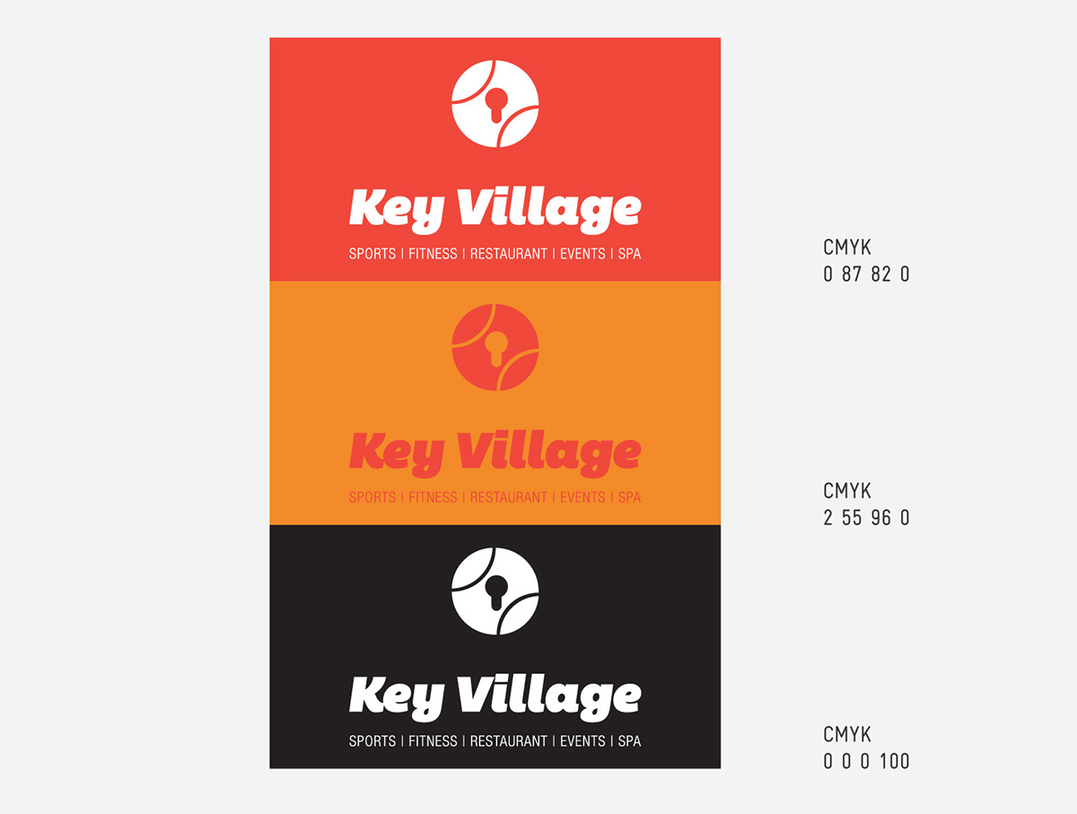
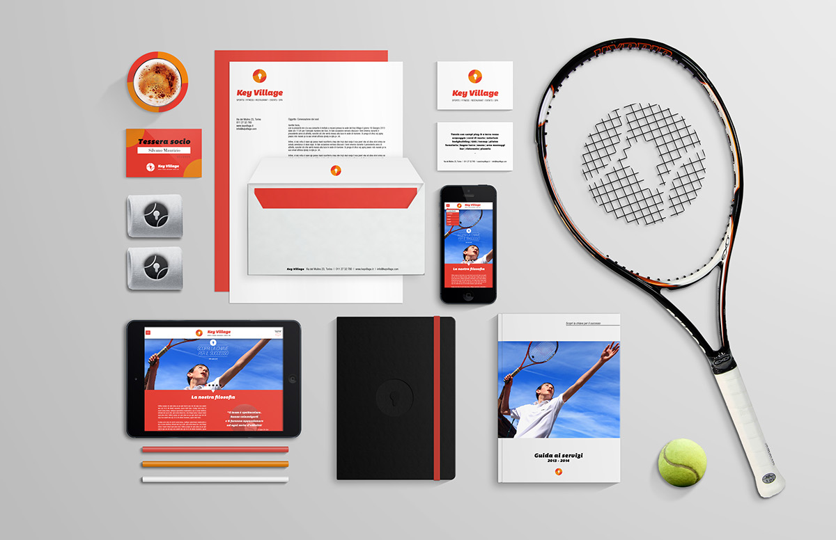
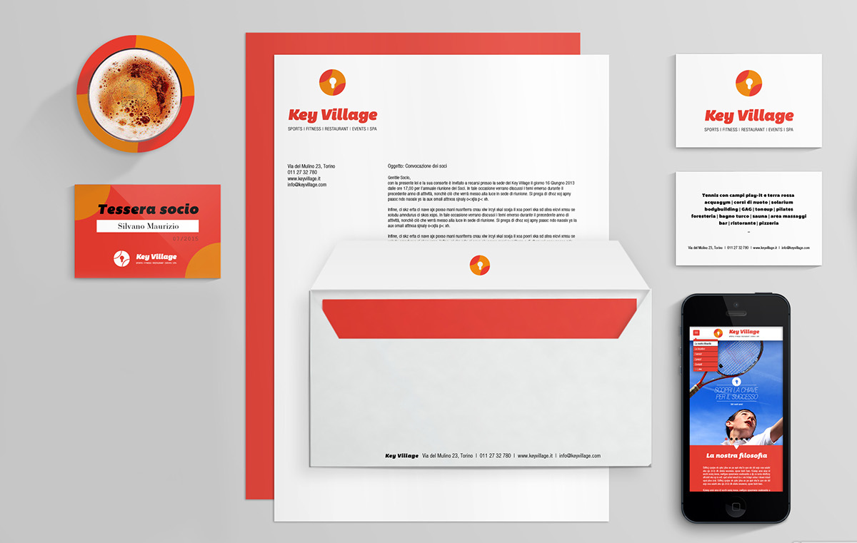
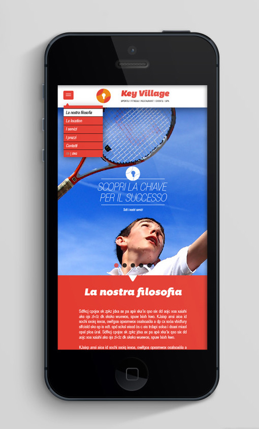
For these reasons, the image transmitted by the logo has a modern and friendly look. The font, with its full-bodied look, is enhanced by the roundness of the descendants. The logo embodies the image of a tennis ball, with his typical subdivision of space, and that of a modern lock, indicating that the key is the village. A possible payoff, although not required, is used later in the webpage and coordinated image, is formulated as follows: Key Village - Scopri la chiave per il successo ("Key Village - Discover the key for success."). Both the logotype that the wordmark can be used, in a disconnected manner according to the needs of the applications.
_
Finally, the colorimetric choices are a red section, energetic and full of vitality, and an orange that recalls the tennis courts.


Thanks for watching! Hit like if you appreciate my work ^_^


