


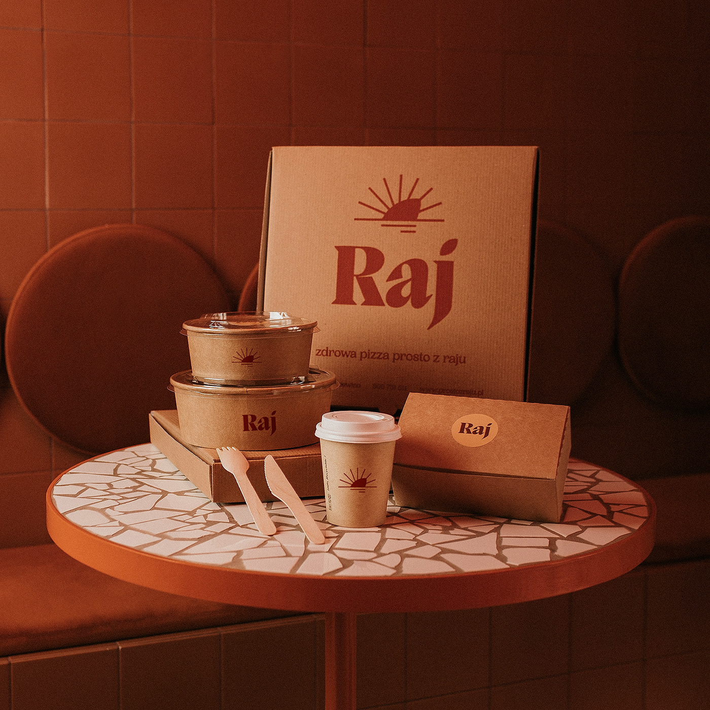
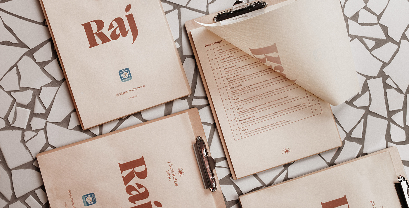
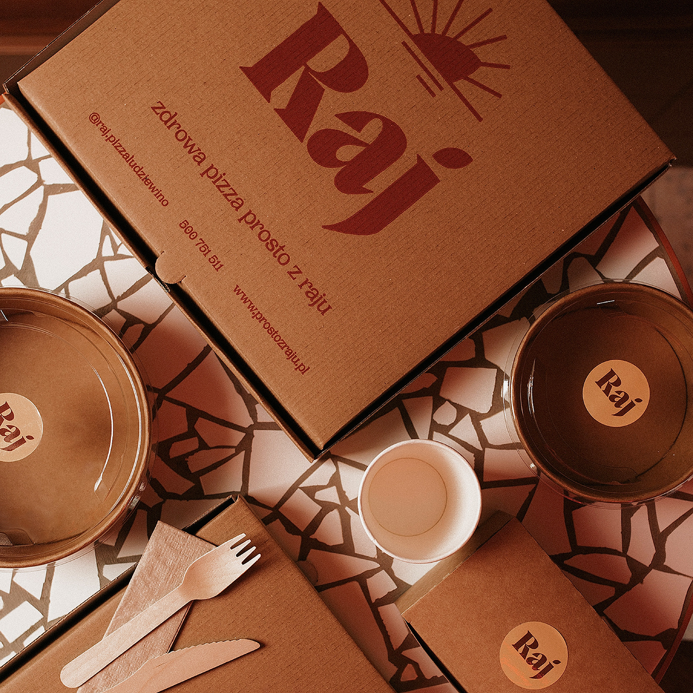
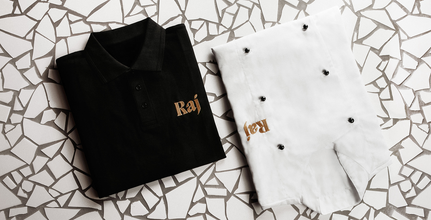
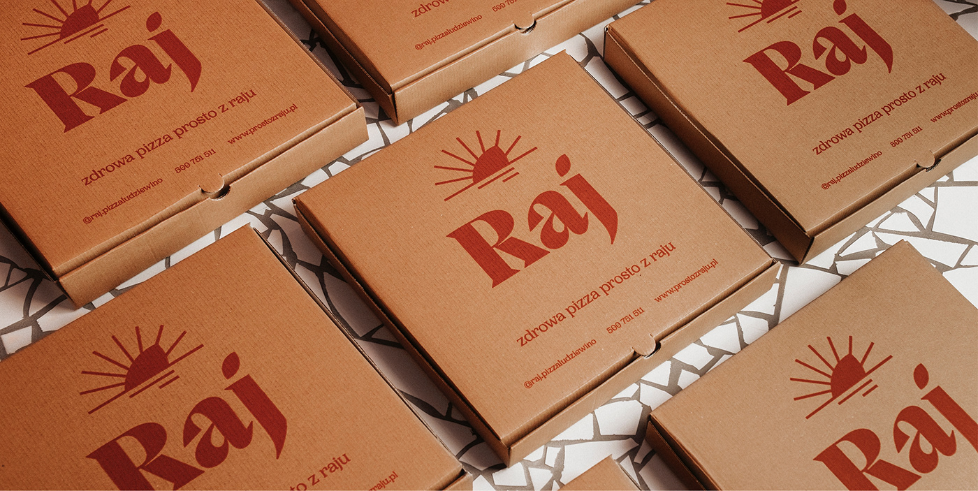
I was invited to collaborate on the project Raj pizza ludzie wino (eng. Paradise pizza people wine) by designers from 74STUDIO. We knew that we were dealing with something new and unusual - certified, gluten-free cuisine that needed an interesting entourage. The name Raj (eng. Paradise) at first glance doesn't sound as something that could be associated with food, but it sounds light, heavenly, warm and holiday-like, just like the vegan and gluten-free food offered by the restaurant. The idea for the graphic identification design came to me very easily after looking at the interior design proposed by the studio. This effectively showed me the direction I chose so that the visual identification was consistent with the colours used in the cozy and warm interior of the premises. The dominant feature of this place is handicraft. Each and every form, apart from wooden stools, was handmade by local metalworkers, carpenters and artists. This is why I aimed for the logo design to be easy to use. The logo was used in the interior as a handle for the entrance door and as an element connecting the table legs. To show respect for the style of a historic tenement house in the city center where the restaurant is located only a typography has been applied above the entrance. The color of the identification was also chosen specifically to be in sync with the natural raw materials used in the interior, such as brick, clay, wood or copper.


ART DIRECTION / GRAPHIC DESIGN
INTERIOR DESIGN
INTERIOR PHOTOGRAPHY
PRODUCT PHOTOGRAPHY
AGATA GLIŃSKA / AIO AGENCY
© DARIUSZ JABŁOŃSKI 2021


