The Mikulik Project is an original project of a personal trainer.
She is a passionate of healthy and active lifestyle, taking care of herself both physically and spiritually. She has a very passionate approach to her life, trying to infect others with her energy.
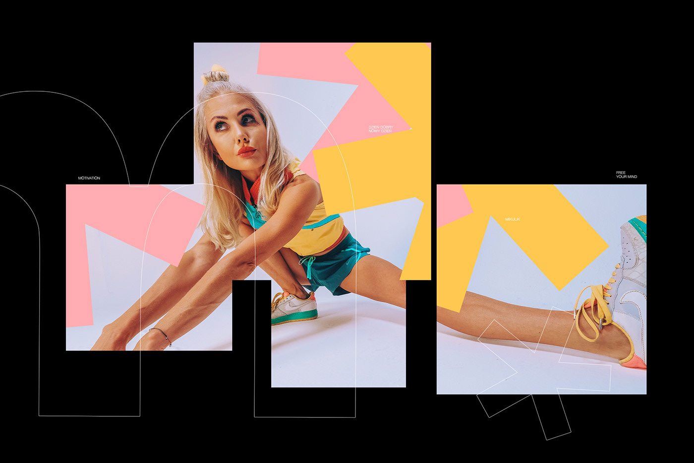
Her form of movement allows her to do things related to acrobatics and gymnastics, which is regularly shown in her photos.
Her activity became an inspiration to create a coherent identification, based on an element known from her life.
Year: 2020


The logotype was created by combining two elements. A star that reflects her frequent gymnastic poses during training, as well as an arrow that expresses movement. This is a person who is committed to constant activity, helping different women with their body problems.
The arrow symbolizes activity and motivation to act. The combination of two elements allowed for the creation of a logotype resembling a person performing acrobatics.


It is called Mikulik, which is the name of a personal trainer. The name is rare enough to create a crowd of fans known as Mikuliks (no, not Minions).
The stars are a stable element in building visual identification, creating various geometric forms, encouraging even more activity and the desire to be healthy.