


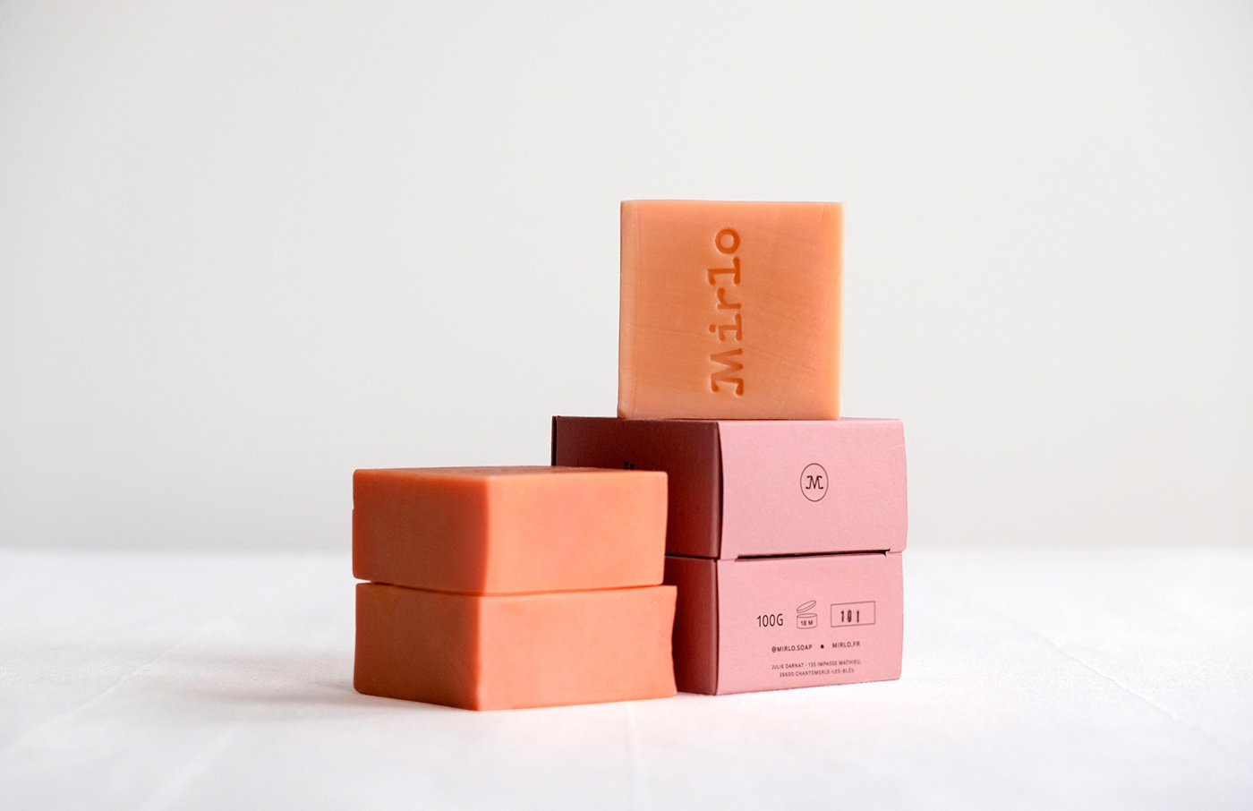
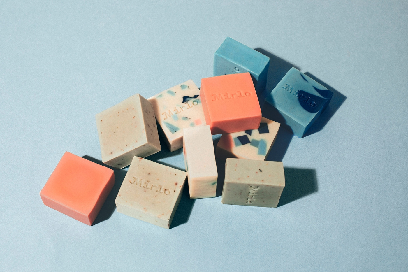
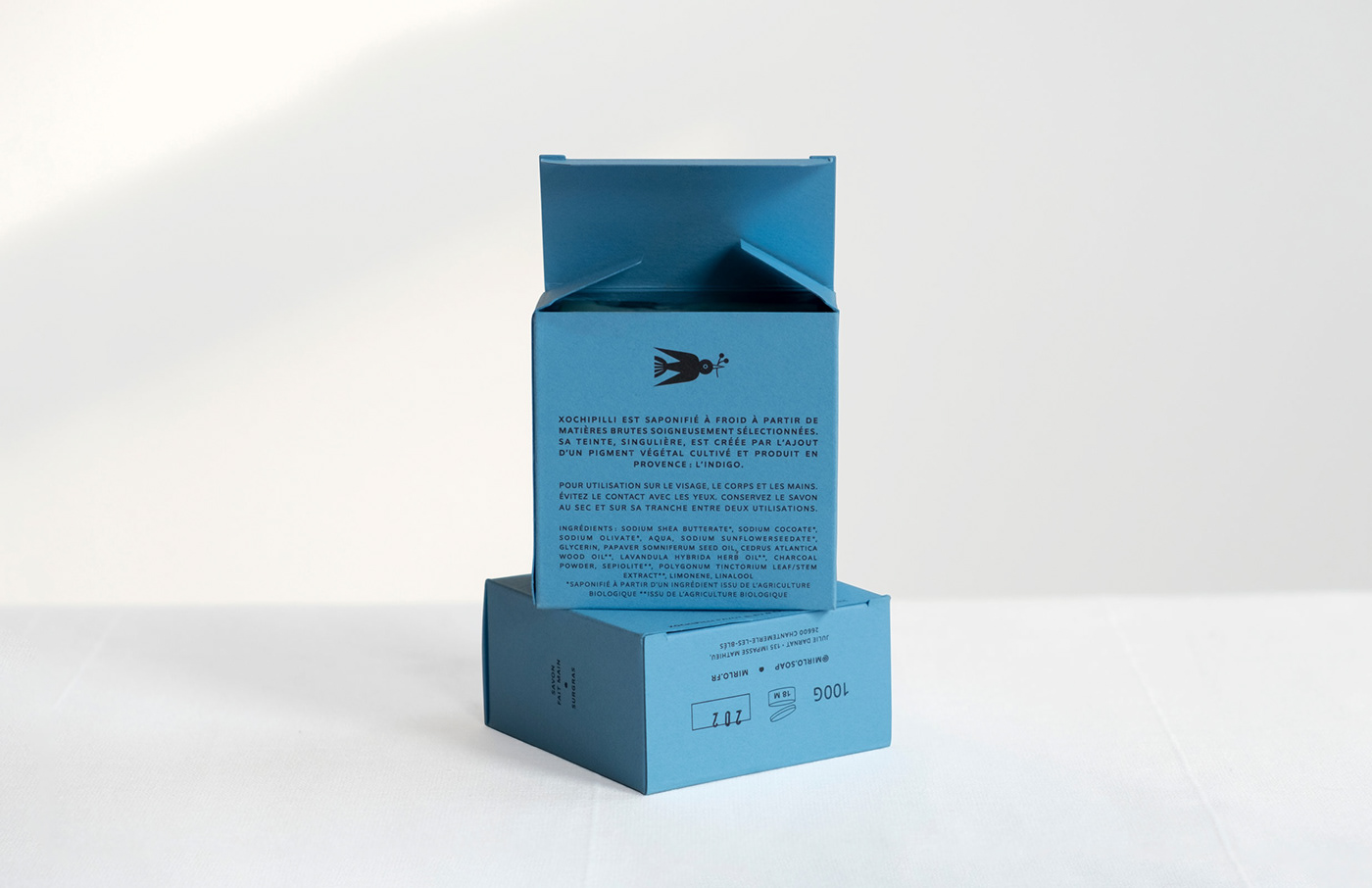
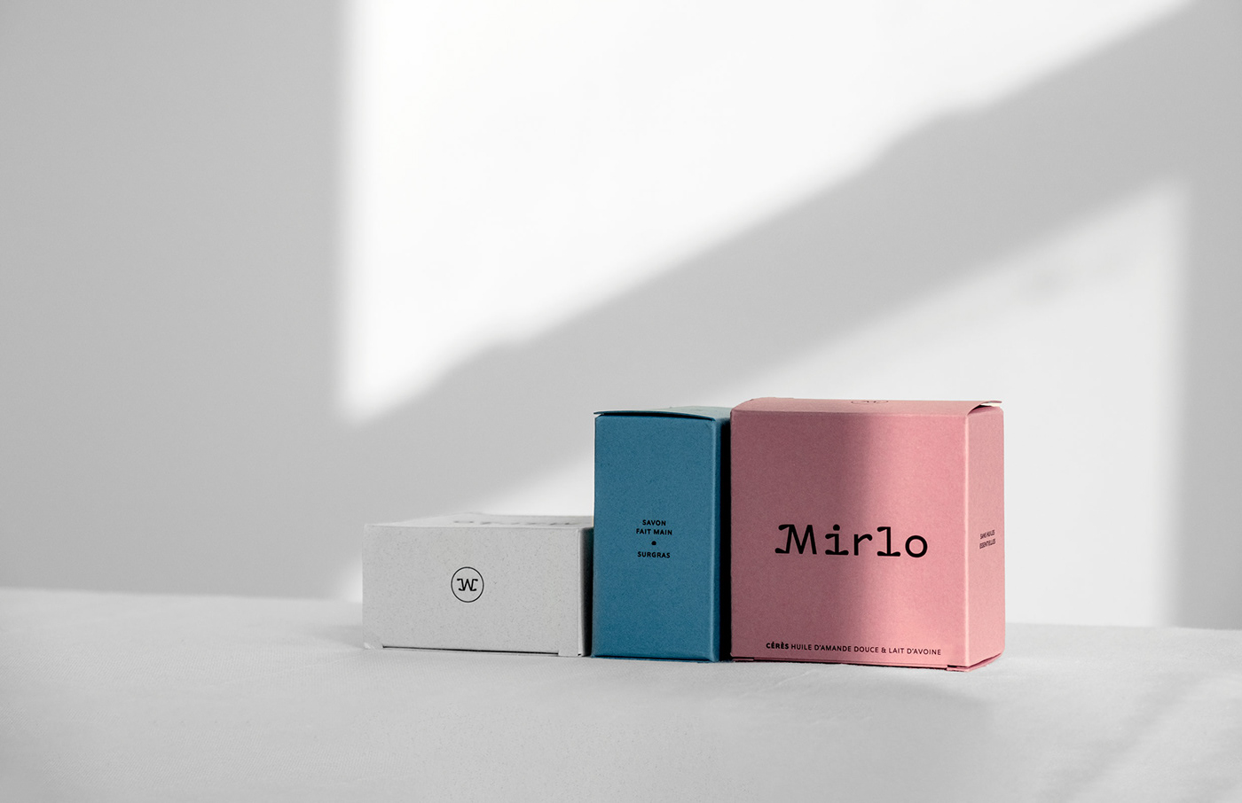
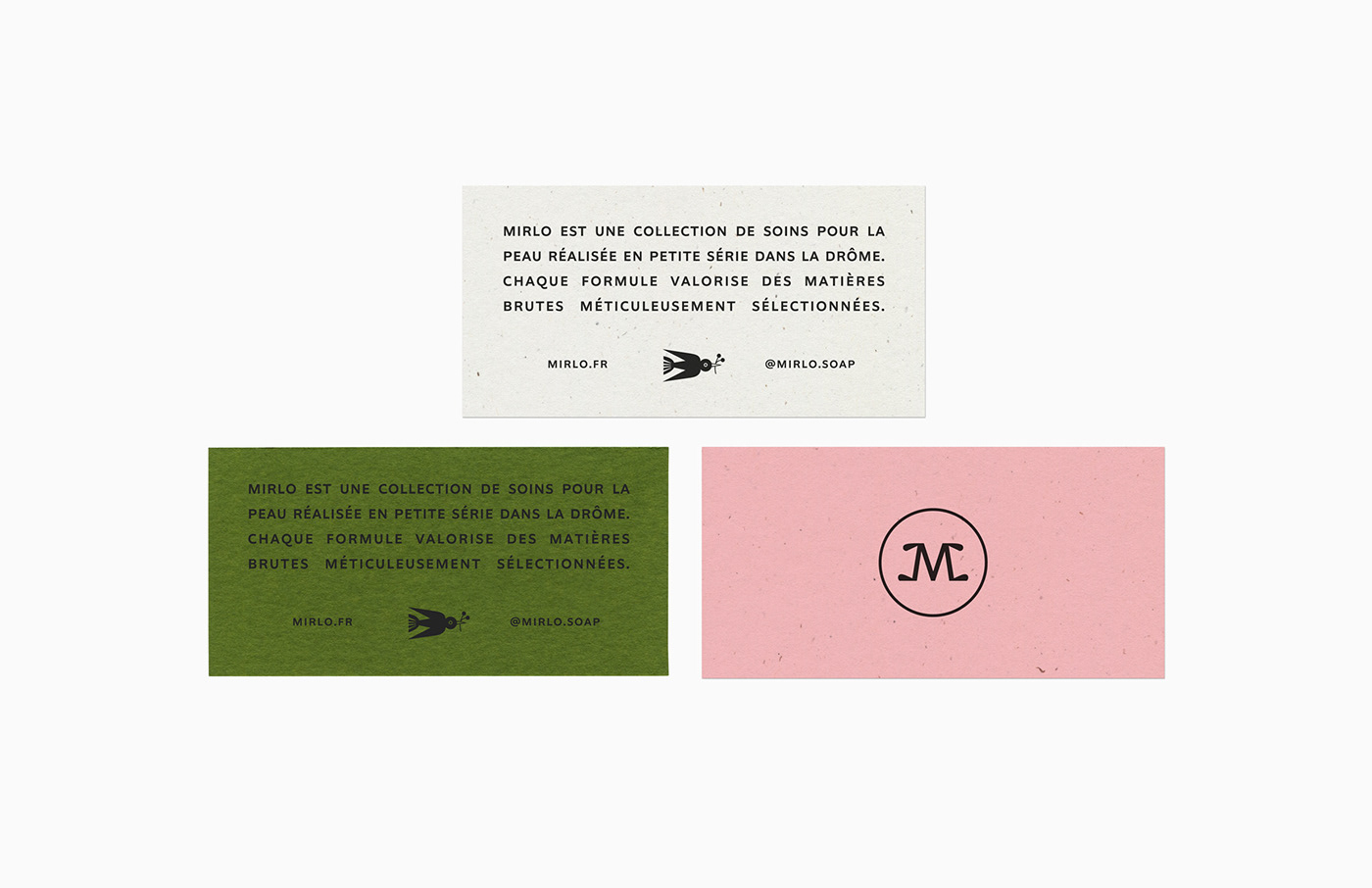
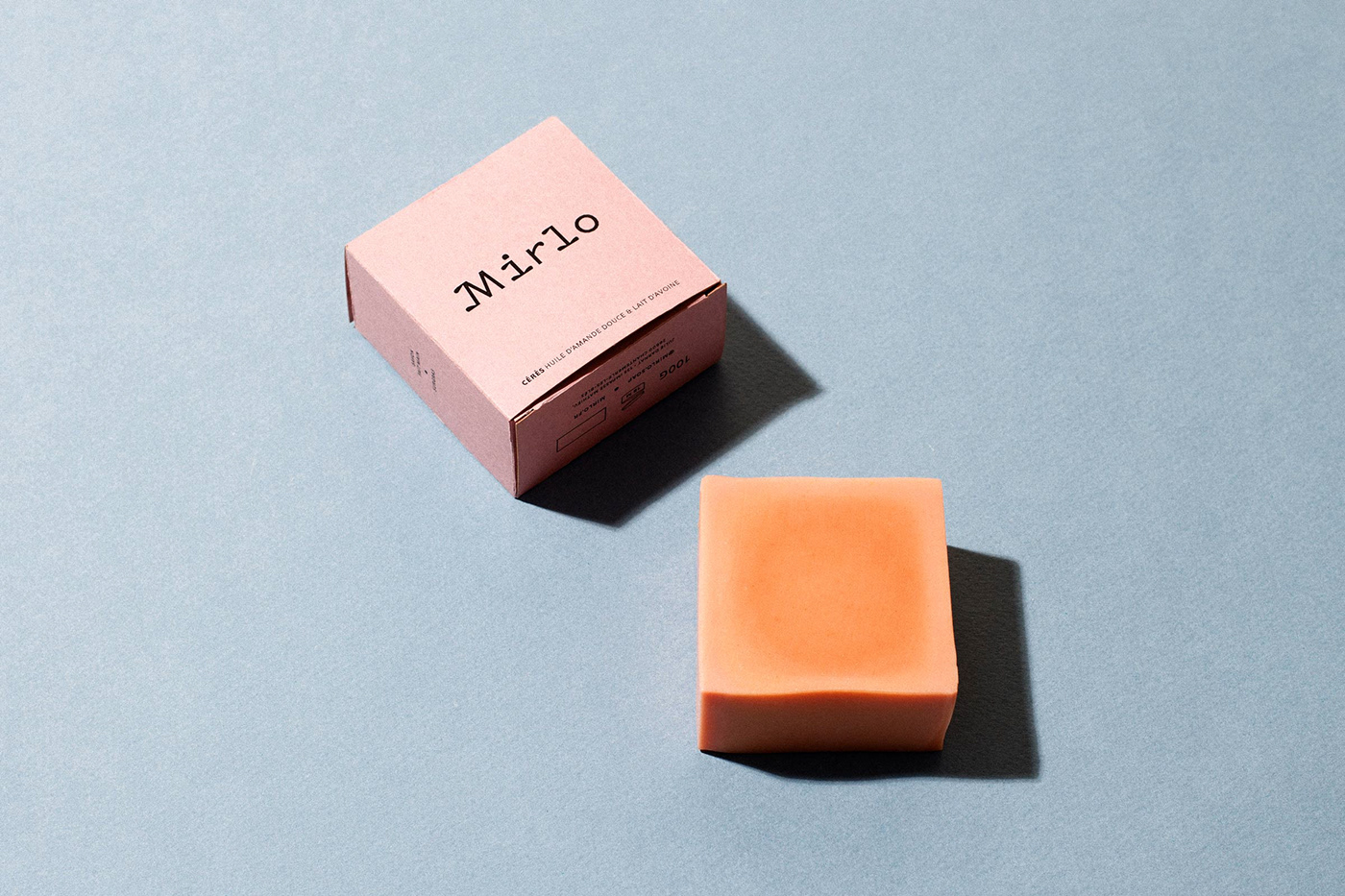
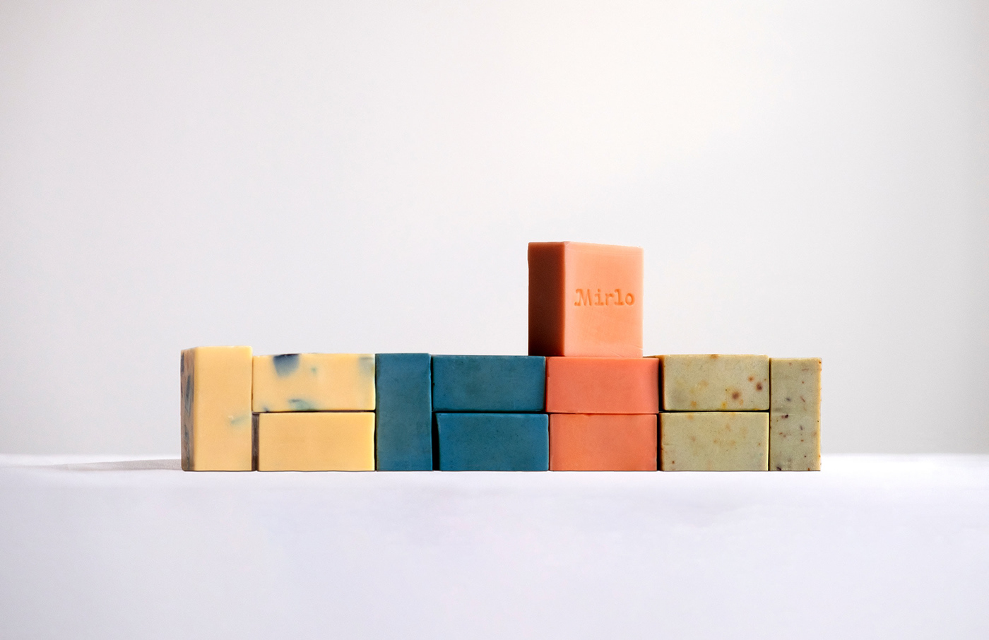
Branding, packaging and website design for Mirlo, a savonnerie based in Lyon, France. Making soap is a rigorous and traditional process in France, so we wanted the logo to embody the seriousness of the process, but also feel playful with a light & floral quality. We wanted the characters of the logo, especially the i and the l, to feel like they grew like plants out from their serifs. The color palette takes cues directly from the soap themselves. The website was designed to highlight the beauty of the soap while also showcasing the process and the high quality ingredients.


Design: Faire Projects (@faireprojects)
Typefaces: Faire Type (@fairetype)
Photography: Ghislain Mirat
Illustration: Carole Barraud


