


Client
S2 Africa
Briefing
S2 Africa
Briefing
Branding of a new business company in Africa.
Solution
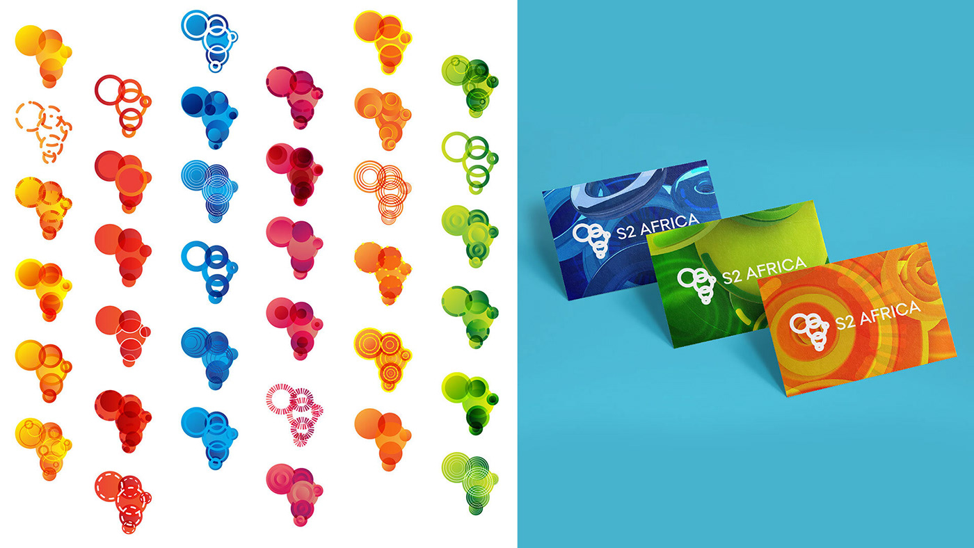
In the beginning there was the circle and then there was land.
Symbolising all beginnings, energy and movement, the circle is a positive shape which also stands for perfection and triumph. This symbolic interpretation as well as the association of its shape to SONAE’s visual heritage made it quite clear for us that the circle had to be the starting point for the graphic identity of S2 Africa.
Symbolising all beginnings, energy and movement, the circle is a positive shape which also stands for perfection and triumph. This symbolic interpretation as well as the association of its shape to SONAE’s visual heritage made it quite clear for us that the circle had to be the starting point for the graphic identity of S2 Africa.
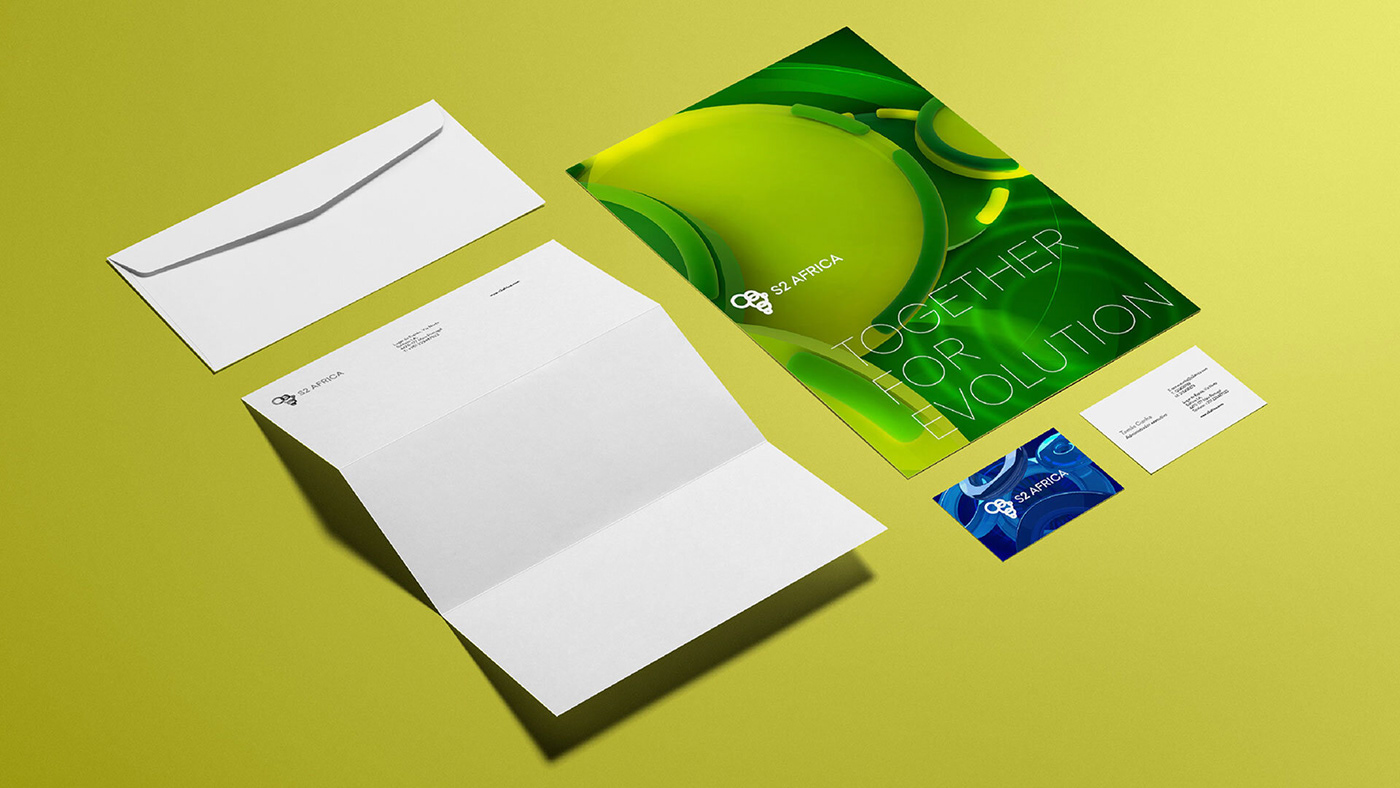
Fertile in its meaning, the graphic identity witch was developed for S2 Africa is also chromatically rich. Vibrant colours characterise the several applications developed for the brand, a brand which may gain some derivations, depending on its future growth.


Team
Designer: Pedro Leal Almeida
Creative Director: Pedro Yildiz Morgado
Strategist: Maria Caeiro
Motion Designer: Tiago Soares
Fuel Lisboa 2014.
All rights reserved.
Designer: Pedro Leal Almeida
Creative Director: Pedro Yildiz Morgado
Strategist: Maria Caeiro
Motion Designer: Tiago Soares
Fuel Lisboa 2014.
All rights reserved.


