The Instituto del Niño y Adolescente del Uruguay (INAU) is the governing body for child and adolescent policies in Uruguay. The adolescents living in INAU's centers formed a group that would allow them, in an organized manner, to propose changes and generate instances of debate on the situation of the different homes. Developing their own voice, voicing his own claims and opinions, thought by them and expressed by them.
A process of teamwork among adolescents and a prove of commitment to seek to transform the reality of their homes.

The name Giraflores was chosen as a metaphor for overcoming and transformation, since this flower seeks sunlight to grow, going through moments of light and others in which it may be lacking.
This stage of growth and development is closely related to the purpose of the educators in charge of the INAU centers and the children who live in those centers.
The centers are a home whose objective is to provide happiness, welfare, accommodation and promote the growth and improve the quality of life of its members.
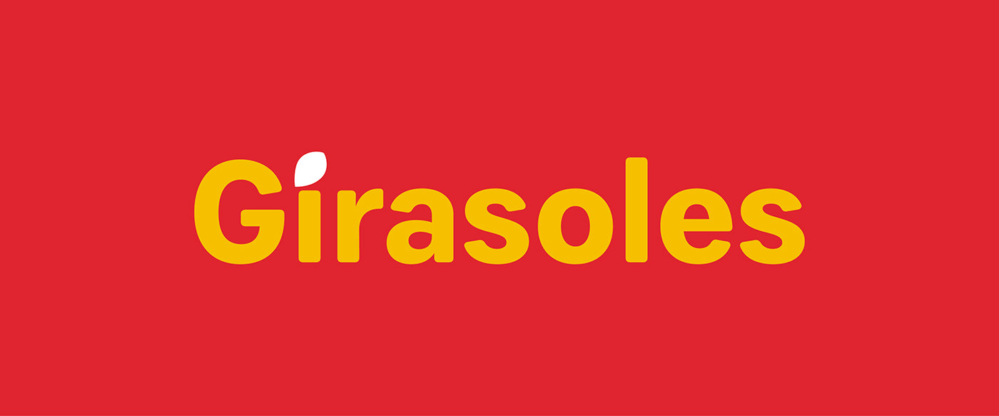
The Girasoles centre's logo is composed of the word Girasoles, and the dot of the letter "i" is replaced by a shape seed. Playing around with the word Sunflowers and further deepening the concept of transformation mentioned before.

Typography
The font for text is Mark Pro, it also established a secondary typeface, Ludicrous Stencil, which can be used for print and digital media.
This font is a relaxed and playfully typeface for be used to communicate specific actions carried out by Girasoles, which are explained below. This typeface will never be used as a text block.

Colors
The color palette is composed with red and yellow as main colors, and a support of 3 complementary colors. The secondary palette will be used for textures and patterns that will be used in the communication, never in the logo.

Resources
Taking the letter G of Girasoles is disassembled, obtaining curved, dynamic figures, which allow a play with each other.

Thinking about sunflower plantations, I get inspired about the furrows for planting sunflowers. Thinking about the concept of growth and development. This graphic element is represented with the elements obtained from the letter G


The elements allow the generation of textures applicable to communication. The textures can be used in the whole color palette, the textures will be used in two colors and only white will be used as the third color.
The elements can also be used in solitaire, being repeated but not tied to a rectilinear grid.


Illustrations
The communication also features a series of illustrated characters, which give an account of the activities carried out by its members.

More Resources
Using the elements shown above, these multicolored and multiform graphics are generated. Its use is exclusive as a support for photographs to be used in social media and web communication.
The photographs will be shown in black and white or in full color as background. They can also be used with illustrations. Shapes and colors represent the environment of Girasoles by intervening people and their environment.


Aplicaction


Events and social media
To communicate campaigns in social media or events carried out by the center, a tag composed by the seed of the logo and the secondary typography will be used.
This graphic aims to have a distinctive element to carry out actions in social media or to differentiate the communication about an event held by the center


