

國際數理人協會 品牌識別設計
IAMSE Visual Identity Design
作品介紹
國際數理人協會 (International Association for Mathematics and Science Education, IAMSE) 為非營利組織,培訓學生參與國際數理競賽,提供數理國際賽事資訊,統整集結相關試題詳解資庫,定期舉辦慈善活動,以推動文教公益活動。
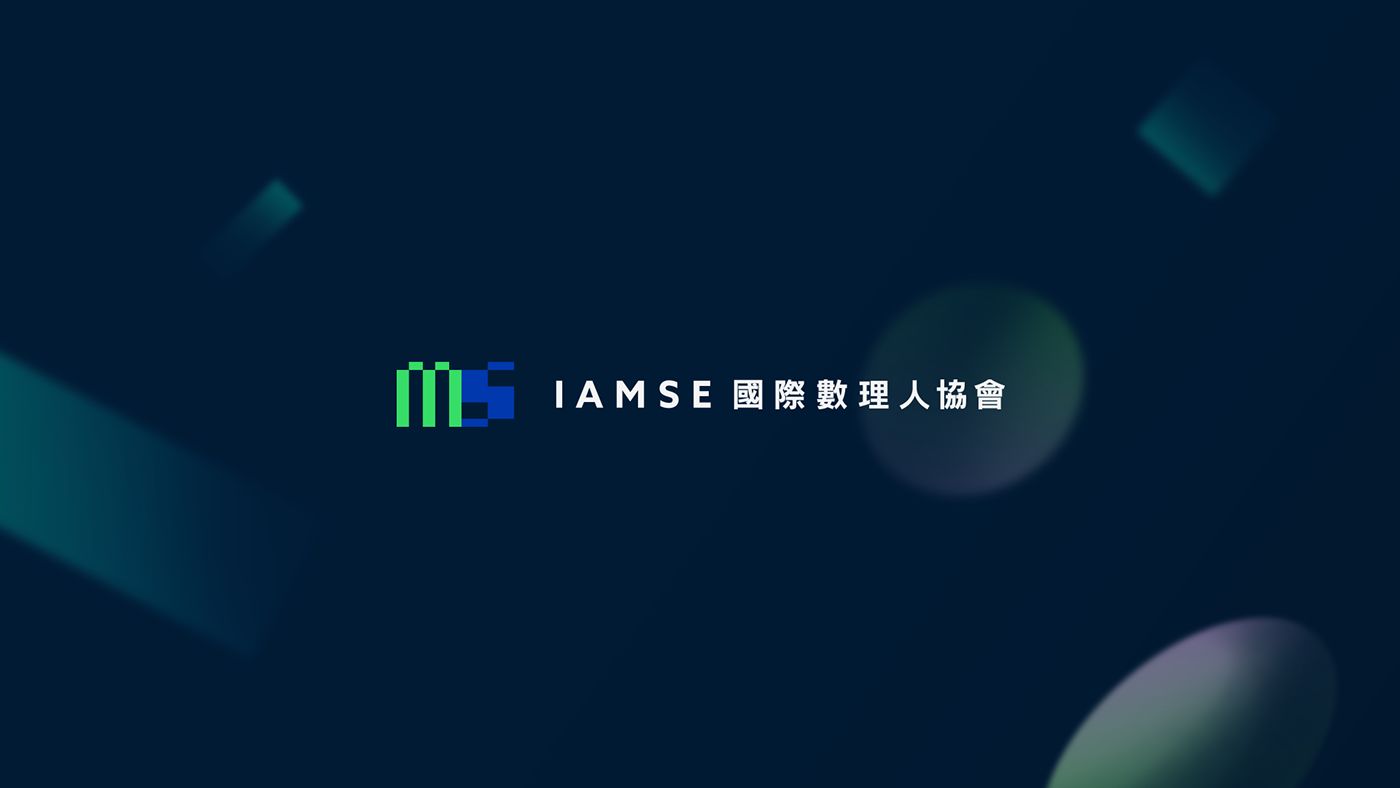
視覺以扁平的色塊建構組成英文字母M與S,作為主要的圖像標誌。扁平的色塊圖形可透過放大及旋轉成直式或橫式,延伸作為其他應用物之輔助視覺使用,賦予其多變的視覺樣貌;
營造科技解碼、知識與奧秘感的視覺語言。
CONCEPT
IAMSE is a non-profit educational institution, providing news and information of mathematics and science competitions around the world, assembling archives about the relative tests and answers. Aiming to train pupil participating global competitions.
Using 2D vector shape to compose the letter of M and S as its Logo Mark, it could also be enlarged and be rotated vertically and horizontally for different purpose of applications. It gives the brand a more diverse look with a mystery and scientific-like visual language.


VI Design: Wei Chia Teng
Year: 2020 – 2021
Client: 國際數理人協會 IAMSE
Client: 國際數理人協會 IAMSE
/ 應用物僅為示意參考 /


