Client: SATS
Project: Rebranding for aviation catering in Singapore (2020).
Concept: The SATS brand drives trust more than any other brand in the aviation and institutional catering spaces. But when it comes to consumer products, SATS does not drive desire.
A new brand was needed to help consumers choose their products without associating the product with airline food. SATS had begun to use the Country Foods name in the B2C sector of their business but had not yet found it a visual identity to match.
Understanding current perceptions of SATS and Country Foods through a series of workshops, before distilling the findings into a new brand identity was pivotal. The challenge was to ensure that the strategy and visual identity balanced the traditional ‘farm-grown’ connotations of “Country Foods” with modernity and innovation.
This was best captured through the essence of the brand idea: “Food Smart”. A brand that uses technology to make it possible for everyone to eat well.
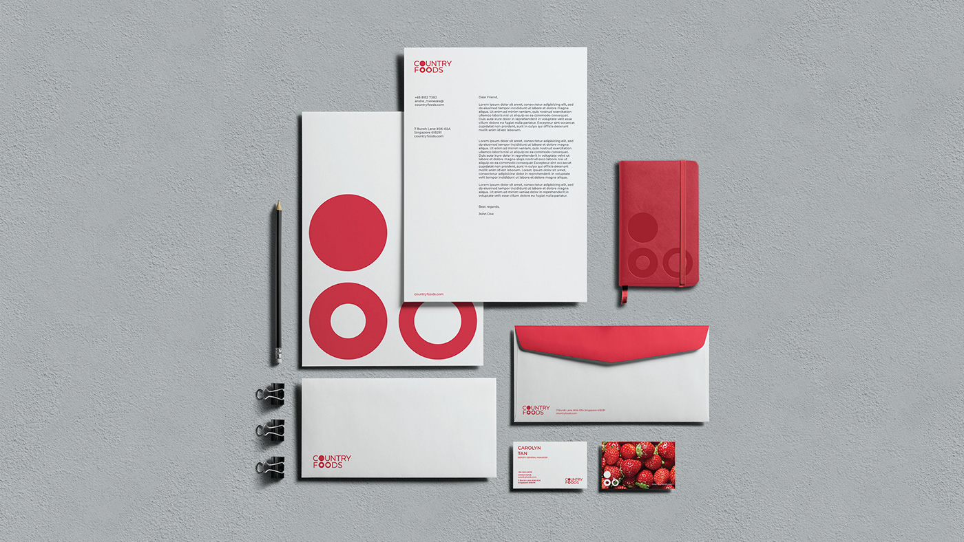
The visual identity was built upon the brand idea “smart food” representing the three key pillars of Constant Innovation, Quality at Scale and Food for All detailed in the brand strategy via the distinct red circles. The logo represented Country Foods in its own right, but hinted at the SATS masterbrand by using its secondary colour palette and echoing the SATS roundel in the filled “o” letters. It becomes a versatile supergraphic which has the flexibility to be applied in solid colors or housing imagery that portrait the micro to macro photographic style.
*Teamwork developed by Landor®.