Sans Serif
Magazine on Typography
Magazine on Typography
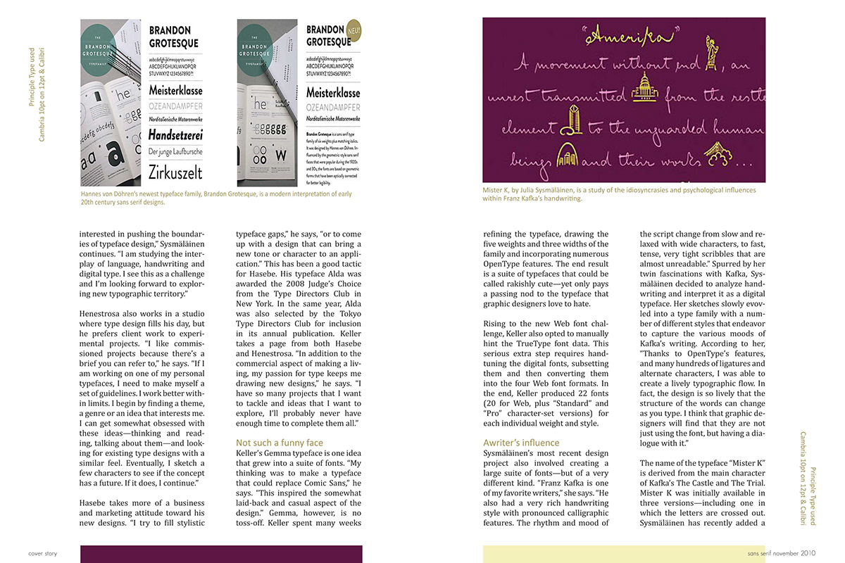
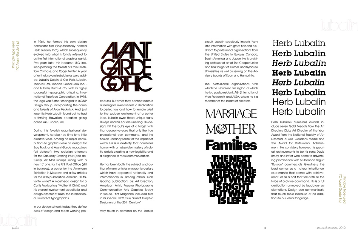
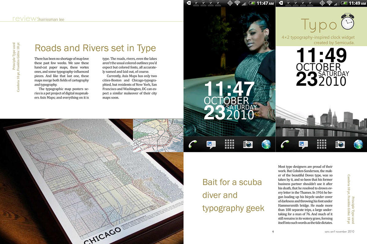
As part of a publication project in college, we were asked to design a different spreads of a magazine of which the topic was our choice. I chose to work with a magazine on typography. Usually when one looks at a publication, be it a book, magazine, or even a print advertisement based on typography, one encounters an abundance and very elaborate type usage. I however believe that typography ought to be simple and minimalistic and fall under the 'sans serif' category. I worked on layouts that were typographically appealing and yet not disturbing the flow of the readers' eye.


