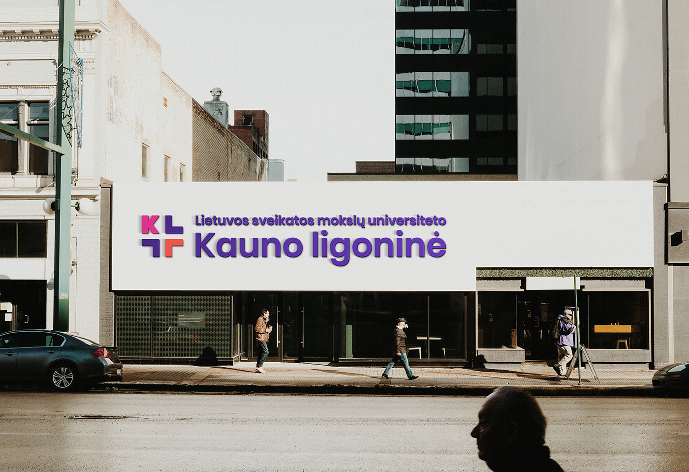

The Hospital of Lithuanian University of Health Sciences is the united hospital which was represented after the merge of Kaunas Clinical and Kaunas Republic hospitals. Our job was to create a brand identity and make it adaptable to various channels.
Challenge
The challenge was to track down traditional and unappealing medical symbols, and come up with the best original solution to replace them. As for the identity, we had to create a warmer, approachable style to emphasise the hospital’s core values. It was important to step away from traditional colours and find more distinctive visual solutions.
Our Solution
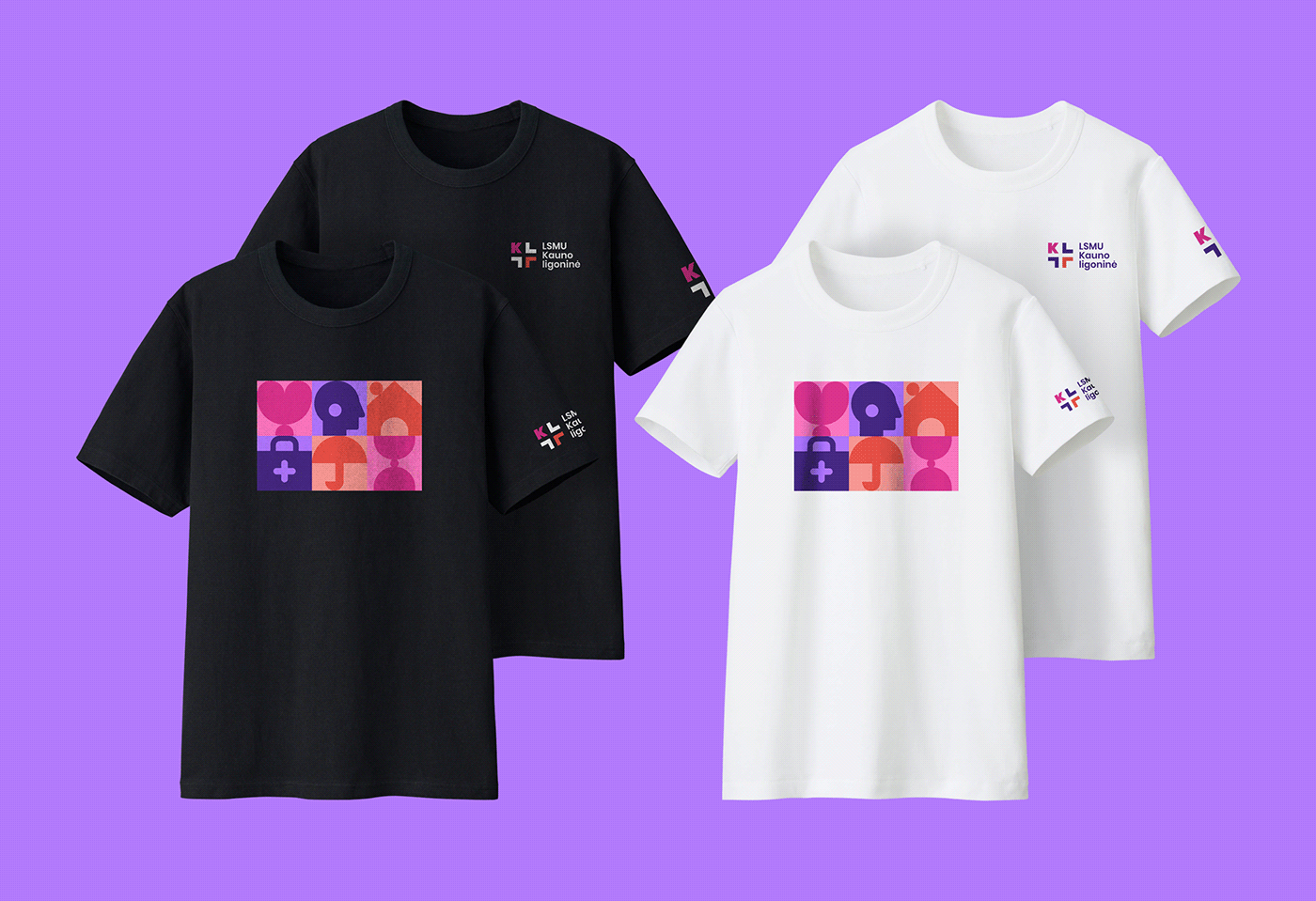
To convey the hospital’s different values and identity, we have used notable illustrations and icons. The shape of the logo is a cross formed by the hospital’s initials. The colours adopted in the logo are unusual and incorporate the visual style.
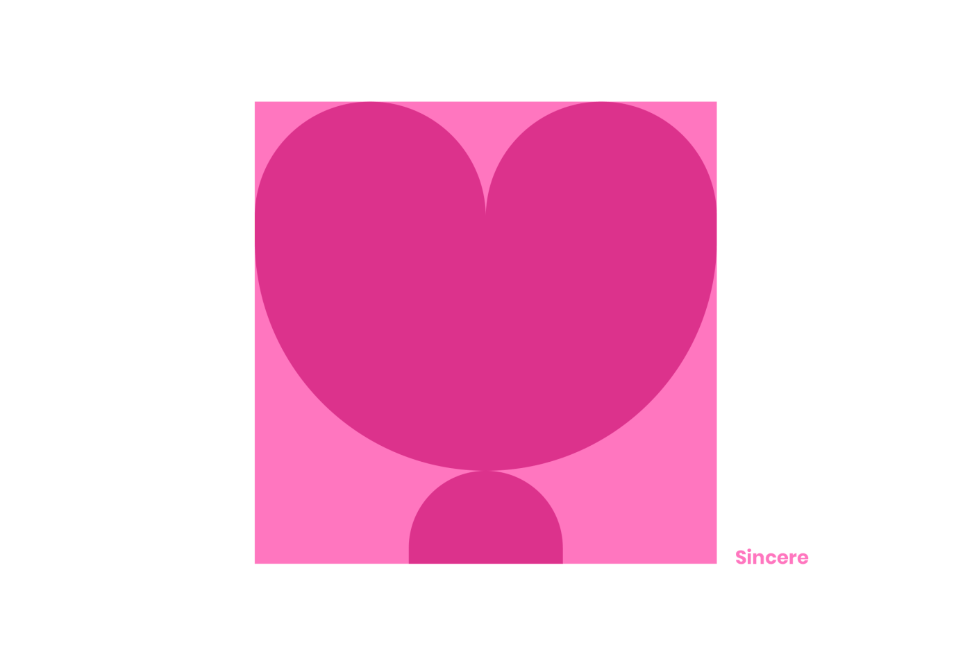
By resorting to various colours and graphic elements, the unique visual style binds the hospital’s core values which create a continuous and dynamic design system and delivers an overall sense of integrity.