
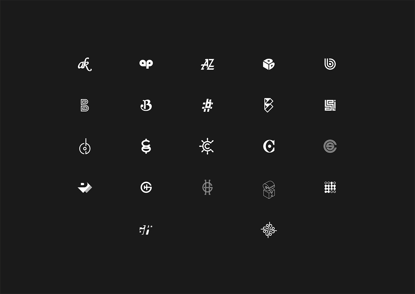
This is the first half of my type icon collection, 46 marks in total.
(Where 'icon' refers to any legible mark that fits in a square.)
Biggest insight: my portfolio is full of B and R logo concepts.
Is it just coincidence, or am I more creative with that shape?
(Where 'icon' refers to any legible mark that fits in a square.)
Biggest insight: my portfolio is full of B and R logo concepts.
Is it just coincidence, or am I more creative with that shape?
Something new to worry about . . .


Thanks for viewing!


