


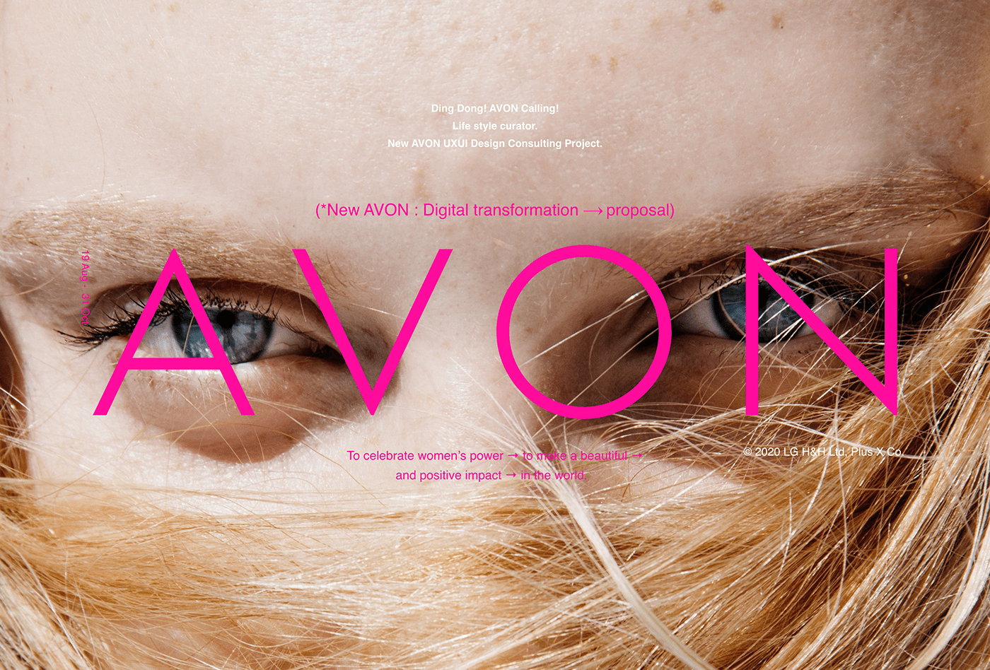


New AVON : [ Digital Transformation ]
UX/UI Design Consulting Project proposal
-
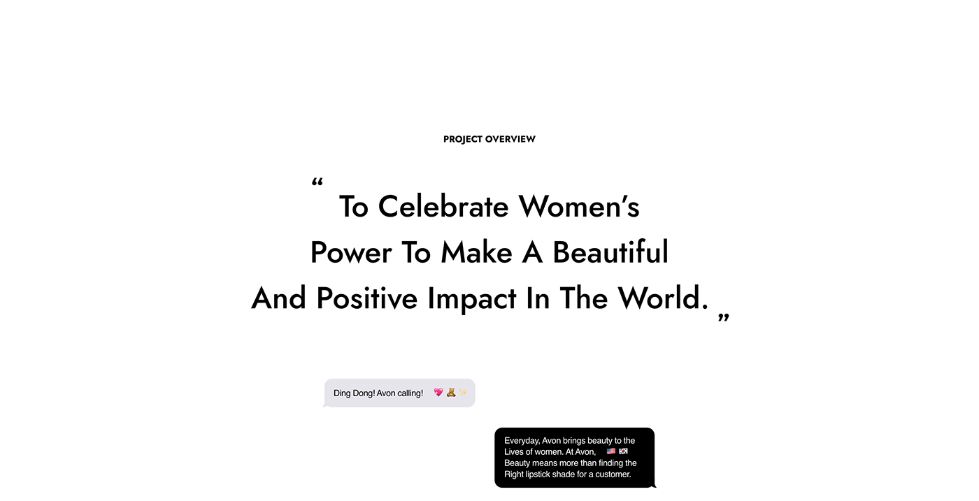
OVERVIEW
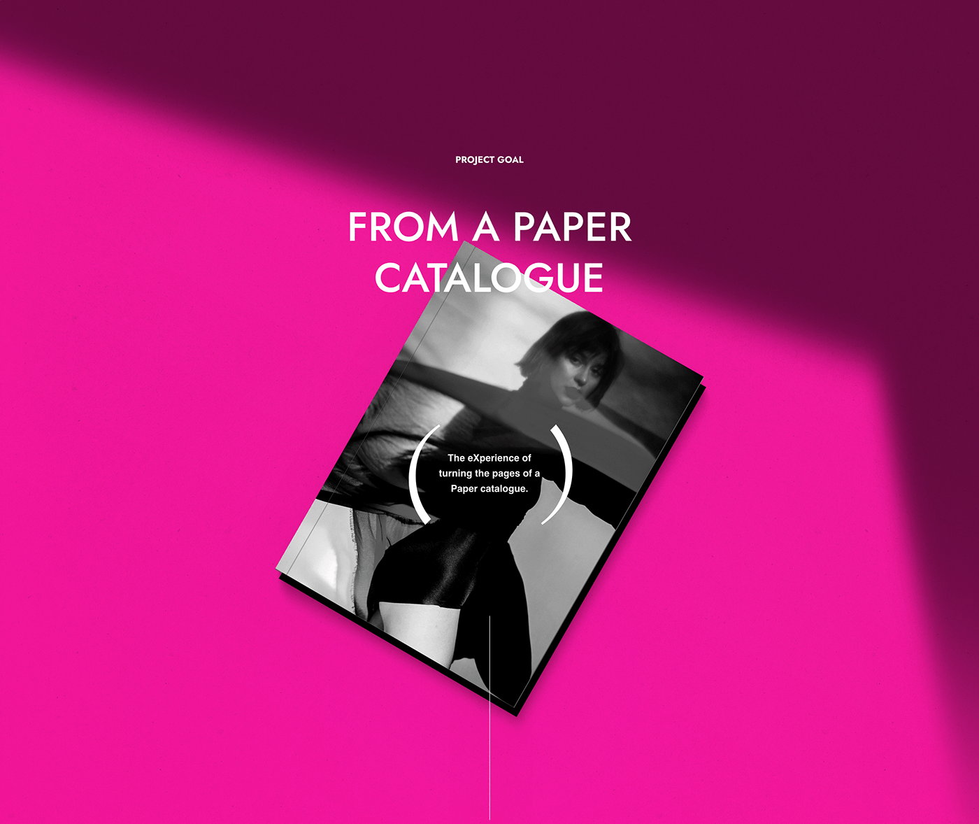
본 프로젝트의 목표는 LG생활건강이 인수한 북미 화장품 직접판매 기업
‘New AVON’의 Paper Catalogue를 Digital Transformation하는 것입니다. New AVON의 움직이는
로드샵인 방문 판매원(REP)들은 환경오염, 고비용, 커뮤니케이션 오류 등의 문제를 가진
Paper Catalogue로 소비자와 커뮤니케이션하고 있었습니다.
New AVON, a North American cosmetic personal care company acquired and
merged by LG H&H, provides a paper catalog to its representatives, 'REP', to support their sales. The paper catalog, which is published about 180 million copies per year,
had various problems such as environmental pollution, high cost, and communication errors. 'Digital Transformation', the core task of the project, was achieved based on the analysis of the surface problems of the paper catalog and the insights derived from local interviews.
-
STRATEGY
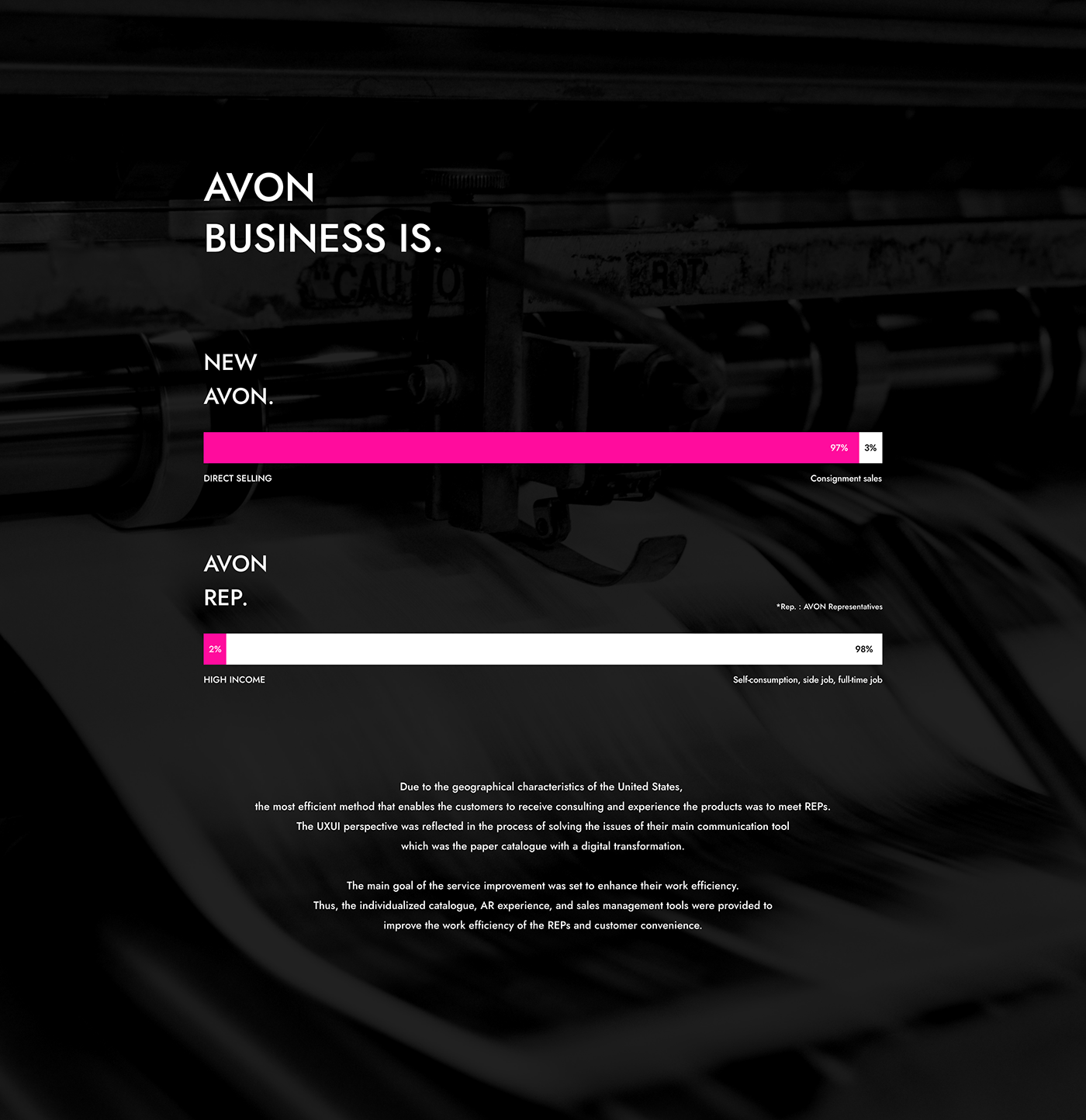
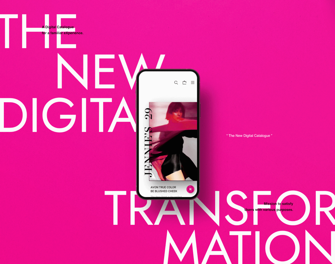
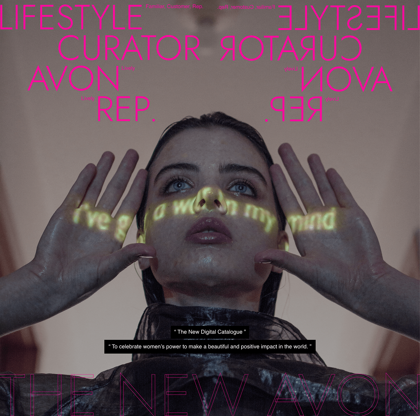
로드샵이 곳곳에 위치하기 어려운 북미의 지리적 특성상, 소비자가 화장품에 대한 조언을 얻고
체험할 수 있는 효율적인 방법은 방문 판매원(REP)을 만나는 것이었습니다.
하지만 이들의 커뮤니케이션 도구인 Paper Catalouge는, 고객이 사고 싶은 제품을 Paper Catalouge에서
발견하면 그 제품 코드를 REP에게 따로 전달해야 했으며, REP은 여러 고객이 보내오는 코드를 취합해서
직접 주문을 넣어야 하는 등 비효율적이었습니다. 따라서, New AVON과 소비자를 연결해주는 방문 판매원의 업무효율 향상을 목표로 익숙한 기존 경험을 자연스럽게 디지털화하고자 했습니다.
Design Strategy으로는 탁했던 기존 Identity Color의 채도를 높여 생기를 불어넣었으며,
Web과 magazine의 특징을 고려한 서체를 선정하고, 아이콘에는
‘AVON’ 알파벳의 기하 도형적 특징을 반영해 Logo와의 일관성 유지하고자 하였습니다.
‘AVON’ 알파벳의 기하 도형적 특징을 반영해 Logo와의 일관성 유지하고자 하였습니다.
구조적으로는 Paper Catalogue의 analog적 UX를 담고, 이미지적으로는 제품의 물성과,
감정이 느껴지는 다양한 표정으로 시각적 스토리텔링 담았습니다.
Due to the geographical nature of North America, where road shops are difficult to locate, an efficient way for consumers to get advice and experience cosmetic products was to meet with a door-to-door salesperson (REP). However, their primary communication tool, the paper catalog, was inefficient. As a prime example, the customer had to find the code of
the product they wanted to buy in a paper catalog and pass the code to REP, and REP had to collect and place orders directly from multiple customers.
Therefore, with the goal of improving the work efficiency of REP, which connects New AVON and consumers, we wanted to naturally digitize the familiar experience.
As a design strategy, The overall image became enlivened, and the fonts that consider the characteristics of the web and magazine have been applied.
Also, the geometrical features of the alphabets of ‘AVON’ are reflected to provide consistency. Structurally, the digital catalogue has the unique sensitivity of a paper catalogue, while its image provides visual storytelling that allows the users to see various kinds of expressions that display the product properties and emotions.
-
CONCEPT
“ Famillar : [ 익숙함 ] ”
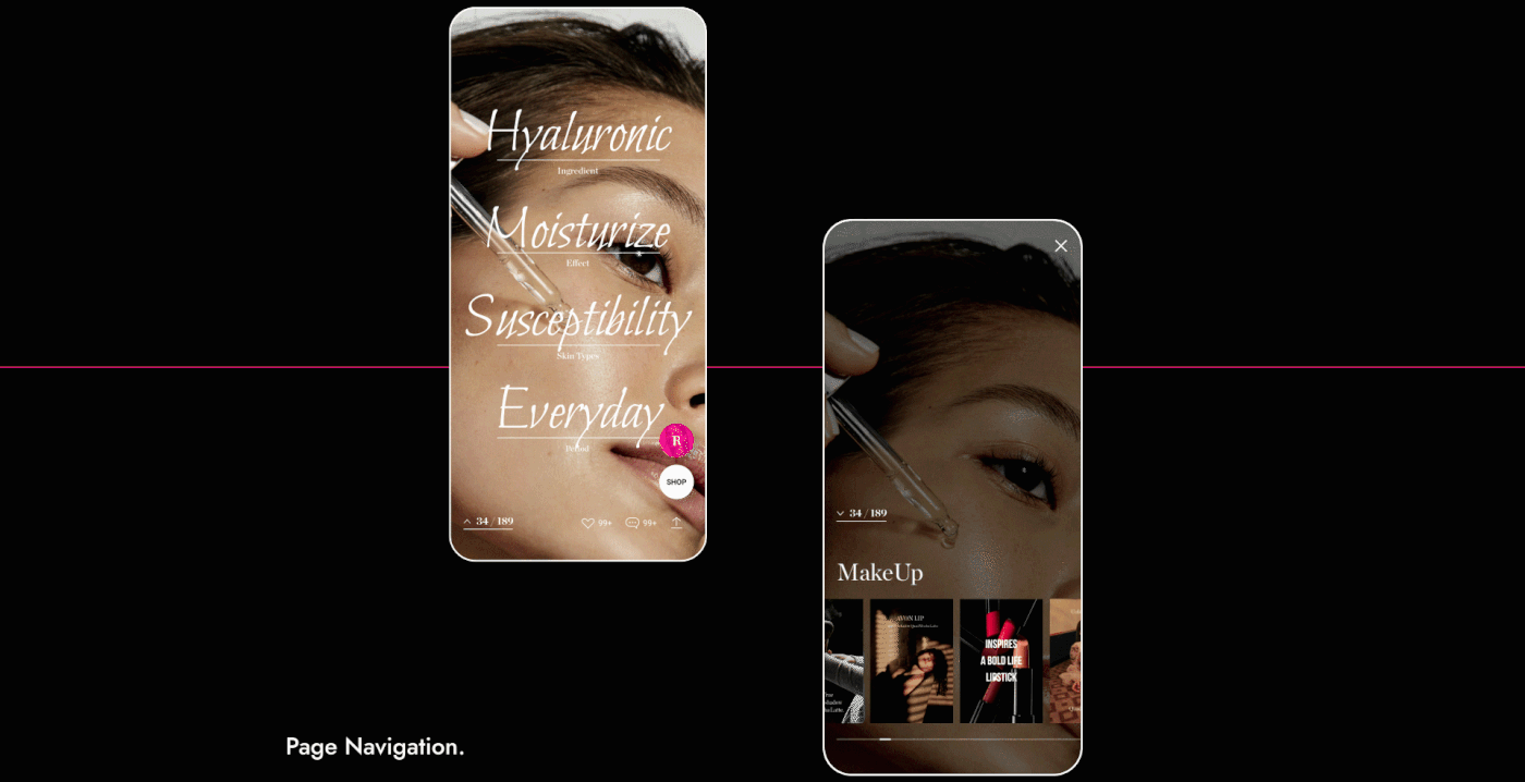
Paper Catalogue를 넘기는 익숙한 경험을 가로형 UX 형태로 Digital에 옮긴 것이 Concept입니다.
그렇기 때문에 디지털에 익숙하지 않은 기존 고객층도 자연스럽게 서비스를 사용할 수 있으며, 한 페이지씩 Swipe 하는 방식으로
정보를 소비하기 때문에 각각의 콘텐츠에 대해 집중할 수 있습니다.
정보를 소비하기 때문에 각각의 콘텐츠에 대해 집중할 수 있습니다.
“Familiar”
The concept is that the familiarity of using a paper catalogue has moved onto the horizontal UX as digital. This provides ease of use for the service by the existing customer base who are not familiar with the digital device, and since the information is consumed by swiping each page, the customers are able to focus on every aspect of the content.


