


PATCH IT! is a monthly subscription box where you get new, unique patches that are designed with love in each stitch from our designers.
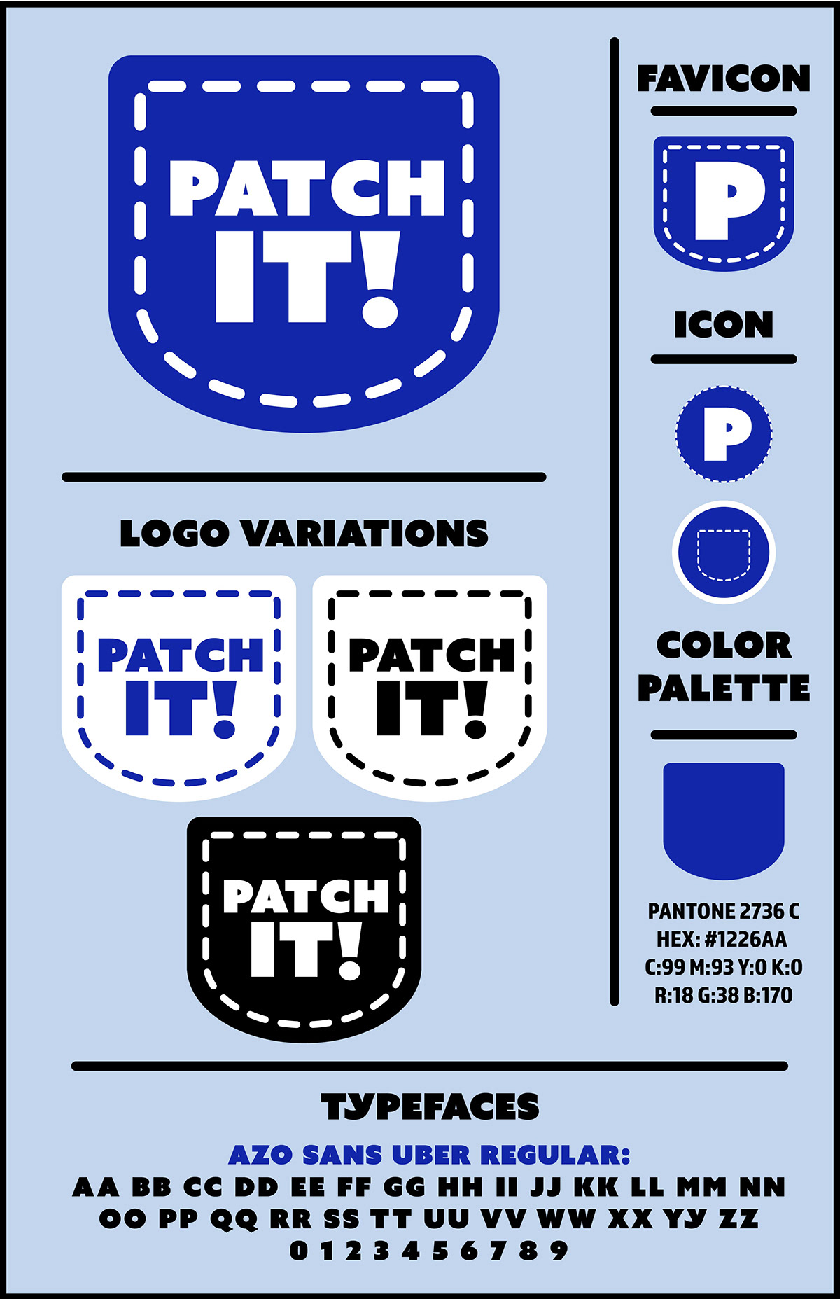
For the logo design, I decided create a simplistic design which resembles a jean pocket. I added a dashed line around the words to emphasize that it's stitched and to give the jean feel to the logo. I chose a bold blue because it stands out from afar and catches the viewers attention.
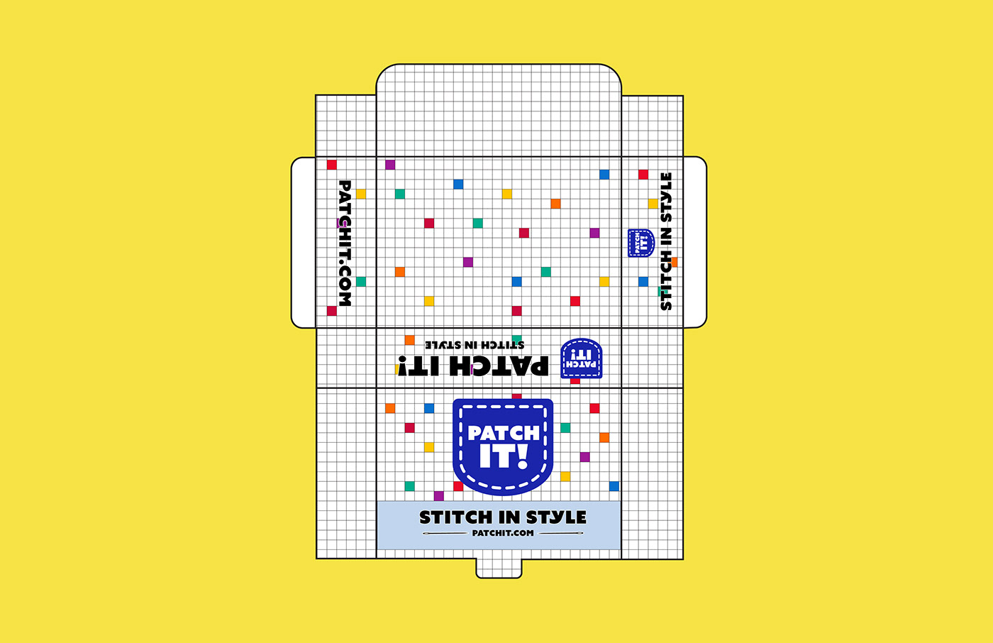
Main Box Dieline
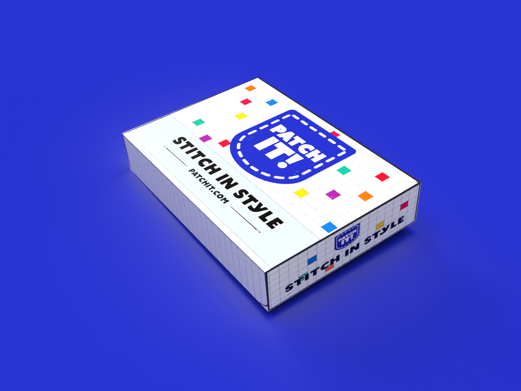
For the main box, I gave the design a minimalistic look created a grid pattern all over the box which symbolizes a blueprint. In some of the squares, I added some colored squares so it wouldn't look too plain and to catch the consumers attention before they open the box.


Patch Box Dieline
The Patch Box is where their 3 new patches will come in. This box will be placed nicely inside of the main box. For this design, I used a pastel yellow and added the grid design to the side so it could be cohesive with the main box design.


Sewing Kit Dieline
With your first purchase of your Patch It! Subscription, you will receive a mini sewing kit which includes all the basic materials one needs to sew their patches onto their clothing.
For the design, I kept it simplistic and placed the logo largely onto the front and used a pale blue color and red lettering.


*assignment for graphics III class // not a real company*


