THE BRIEF
Branding for an all natural acne skin care line. KitavaMD was founded by two dermatologists from San Francisco who had found a need for a product like this. The branding needed to reflect the evidence-based and scientifically researched product formula, which uses only natural ingredients, unlike other acne treatment products which use mostly chemicals. The target audience is teenage boys and girls and their parents so the branding needed to be gender neutral and look youthful yet professional.
THE SOLUTION
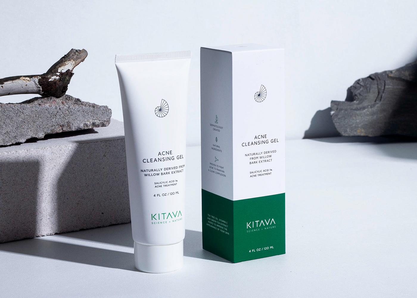
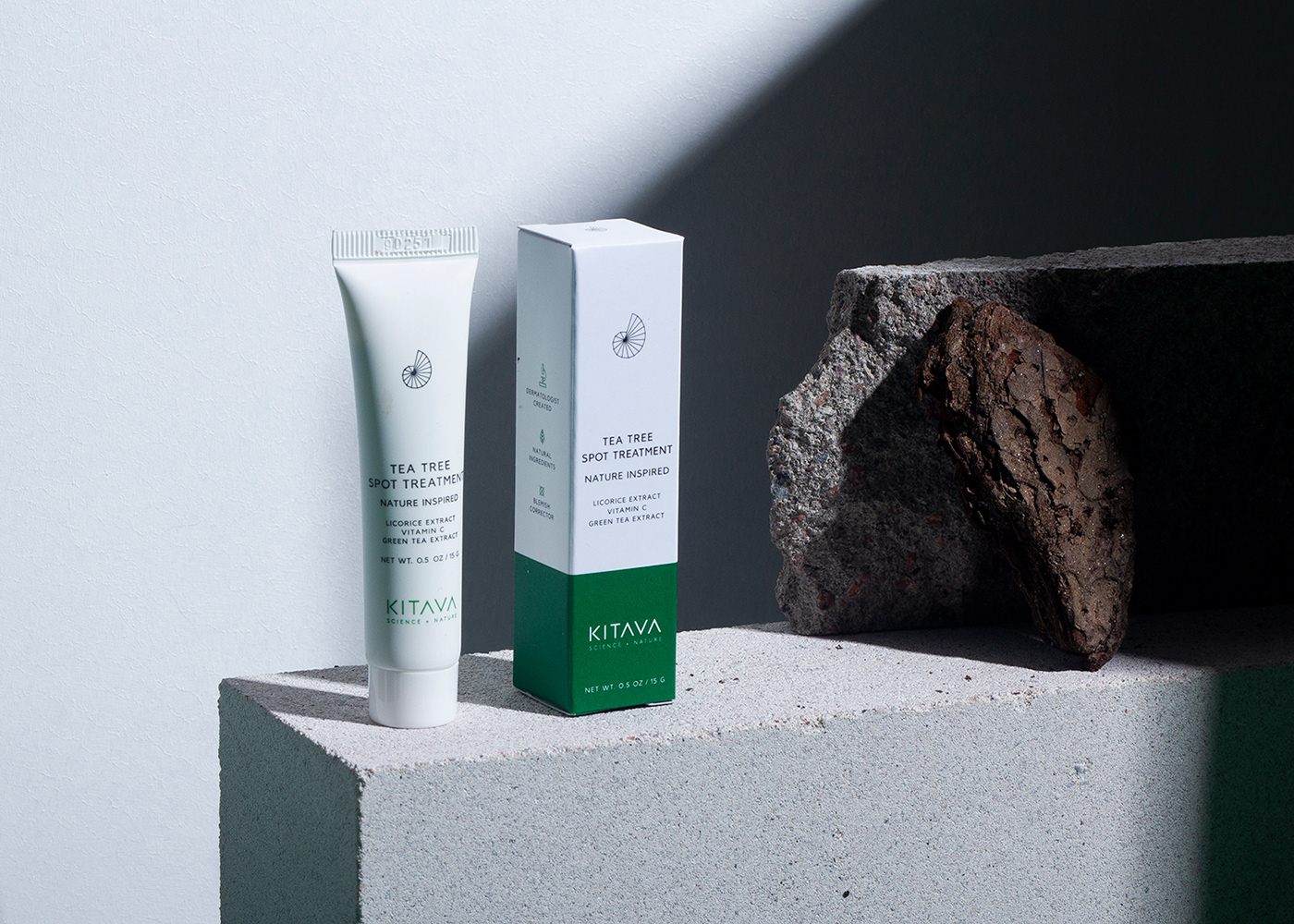
The branding concept takes inspiration from the science of the nature and the mathematical shapes that are behind each natural form. It combines medicinal and natural, just like the product does. The graphics are simple and bold and the packaging is kept very minimal and clean, to communicate the clinical attributes of the product.
The color palette is minimal and clean; a lot of white, black typography and green as accent color. The shell icon is a symbol for purity, and is also a classic example of the appearance of science in nature.
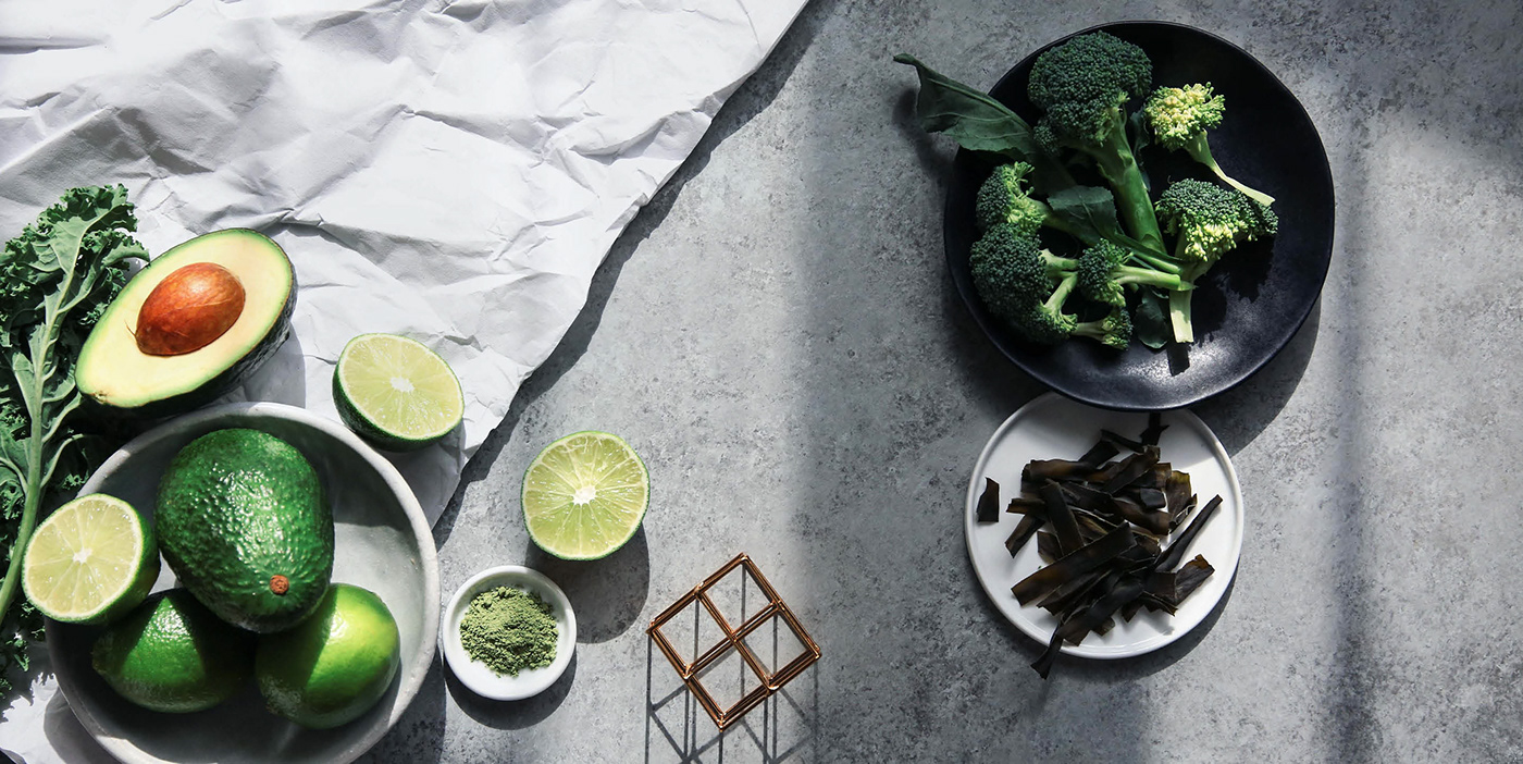
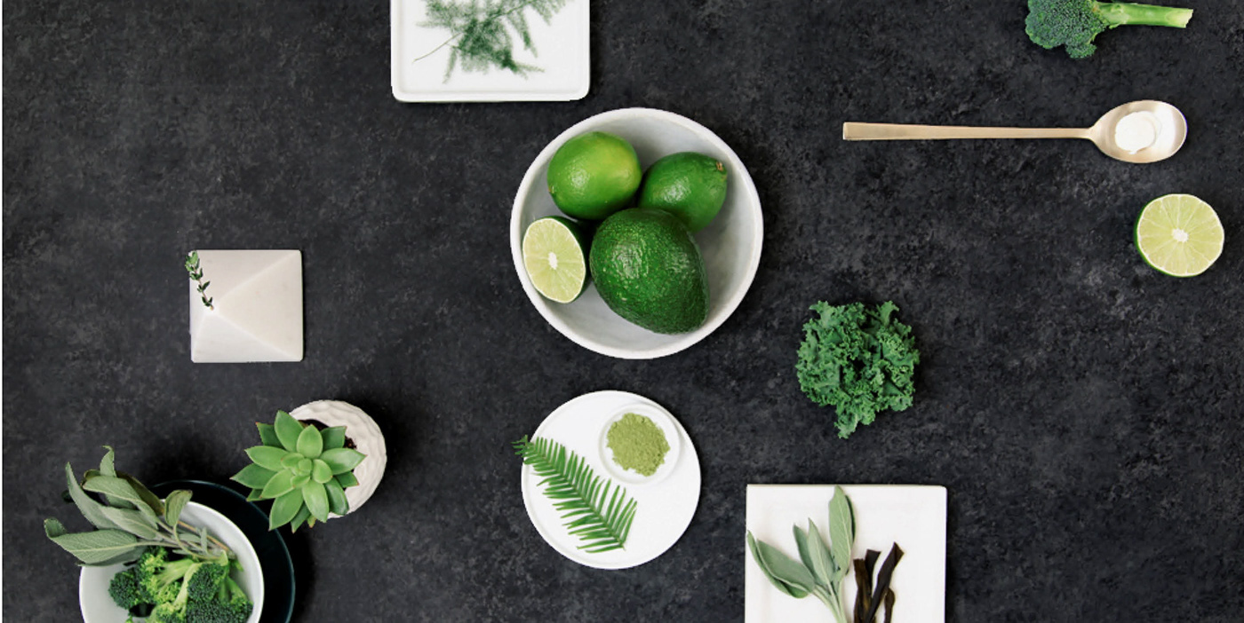
BRAND PHOTOGRAPHY
The same minimal color palette and style is repeated in the brand photography to enhance the brand experience in all the platforms. The images are simple and fresh, and gender-neutral.