From a restaurant
to a consumer brand.
to a consumer brand.
We started our partnership with Bagri back in 2016, when we helped them launch the first farm-to-table restaurant in Sofia, Bulgaria. Everything was going great for them until the pandemic in 2020. Their physical space, as many others worldwide, was closed, and the business started to slowly fall apart. They had to move fast in order to keep their company alive. And that is how Bagri Farm was born. Staying true to their initial mission they found a way to keep bringing high-end farm products to the conscious customer's table.

Continuity
–
–
In the short period of its existence, Bagri restaurant managed to establish a genuine connection with its audience. Celebrating it and building upon it was essential for us. Our goal was to transfer key visual elements from the restaurant identity into the new brand. We wanted this transformation to feel like an evolution rather than a start from scratch.
Old / New


We redesigned Bagri's logotype, so it has a consistent bilingual look & feel, created a flexible packaging design system for a growing dairy product line, and set a strategic & creative direction for
the brand's future development.


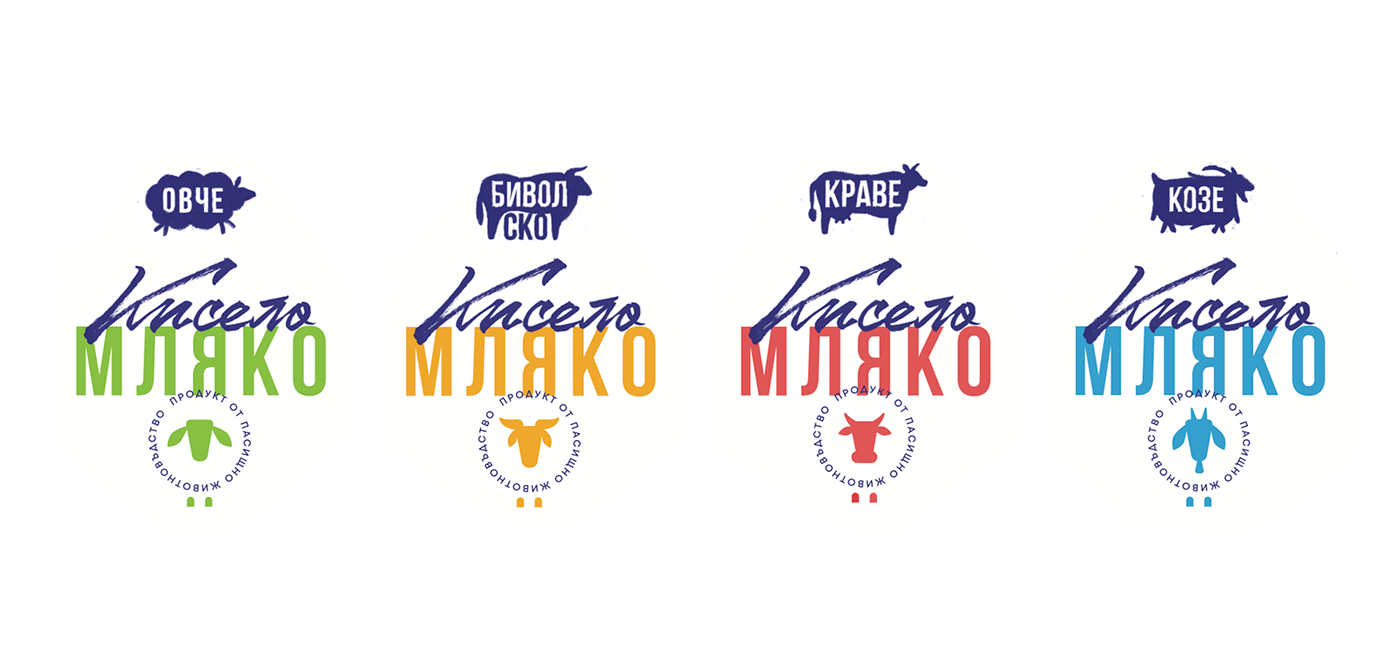
Color palette
–
–
Color coding is a crucial ingredient of Bagri's new identity, as they have ambitious plans to expand their product line in the next few years. Starting with sheep dairy products, we established the green as a distinctive accent among its competitors on the local market. Yellow, red & blue will be introduced as key colors for the buffalo, cow and goat dairy product lines.

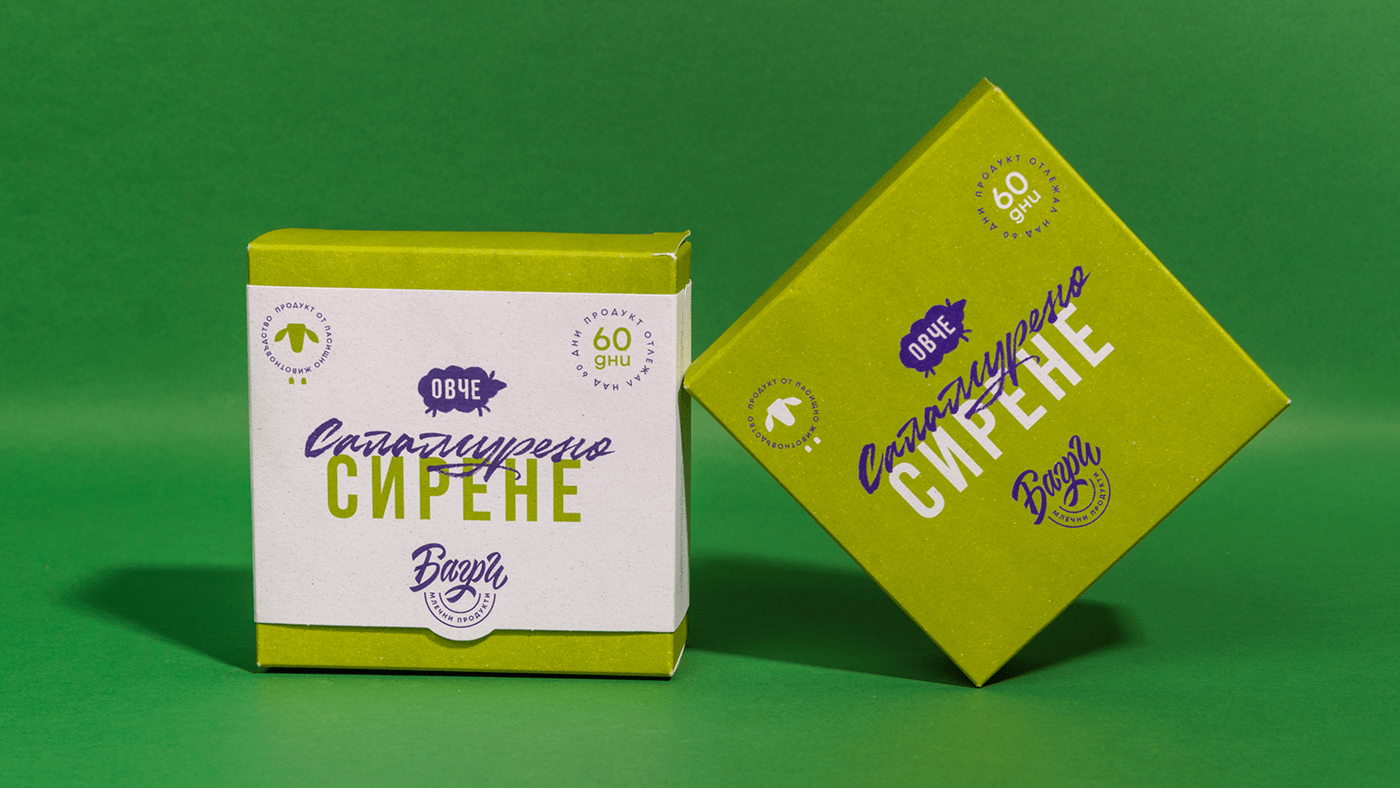
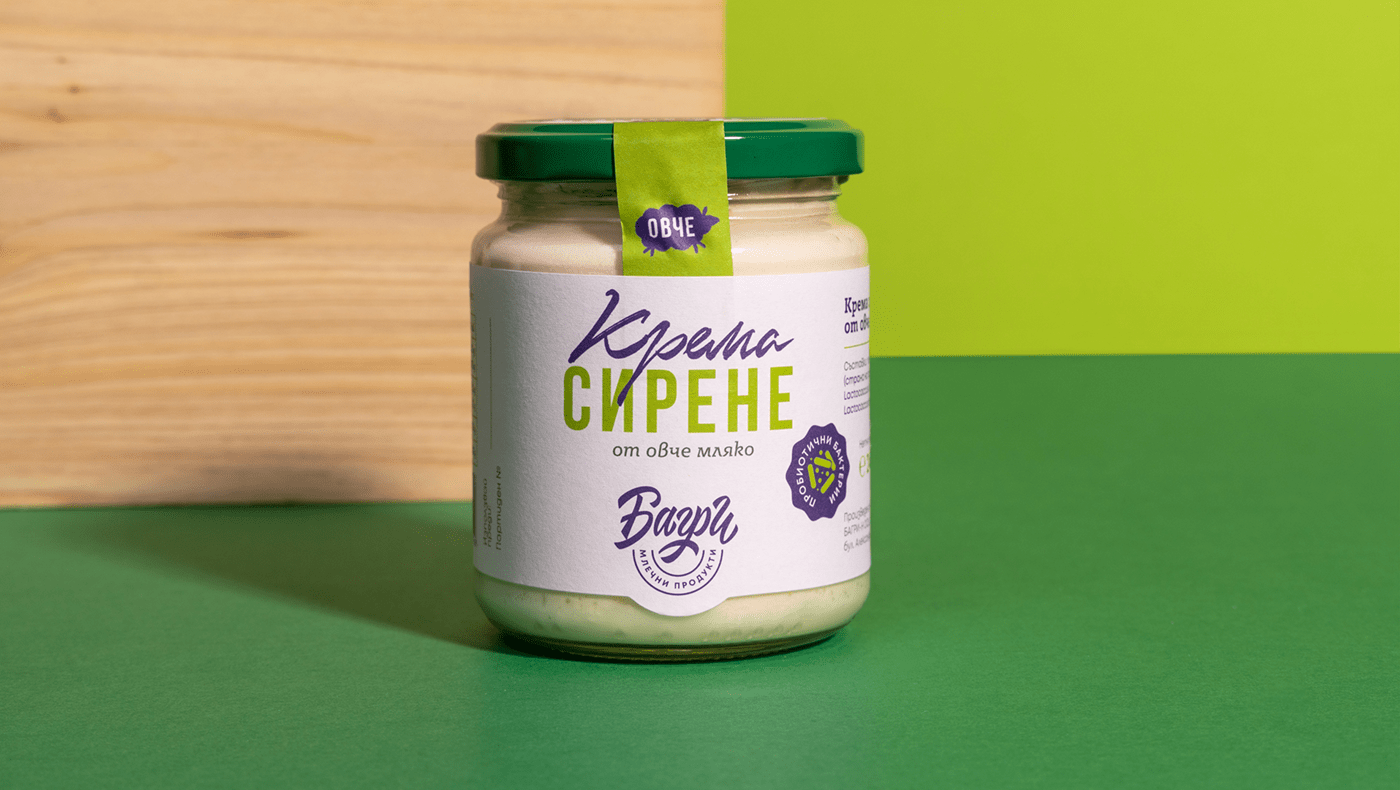
Packaging
–
–
Grass-fed dairy products in Bulgaria is a relatively new and niche market. Bagri had to find its place among small local farms and bigger, well known companies in the industry. The challenge was to design a visual language with an authentic voice, love for the artisanal process and care for the environment. The design language had to be adaptive, serving a dozen of different products, packaged in boxes and jars.
We developed a system combining condensed and handwritten typography, iconography and special selection of papers to achieve a bold, yet natural, look & feel for each product.
Brined sheep cheese / Aged over 60 days


Sheep yogurt


Yellow sheep cheese / Aged over 60 days


Cream sheep cheese & Artisanal sheep katak


Credits:
–
Creative Direction: Ivaylo Nedkov
Graphic Design: Ivaylo Nedkov, Tsvetislava Koleva
Animation: Alex Zhelyazkov
–
Creative Direction: Ivaylo Nedkov
Graphic Design: Ivaylo Nedkov, Tsvetislava Koleva
Animation: Alex Zhelyazkov
Client Service: Vera Schwartz


