
For this project, we had to come up with 3 book covers to accompany 3 book to movie adaptions with a similar theme. I decided for my main theme to be based around the idea of alienation. I picked the films ‘The Virgin Suicides’, ‘Girl Interrupted’ and ‘Shutter Island’ as the three to design bookcovers for.
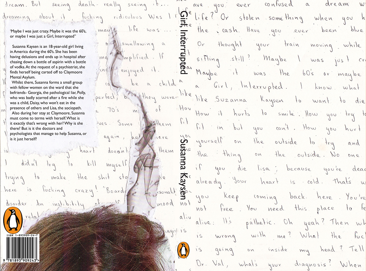
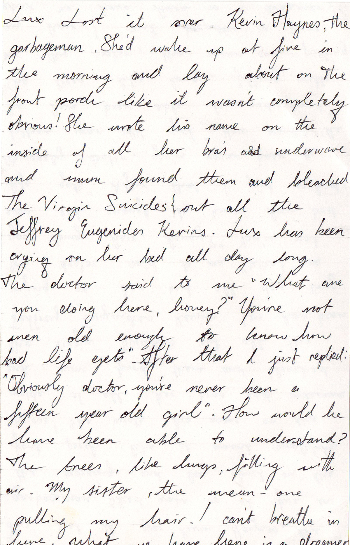
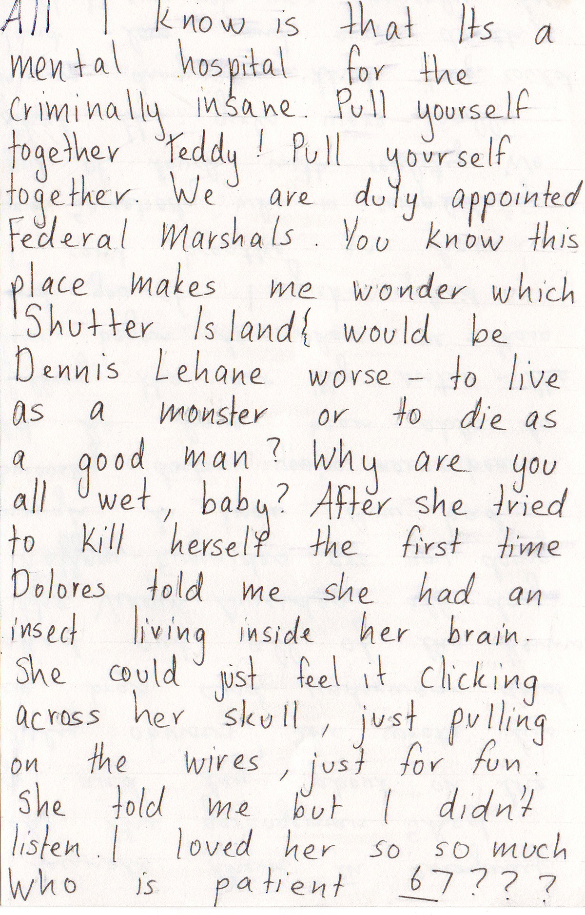
There were two different ideas I thought of when I designed the bookcovers- the idea of the protagonist’s journals, and using just the tops of their heads to reveal certain aspects of the film. The idea of the journals came from the fact that all of the 3 main characters in the films keep some sort of journal. In The Virgin Suicides, she keeps a diary, in Girl,Interrupted she keeps a sketchbook/journal, and in Shutter Island he keeps a reporters notebook. These three books are where the characters keep their thoughts and secrets. It acts as a person to talk to and confide in because they feel so isolated and alone. So I decided this idea would be displayed through using different handwriting on pages with quotes from the screenplays about particular events that happen throughout.
The other idea was for just the top of the heads of the 3 protagonists to be displayed through the three screenplays with a piece of information to be told about the book. For example, for the book Girl, Interrupted I showed the top of the head of a girl, supposed to be the main character Susanna, and a line of smoke travling upwards which is supposed to symbolise that, even though we cannot see it, she is holding and smoking a cigarette. This is something key to the film and that she does throughout it. I decided that the pictures were to be done in a collage form to tie it in with the ideas of the journals, and sticking photographs in it. I achieved this through ripping up pictures to create a jagged edge effect, sticking them on sheets of paper and scanning them into the computer. I then placed these on the back cover of the screenplay
For showcasing the titles of the screenplays and their authors, I decided to hide them in amongst the rest of the writings on the front cover so that it wouldn’t be exactly evident from first glance with what screenplay you were looking at. I also did this because it would make the viewer have to read the writing on the front cover, which in turn would give them a taster of what the story is about. The typefaces I used are all hand done by myself except for the title on the spine and the blurb, which is Gill Sans. I chose this to stay true to the penguin series, which used to uses that typefacein a variety of their work.

