


Communication design. Yandex.Live 2020
This time, I'll be talking about communication design. This has been a major focus recently: in just the past six months, we’ve updated the Yandex.Live logo, created its visual communication style and principles, and developed techniques for following these principles while performing product-related tasks.

Updating the icon
The logo we had didn't suit all our needs and it didn't adapt well to different formats. Aside from that, we wanted to give it a more professional look that gave the impression of confidence. The icon was designed to represent a portal. We removed its outer layer to make it more flexible and abstract. Following the initial concept, now any shape or background that the logo is placed on becomes the gateway. The symbol also took on new meaning, which better reflects the essence of the product. We adjusted the geometry by making the "opening" more precise.


Standards
Our first priority was to define the basics: how the logo and service name could be used. To do this, we made a brand book for our partners. It contains the key elements of our corporate identity, their terms of use, and templates for preparing graphics for videos with our branding.

With clearly defined standards for our video graphics, we could inform a large number of external contractors, partners, and ordinary users how to better use the logo, how to animate it, and what elements were available. We developed our own animated buttons that could be used on bloggers' videos to perform standard YouTube functions, like "Subscribe".

We also wrote the Yandex.Live jingle, which is also now part of the service identity.
Communication principles
Next, we had to develop our principles of communication. The product team defined the principles that would eventually evolve to encompass all communication and the product as a whole:
– Clarity and precision: We speak directly without hiding our message behind metaphors or allusions. We say what we mean in a way that our audience can understand.
– Openness and simplicity: There aren't any barriers between us and our audience. We avoid corporate talk and treat our audience as equals. We don't feign humility or brag about our achievements.
– Communication can be emotional (within reason) or neutral (if need be), but never dry and corporate. A good sense of humor is paramount, but there's no need joke for the sake of joking or deliberately flirting with the audience.
– Modern: We're not afraid to use anglicisms or specific turns of phrase when appropriate.
– Visual communication should be concise and reserved without being excessively flowery. Content is king.
– Blogger content should be unique and diverse.
Techniques
Following these principles, we compiled a set of visual techniques to be used in communication, depending on the purpose and context.
Technique: A method of achieving something or way of carrying out a task, especially of an artistic work or a scientific procedure (product communication tasks).
– The screens in the logo and identity symbolize diverse content and user interests.
– The content stretches beyond the screen to symbolize how close bloggers and content creators are to their audience and how they interact with them.
– The line in illustrations symbolizes the video timeline, which ties all the themes together.
– Streamlined interface elements with rounded corners look softer and friendlier and perfectly fit modern phone screens with large rounded corners.
– Bold typography and clear message.
Here are some examples of these techniques in practice.
Screens in the logo
The screens in our icon help convey the idea of our service, even when there’s nothing interesting to tell. It’s easy to identify when you just need to say that this button lets you "Subscribe" in Yandex.Live. It's the same as when a user joins a Facebook group. They can immediately tell that it's a Yandex.Live profile with different content.

Design of sections, categories, and channels
We had to create our own style for channels and categories. We came up with a simple concept of a minimalist background, an object (a photo or 3D image), and a line that represents the video timeline.

This minimalist approach was inspired by the principles of clarity and simplicity in communication. We also wanted to set ourselves apart from other service that use over-the-top graphics. Our focus is on the central object. It should be simple, but interesting; understandable, but new. For example, you could use a pair of dumbbells to represent a fitness channel, or you could use a girl dressed in a neon aerobics outfit. The line here isn't the main object. It serves to complement the object and add detail or dynamics. In some of the examples below, it represents the speed of a tornado, the sound from a megaphone, and a fishing line.

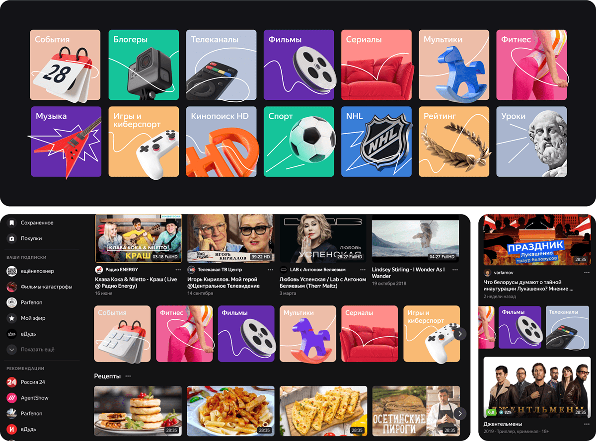
We used the same style for creating sections in the service.Design of My stream and My music. We use the same principles and techniques, but with a 3D object.

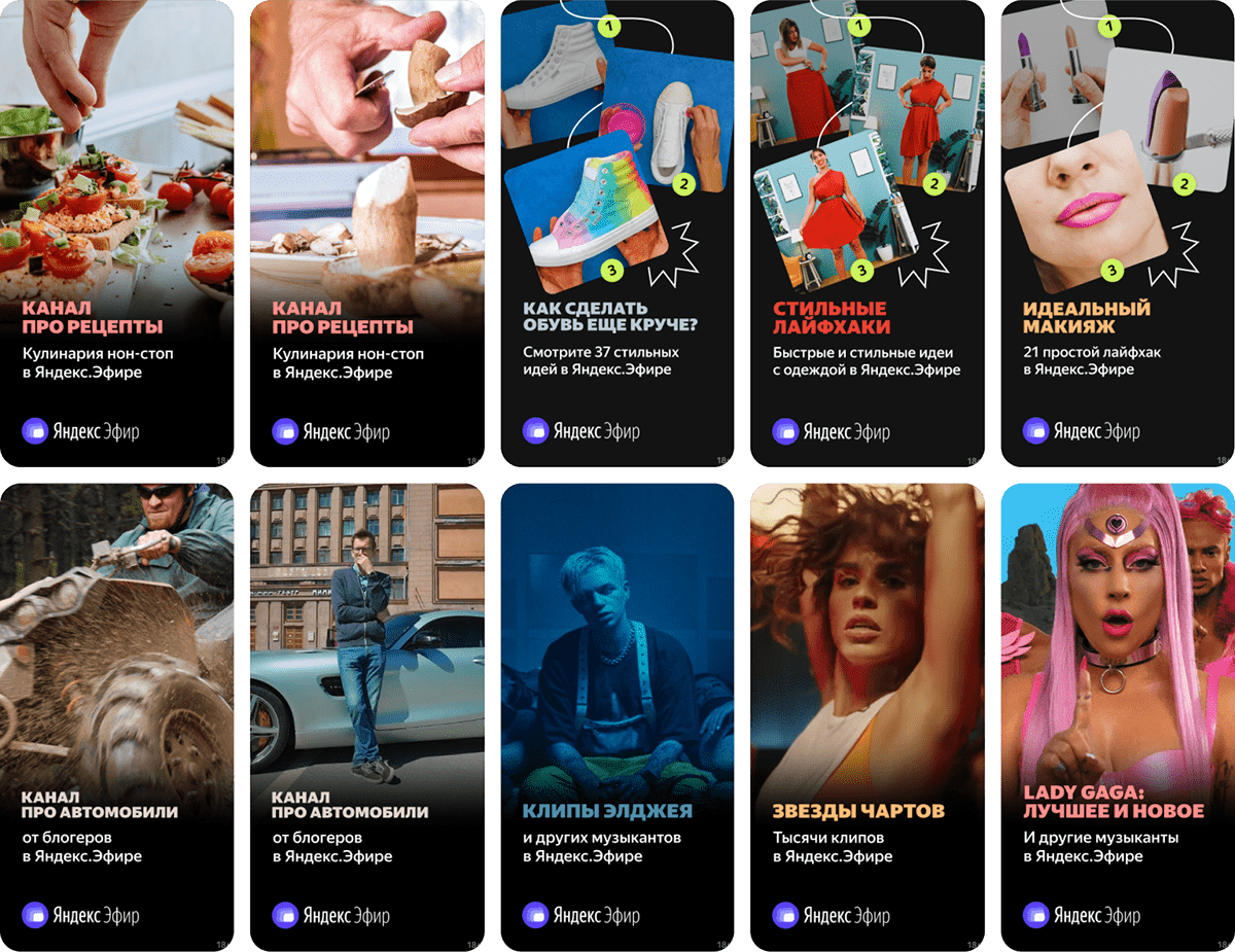
Illustrations
We started having to illustrate product communication in the interface, which we developed a common style and guidelines for. The style revolves around a 3D illustration, glow effect, and minimalism. We wanted clear and emotional illustrations in a succinct and simple style. A good example of this is the empty piggy bank when there aren’t any videos yet.
Not long before that, we created icons for categories. We wanted them to look good regardless of their size, so we developed an intermediate illustration style that has volume, but lacks the details used in larger formats.

Store design
To present our app in the store, our approach focuses on typography and the line, which is used in this case to emphasize key words in the text.


Performance
Content is especially important for these formats. By repeating techniques, we combine different genres and emphasize the service that encompasses them all. Bold typography conveys the message, while the line adds details to more complex subjects.
Communication with bloggers
We didn’t use to have any in-platform communication with bloggers who came to Yandex.Live. To quickly remedy this, we came up with the following ideas: show pop-up messages in Yandex.VideoHub, add onboarding to the platform, and start sending push notifications and email newsletters. Different notifications are given when users sign up, create or block a channel, and enable monetization. This is where illustrations really came in handy: it's really difficult to show someone how to block a channel using just a photo.

Advertising campaigns
Every advertising campaign starts with an idea (usually backed by insight) that leads to a script and message. Then, we choose the techniques, emotions, and visuals that best convey this message. How should the viewer feel after watching? What should they remember? This all has to match the product and its style. This year, we launched a few of these campaigns.
Advertising campaign for bloggers
Idea: Show how bloggers join Yandex.Live.
Message: Put yourself on Yandex.Live, and others will see you there.
Impression: We're a cool new service, join us and be cool, too.
Solution: We shot our ad like a fashion show to make it seem chic. Our subjects walked through a "tunnel" and emerged in Yandex.Live. We also wanted to showcase the bloggers that joined us and share their personal story. For example, Arkadiy Gritsevskiy is a pizza-flipping virtuoso, and Katia Adushkina is an exceptional dancer. That's why each blogger got their own "tunnel" that highlighted their unique features. We used color correction (mostly cold shades) and music associated with a modern digital service.
The project team came up with the idea, and the "7.47" internal creative agency at Yandex helped bring it to life.
The photo shoot was used for banners, the landing, product design, and SMM. Here, we used the service's typical bold typography and minimalistic design, as well as included the image of a glowing screen and the metaphor of Yandex.Live as a portal.

For TikTok, we made original looped videos that were more in line with the content on that platform.
video director: Natalia Bazina
production: bakehouse
production: bakehouse
"Fall" advertising campaign
Idea: Yandex.Live has a lot of cool videos, all thanks to the bloggers who are ready to produce content 24/7.
Message: Hundreds of bloggers constantly make videos...so that you can constantly watch your favorite channels on Yandex.Live.
Impression: Create a "wow effect" by demonstrating that bloggers on Yandex.Live can tirelessly do what they love while you watch.
Solution: To convey this message, at the beginning of the video, we narrowed the frame to what people are used to seeing and gradually expanded it to tell the whole story. For example, while watching the video, we see the girl has managed to crochet her entire room, and the comedian has been streaming for months. At the end of the video, we bring up the interface and see that it all happens on Yandex.Live. All three stories are shown as the continuation of one another in a match cut, which again emphasizes the fact that the process never ends.
copywriter: Natasha Polyanichko
video director: Slav Syrkin
production: Bakehouse
video director: Slav Syrkin
production: Bakehouse
Result
The most important thing we've achieved in the past year, through the joint efforts of a small team of product and communication designers, is shaping the clear principles and visual techniques to be used in product and brand communication. Yandex.Live finally got a unique style that meets its business goals and makes the audience aware of the product.
Art director/designer: Dmitriy Vershinin
Product art director: Roman Shadrin
Designers: Artem Kakourov, Andrew Serbul, Lena Sidenko, Nastya Belousova, Masha Panihina
Illustrator: Evgeniy Semiryakov
Marketing team: Anna Afinskaya, Olga Elizarova, Aleksandr Shirokov, Anna Timohina
Designers: Artem Kakourov, Andrew Serbul, Lena Sidenko, Nastya Belousova, Masha Panihina
Illustrator: Evgeniy Semiryakov
Marketing team: Anna Afinskaya, Olga Elizarova, Aleksandr Shirokov, Anna Timohina
Thanks for watching


