Visual Identity
Engenheira Leitora
Engenheira Leitora ("Engineer Reader") is a brand produced by Natália Moraes, creator of digital literary content. The brand has this name to make a combination of her academic background as an Engineer, an exact science, with her passion for reading books, a human science. The goal is personality and also to make a provocation about the union of the two divergent areas.
The visual identity created for the Engenheira Leitora brand conveys the desired attributes through the logo and its variations, typographic family, color palette, and graphic elements. All the components of the visual identity complement each other to form the personality of the brand.
Client / Natália Moraes
Project Type / Visual Identity
Place / Porto Alegre, Brazil
Year / 2020

Mapping
Engenheira Leitora brand is...
...Wise without being traditional.
Sensitive without being shy.
Bold without being arrogant.
She is adventurous, dreamy, and free.
Reliable, cheerful, and friendly.
Bold without being arrogant.
She is adventurous, dreamy, and free.
Reliable, cheerful, and friendly.
She creates content. She studies, reads, and writes. She communicates with people.
She has an image of herself. She is a humanized brand.
She has an image of herself. She is a humanized brand.
Development
The Development Stage was guided by the previous stage of Mapping. The conclusion was that the figure of the brand owner was an indispensable element. It was also essential to pass the image of reading and wisdom.


Typography

Color Palette

Brand Applications
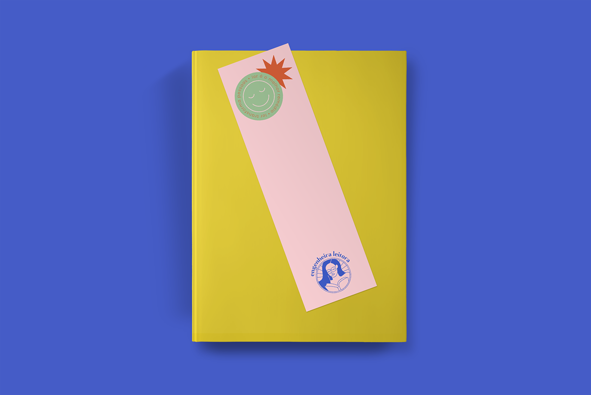
The Engenheira Leitora brand has a visual identity very rich in graphic elements, such as the ten-pointed star and the smiling sticker. Additionally, a tagline was thought to identify the brand "reading transforms people."
Along with the tagline, it was selected some phrases that will be used as support to create the brand personality. These phrases appear most of the time in wavy format, another characteristic of the visual identity.
All these elements appear in the applications presented below.


Graphic elements are an essential part of a visual identity and serve to make it stronger and more representative. Besides the main graphic elements, icons have also been created for the visual identity of Engenheira Leitora. These icons are related to the brand universe and will help in the creation of future materials.