VR Spice has been in the market for more than 13 years.
The brand has not been consistent with its packaging or identity hence people have not been able to identify the product.
A new identity for the brand is to make its presence known in the market and should be able to grasp the attention. In order to achieve it, the logo has to be efficient and effective in most of the spaces.
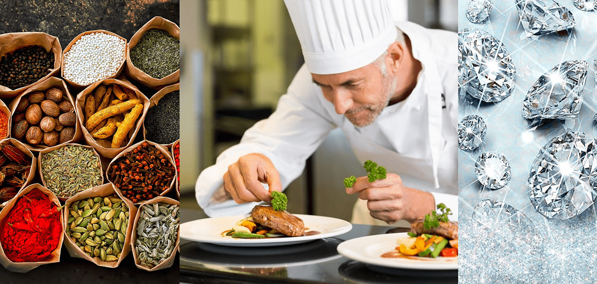
Spices are parallel to precious jewellery. Spices spark the flavour of your food like a jewel makes their host shine. It gives emotions and makes it enjoyable, it is considered as a luxury of food.


The idea is to appreciate spices in every form from
the manufacture to the final recipe.


The mark portrays the emotions of the flavor it produces.


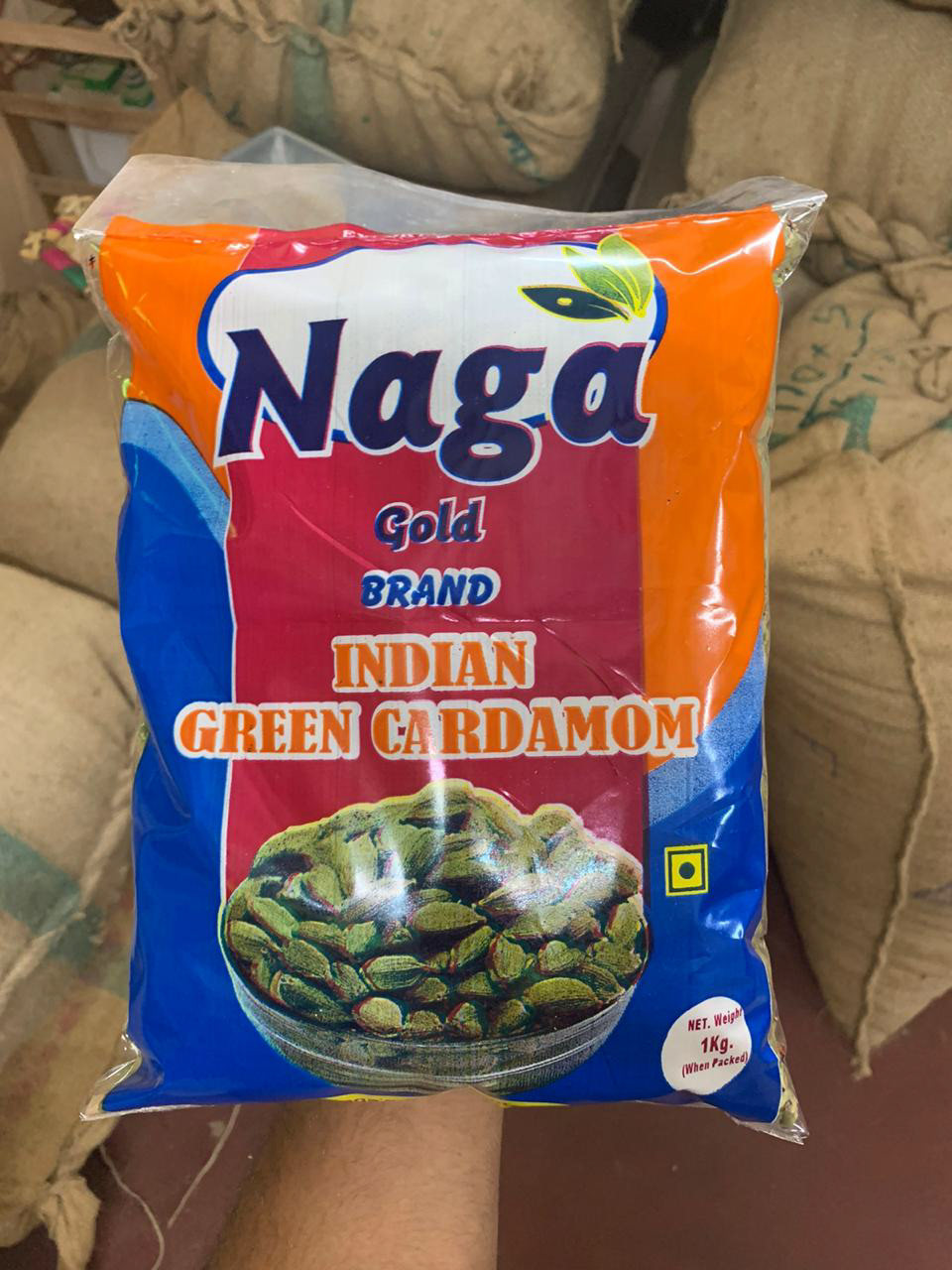
Before - The packaging that were in use
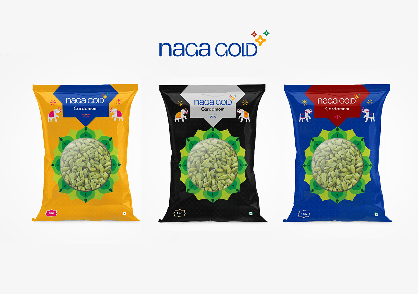
The Naga Gold cardamoms are a product of VR spices which they are famous for in the market. In Order to represent with the new branding the naga gold was also given a new typeface logo and also the packaging design was in the lines of premium yet conventional for the local market.