Samanta - Lingerie
We had a pleasure to cooperate with Samanta - Lingerie. Handcrafted, underwear from Maków Podhalański - Poland. Company with a long tradition. Inside their own sewing room with passion and creativity, in almost 25 years arise, unique underwear for a beautiful womans.
.
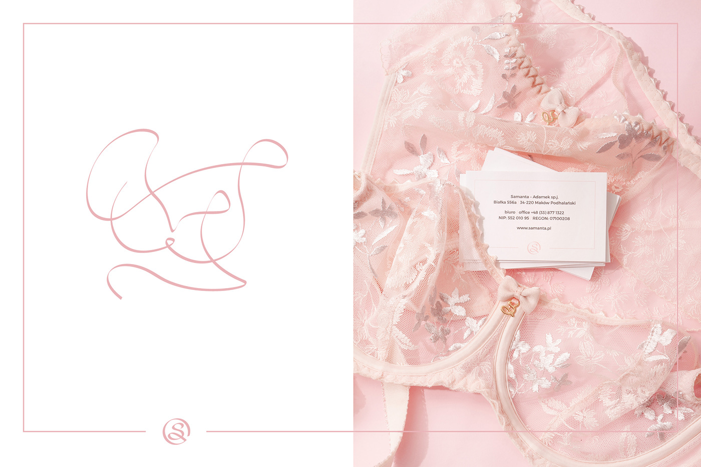
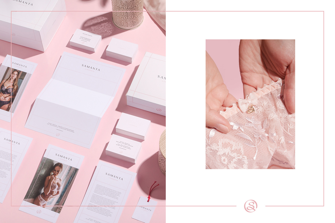
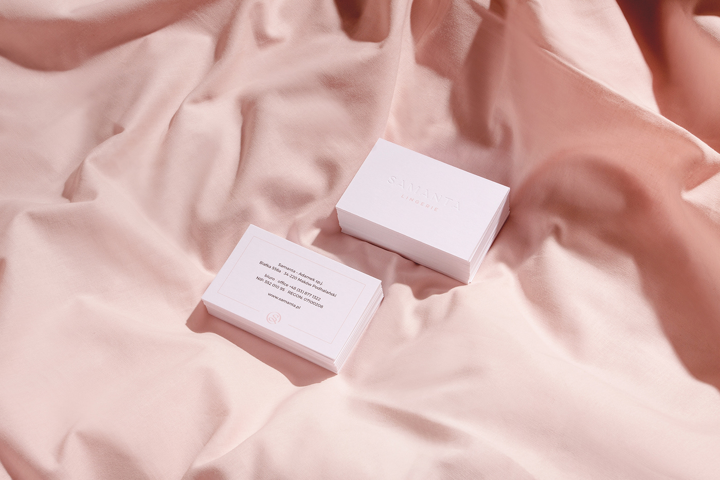
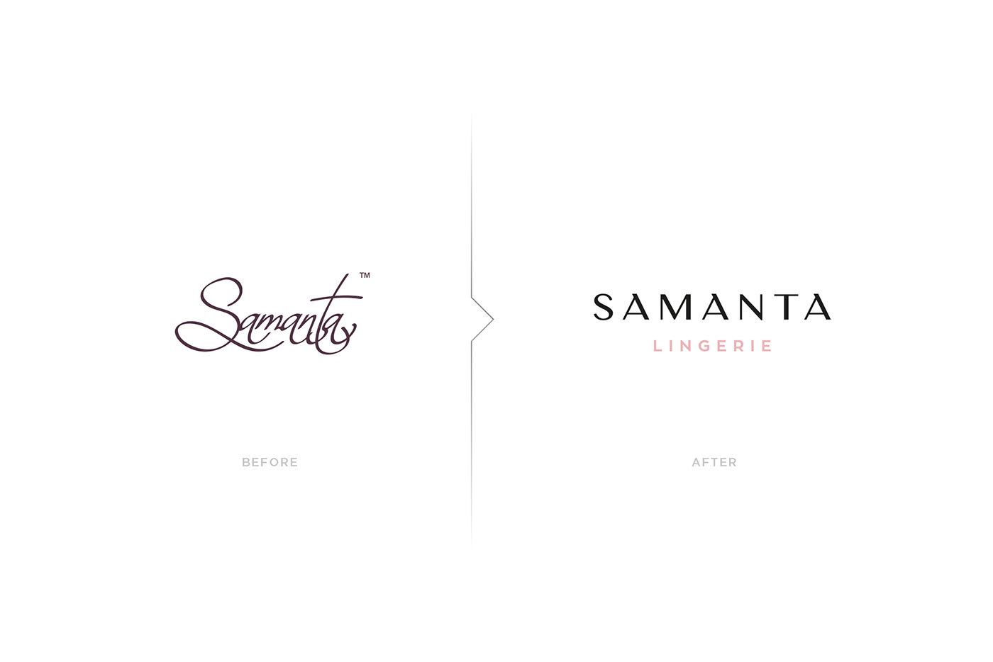
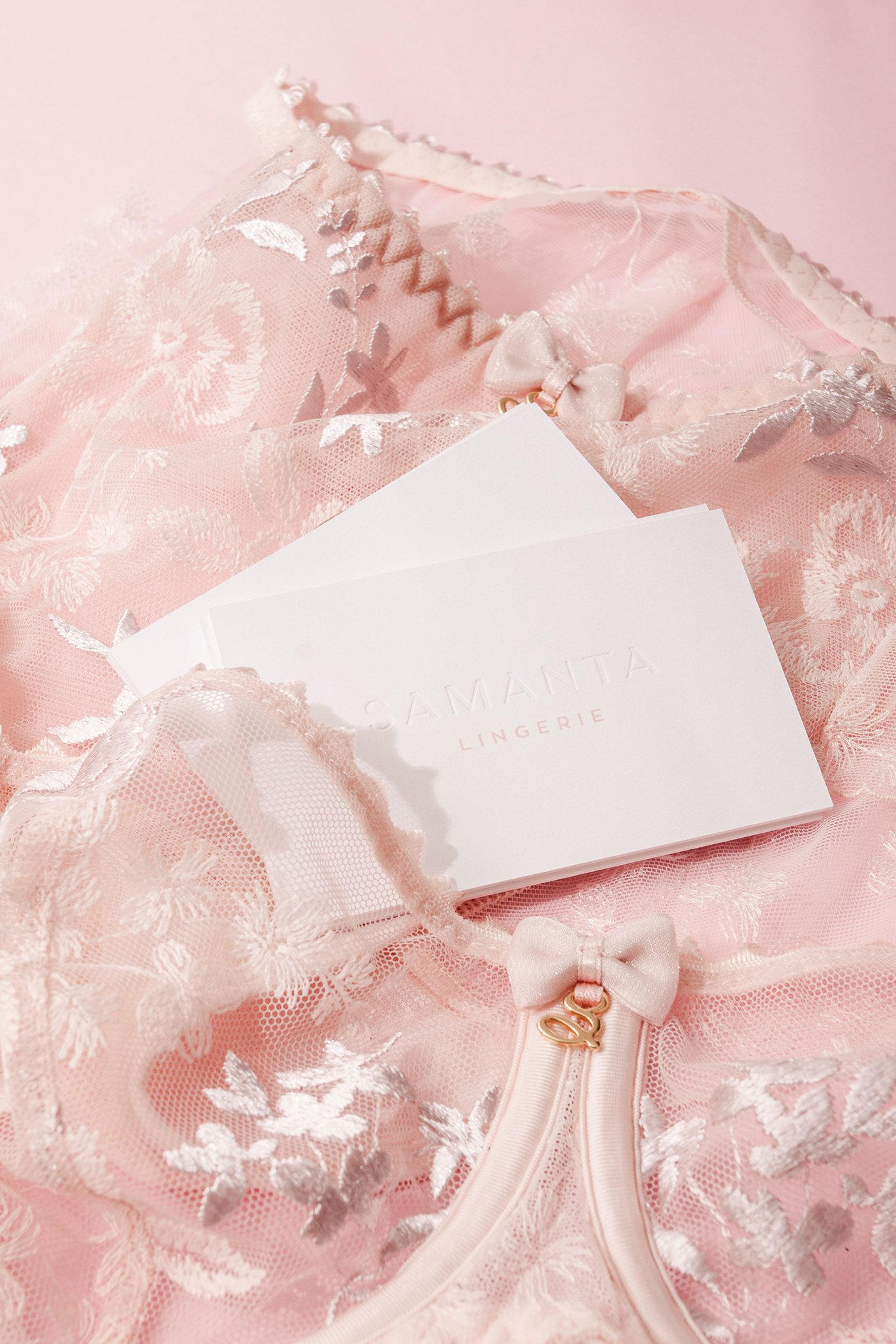
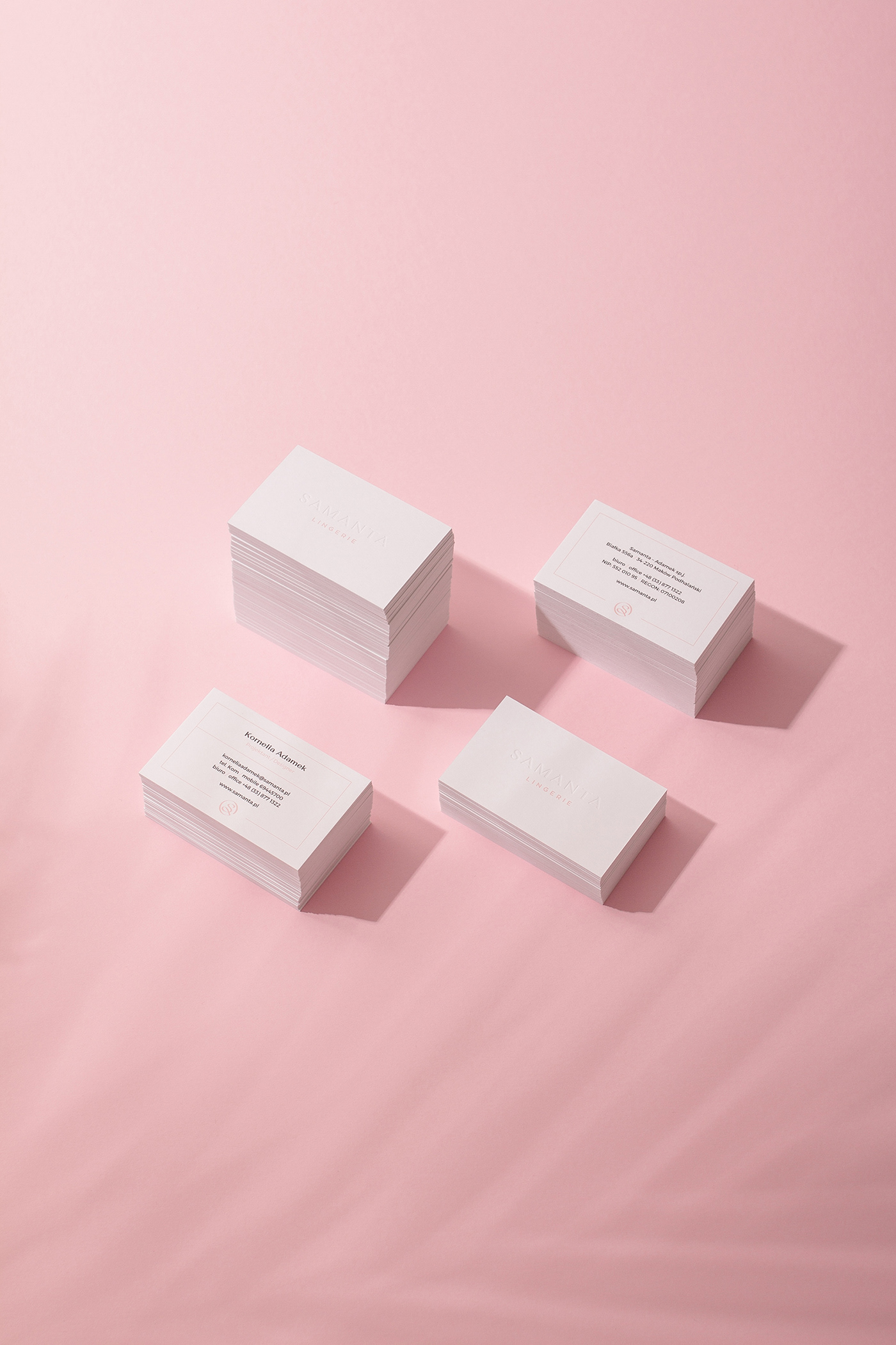
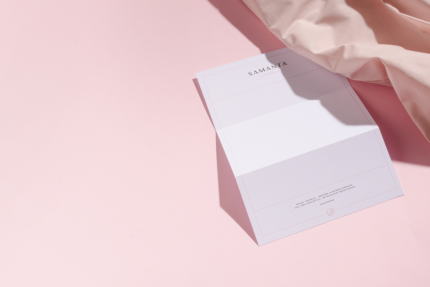
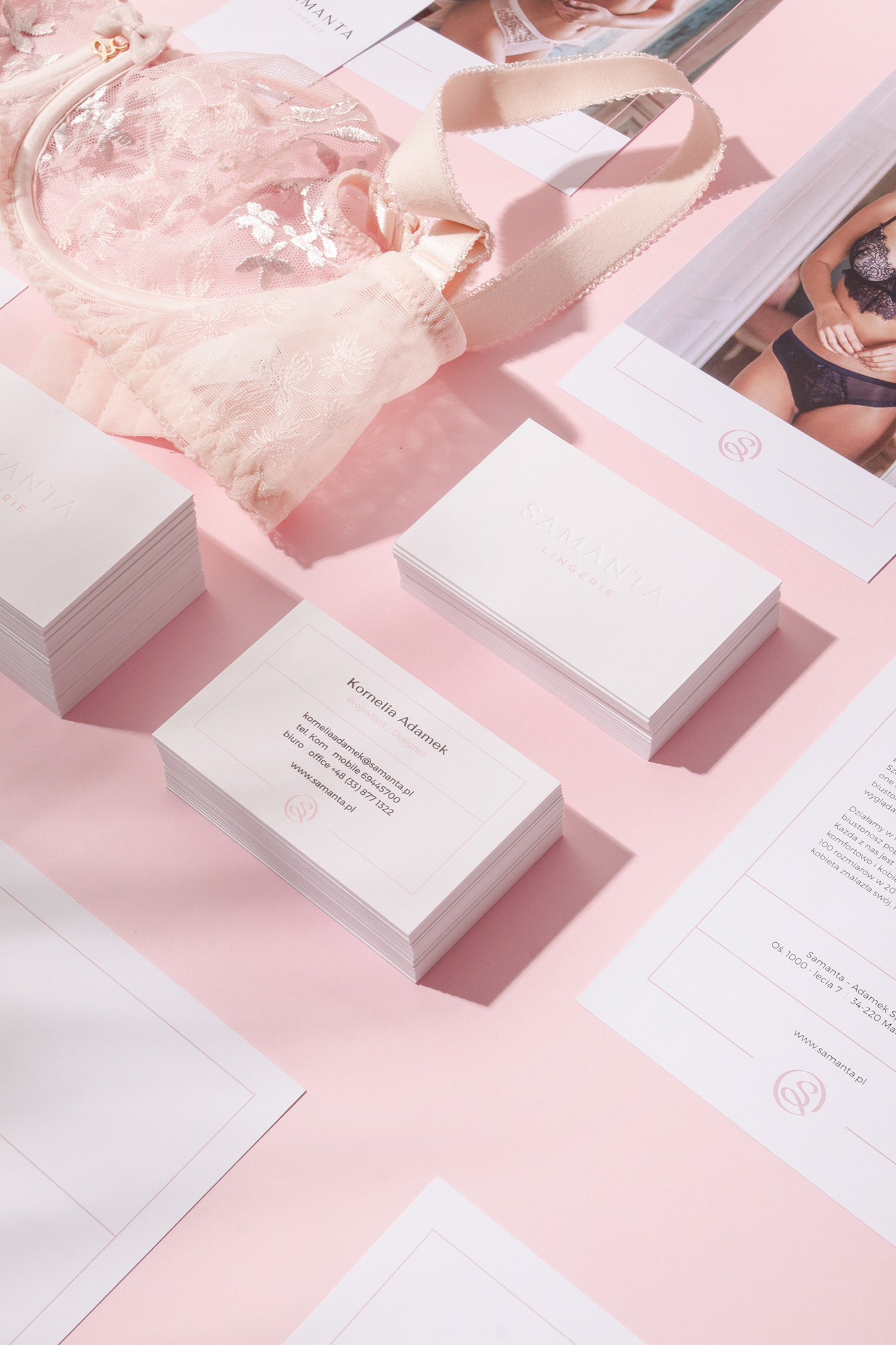
They came to us for advice for their actual look of the company materials. This is how journey to rebrand of the company began. Maintaining harmony in the typography with modern and simple look but in the same time communicate professional services. We applied embossed logotype effect. It gave us premium and lovely look with very sensual feeling which in our opinion in lingerie is necessary. In the next step we moved visual system to whole materials of the company like - boxes, business cards, bags, tags, compliments cards and others. That was our mission. Outstanding attention to detail in their products we translate to brand identity.
.
Services:
Rebranding of the Visual Identity
Packaging
Art Direction
Photography

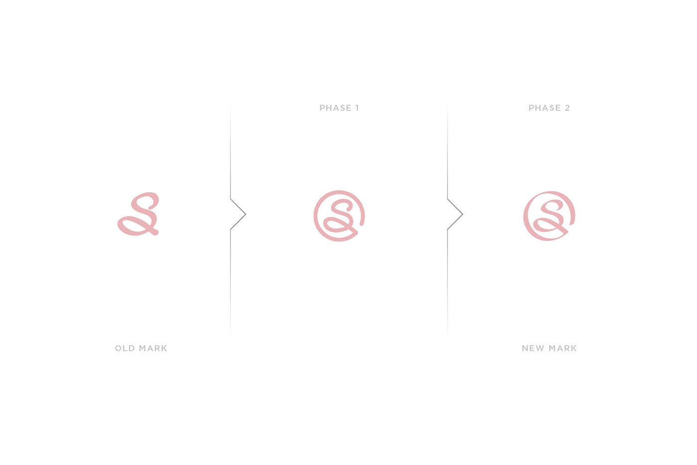
Samanta Lingerie in old brand identity used additional brand elements which was letter "S" from the logotype. We took this element and we give him new life. First of all we close this letter to the circle. Next step was give him sensual vibe. Calligraphy style of the line was perfect decision to implement it to this place. Now it looks like soft ribbon. We decide to move forward with this story and style of the implementation which we can use in illustration which we made for Samanta. Never ending story about pdoducts or womans beautiful shapes of the body fits to lingerie sensual world.