
36 Days of Type 2020
As with last year's edition, I treated 36 Days of Type as an exercise in pushing the boundaries of readability of each letterform, as well as a way to explore and solidify my personal style.
Last year was stylistically all over the place. This year I strived for consistency and minimalism. What I didn't plan for though was how unpredictable this year will turn out to be and how it will basically co-author the project.
The series were nominated for the Design of the Year award by the Association of Polish Graphic Designers (STGU).


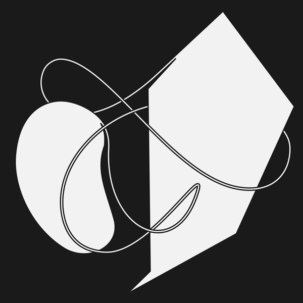
A–F. Just in case I pushed the said boundary too far.
When the covid happened, I realized some of the letterforms started getting a little weirder than I initially planned.

I is for ice age. Unrelated, but woke.
Meanwhile, as the pandemic was unfolding, the whole world locked down and everything became surreal.
At some point, I realised I couldn't keep doing this as a fun escape anymore; the reality started creeping into the designs. An innocent challenge started shifting towards some sort of a visual diary, reflecting everything that was happening around me.
J is for home sweet home. I made this around the time when the anxiety and isolation of lockdown started kicking in.
K is for kuarantine diet.
In that way, 36 Days of Type became my way of processing and venting the experiences and emotions of the unexpected weirdness of 2020, and helped me stay relatively sane throughout its run.

L is for learning curve.
Sometimes it felt good to retreat to the simple pleasures of exercise in aesthetics and rules of composition (contrast, rhythm, movement) though.


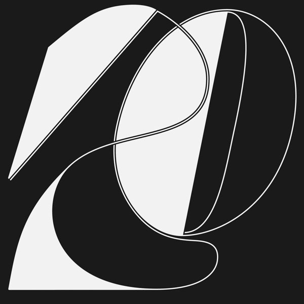
M & N. No hidden meanings here.
O is for osmosis. Back to processing the reality of social distancing.
I was switching back and forth between the pure aesthetics and the commentary; Sometimes I couldn't decide between both.


2 variants for Q. Q could well be the letter of the year, if you ask me.


R, S, T, U, V, W, X, Y
Looking back on it, I think Z, 0 and 1 were done when I felt the hardship of social distanced life the most.
Caption from the time: "No, this has nothing to do with anything that's currently going on around the world, why would you ask? What a silly thought. Just a letter Z."
"The underappreciated role of the slash in zero."

"1 can dream."


Slightly tired but still growing and self-supporting three.

4 is for shifting sleep patterns.


5 is for pique interest. Or perfect timing. (This might have been about dating during the pandemic. I offer no further commentary on the matter.)

6 is the number of times you need to say goodbye to your needy friend in order for them to let you hang up.

7 is for those lying wannabes that pretend they add depth to the character, when in reality they're just a single outline (they're everywhere watch out)

8 is the amount of bowls of ramen I'm going to eat the day this whole sh*t is over.

"Is it tired? Is it happy? Who's there to know? Why can't it be both? Its eyelashes sure seem to have grown longer than I remember, as has its beard, for that matter!"

Boy was it hard but fun. (That's what she said.)
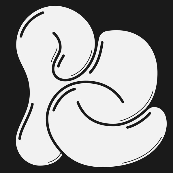
Bonus round: 2 ampersands

A perfectly rational &.

Science fact: If you combine two ampersands together, it kind of looks like a happy French bulldog. Or a cat, I guess. Point is, it looks happy. Happy ampersands, y'all.
Appendix: The Rejects
Since it's always fun to look at the process: I made dozens of variations for almost every letterform, here are just some of them.


