Client/
TAAK Arquitectura
Project/
Branding and social media
Brief/
TAAK Arquitectura is an architecture firm in Monterrey, Mexico that designs sustainable spaces with a modern look. TAAK is a word in Mayan that means "Union" or "Adhere" that applied to the brand means the union between architecture and nature. Sustainability and nature are the main values of the brand, and the client sought to capture them through branding, uniting them with the main concept that is architecture.
Solution/
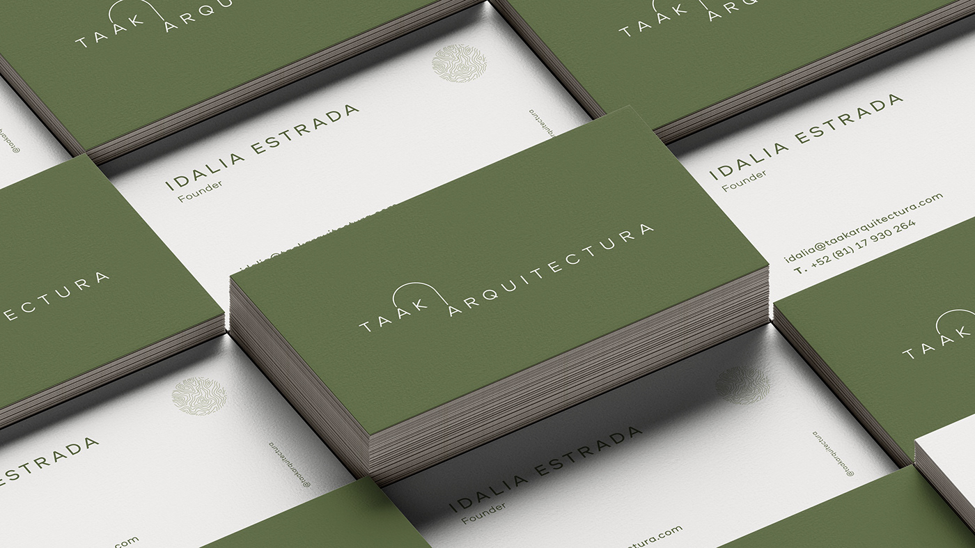
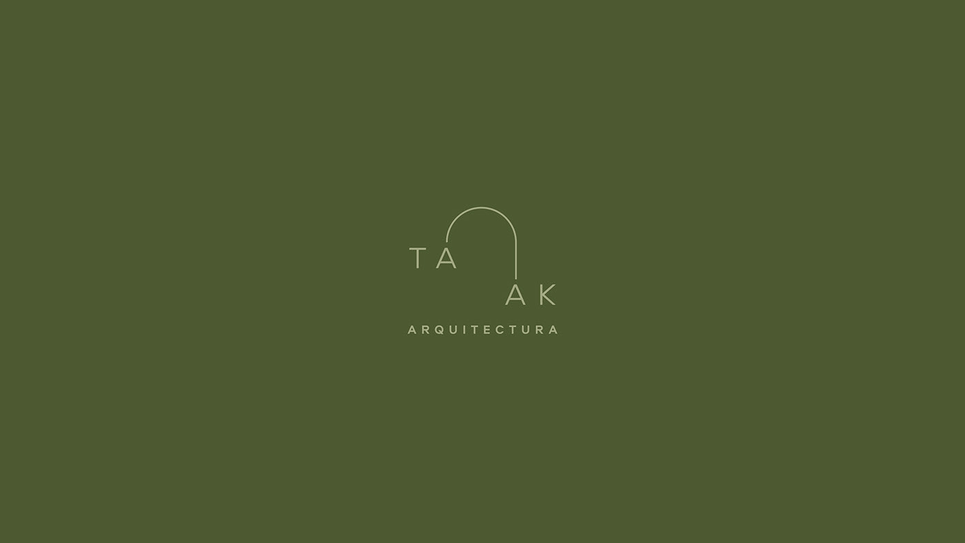
An arch was designed that connects the syllables of the brand "ta-ak" to symbolize the union of architecture and nature. To reaffirm the concept of sustainability and nature, it was chosen to use earth tones with a palette that contains green and gray tones that also connect with the materials used in the works such as concrete, wood, among others.
Brand assets were also designed to accompany the brand. Inspired by the contour lines in the world of architecture, three stamps were designed that can be used in institutional materials and as additional graphics in social media.