Pato Selvagem (Wild Duck) is an independent magazine about exploring wild and unpopular places (as a coursework at my university). The goal was create a visual identity and design a whole edition for the magazine with no theme restrictions.
The name connects directly with its purpose and shows there are no limits or or strict lines: let your will take you everywhere, anywhere! Afterwards, it was time to draw a symbol to represent the whole ideia. Obviously, I thought of a mad, serious-looking duck, but it took me dozens of different sketches and a few paper sheets to get something that could deliver that message and still look sharp.
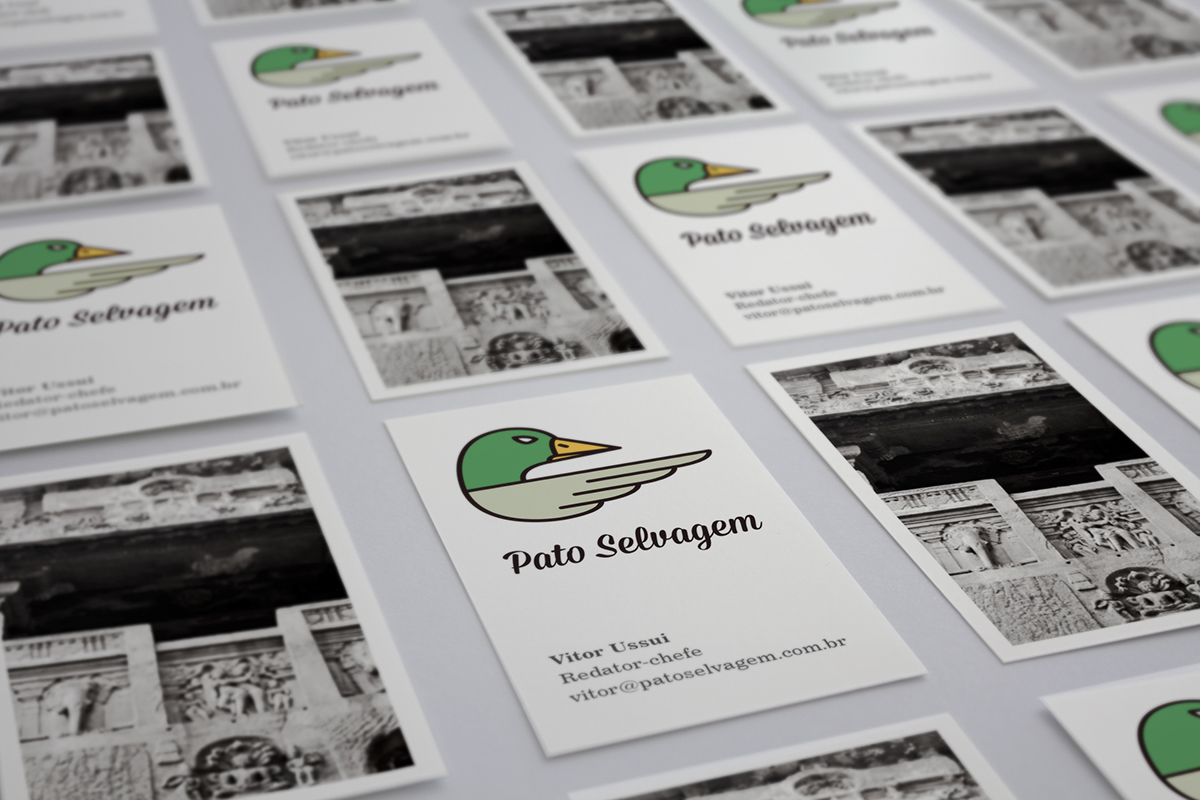
Even though the name seems a bit rebellious, the visual identity was built to represent a strong, elegant and, yet, fun brand.
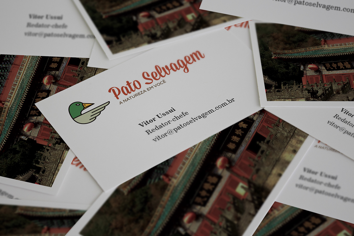
The symbol, despite being organic, shows a serious mallard, always pointing its wings forward. It leads to something new and different, going outbound edges and rules.
The colors were applied in a way to mimic the animal and to balance contrasting and warm tones.
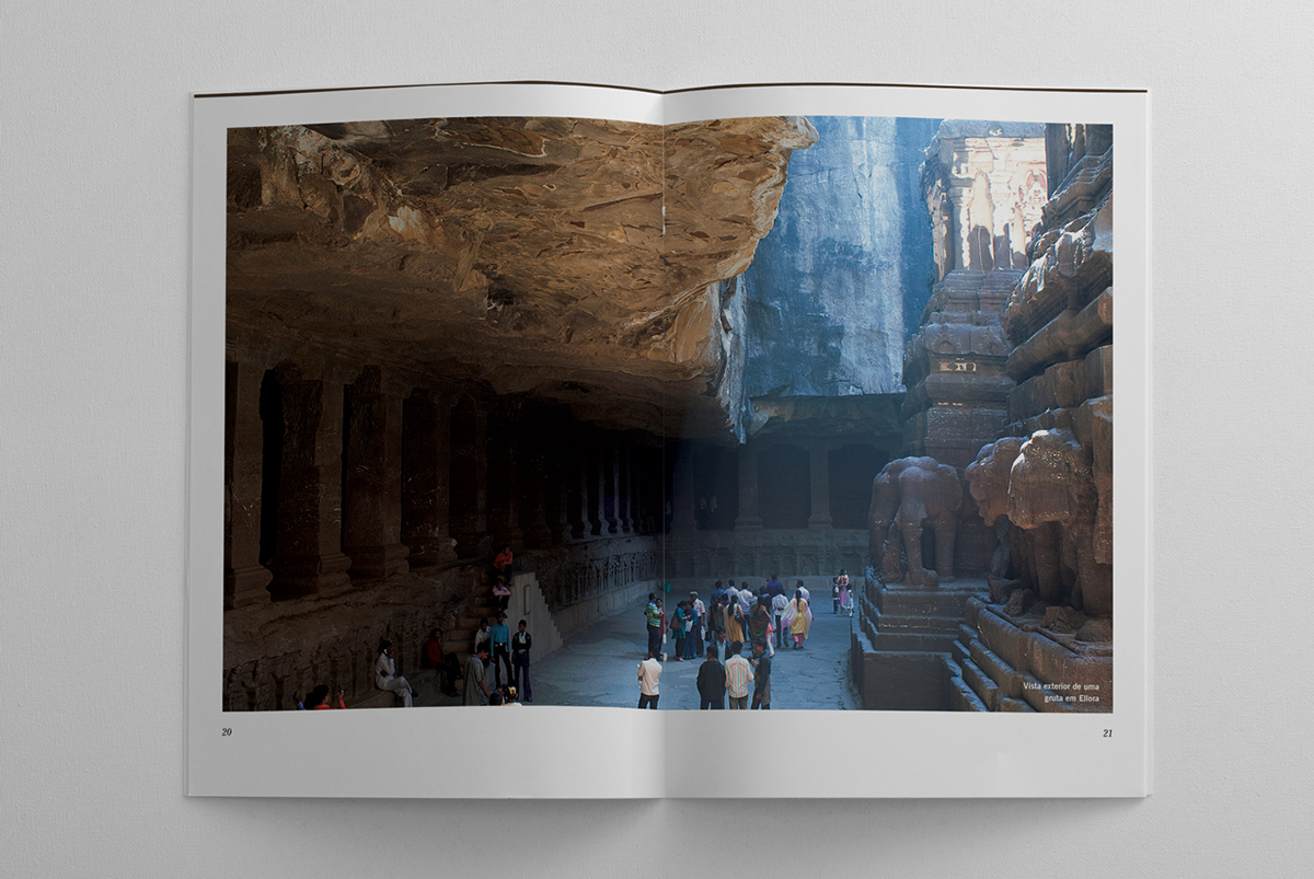
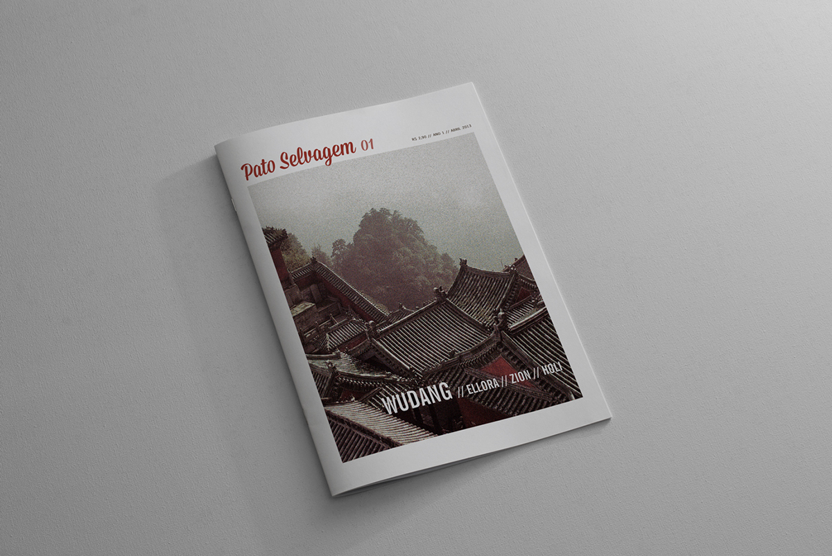
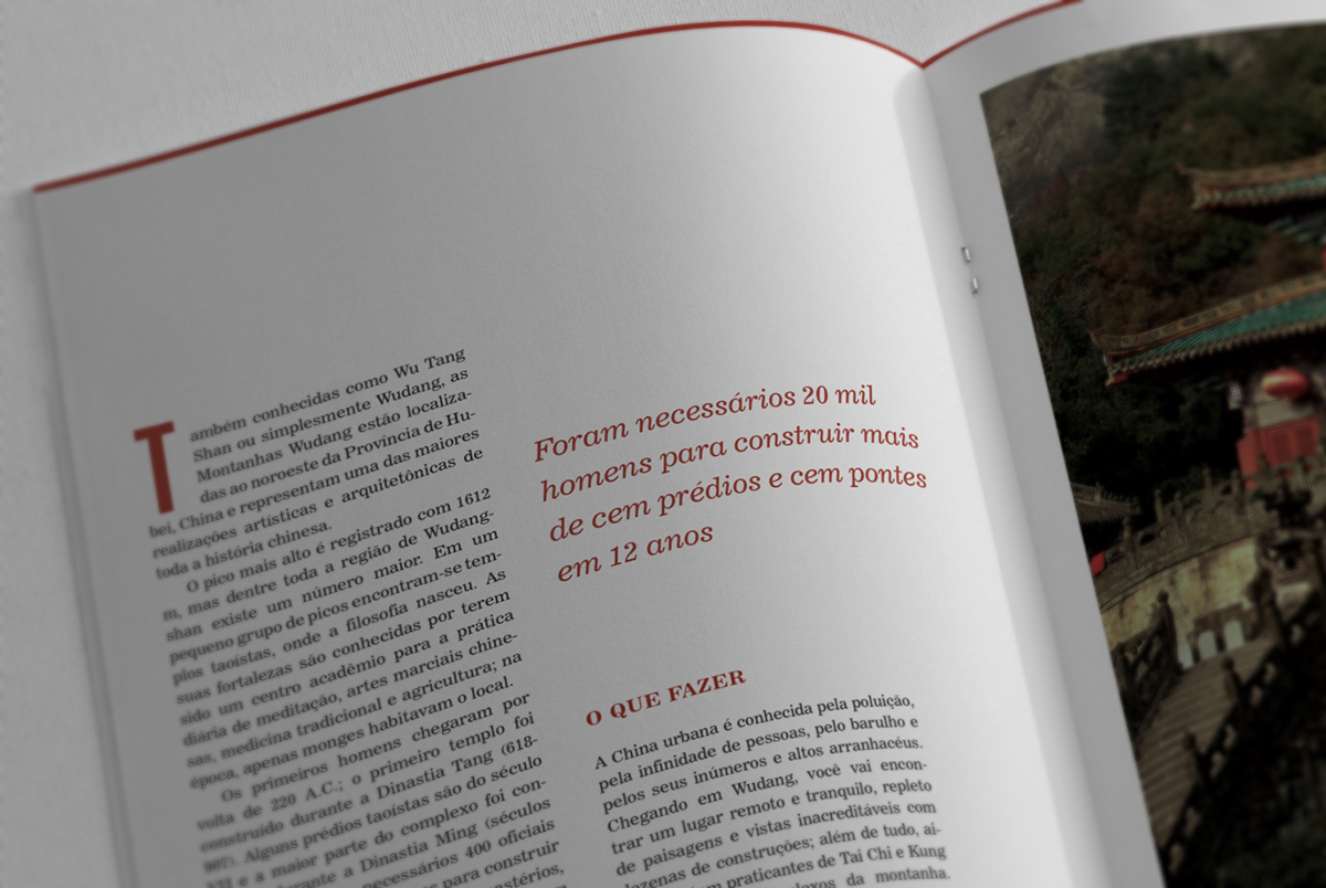
I searched for dozens of distinct places and most of them are located in Asia, so I figured I could use it as a main theme for this edition. Even though the written content is crucial for a magazine, the most important feature here is the set of photos; the goal was to pick the most astonishing and atmospheric images in order to urge the reader for more information.
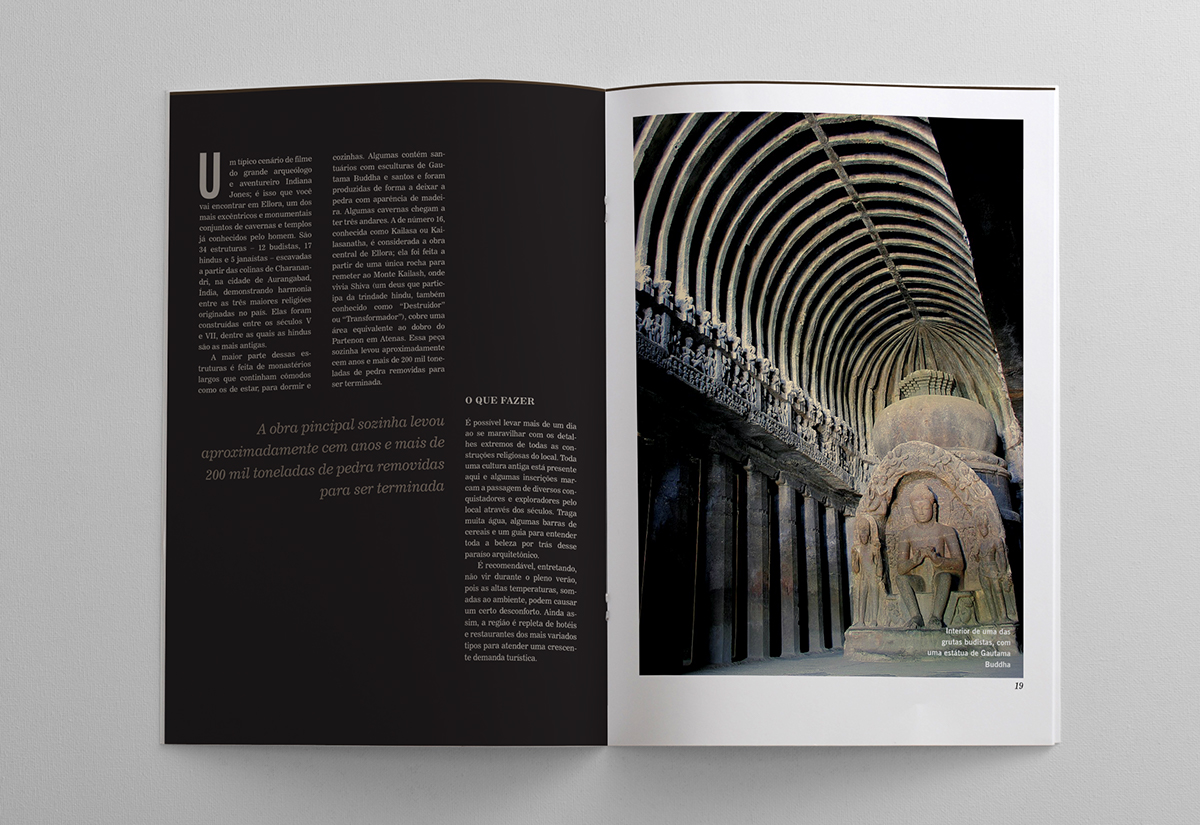
All articles tell some background facts and a bit of history and, later on, explain what can be done and how to get the most out of each wonderful place.

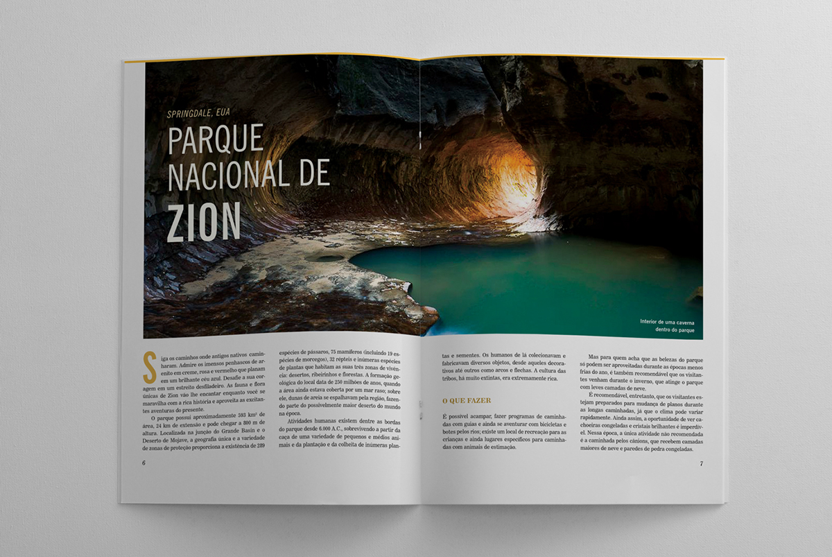

The editorial design was thought to be clean and incisive, but still elegant and attractive to the eyes. Since it's a magazine about exploring and trying new things, each page (except for the two-page photos) has a different layout. Still, all blocks were carefully laid on grids while intending to be dynamic, otherwise monotony would rise over time across the pages.
The photos follow the same principle: while the main article has a full double-page introduction with a unique stylized background, the others have contrasting ways of managing text and imagery.


This piece about Ellora, for instance, has a dark background on the text page in order to display progression and connect the colors with its theme: caves. The grid was also modified to adapt itself to the content and form a compelling set of interchanging blocks.