DEVELOPMENT STEPS 01 / The first step was to create key message
02 / The second stage was the process of sketching and inspiration with ideas
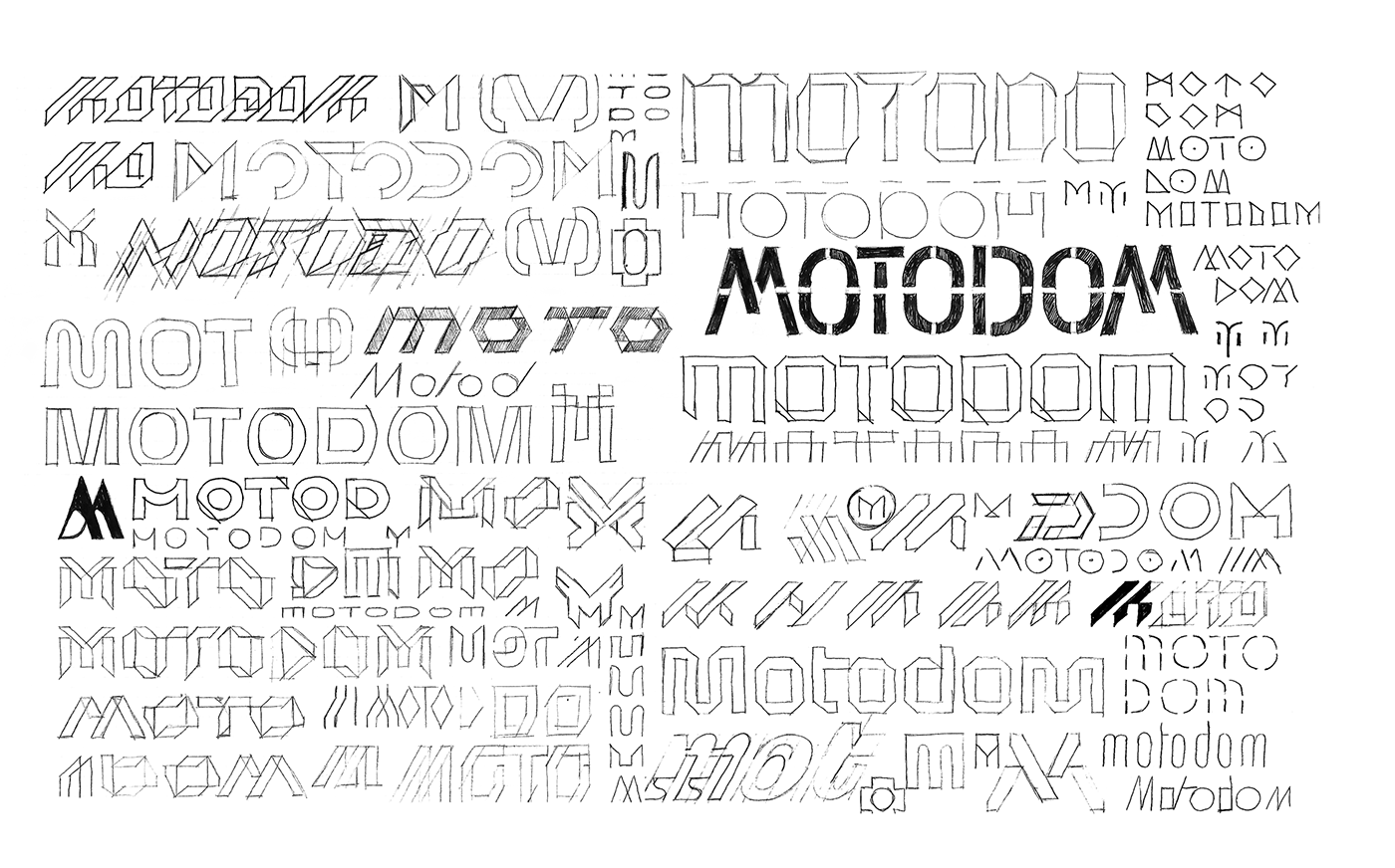
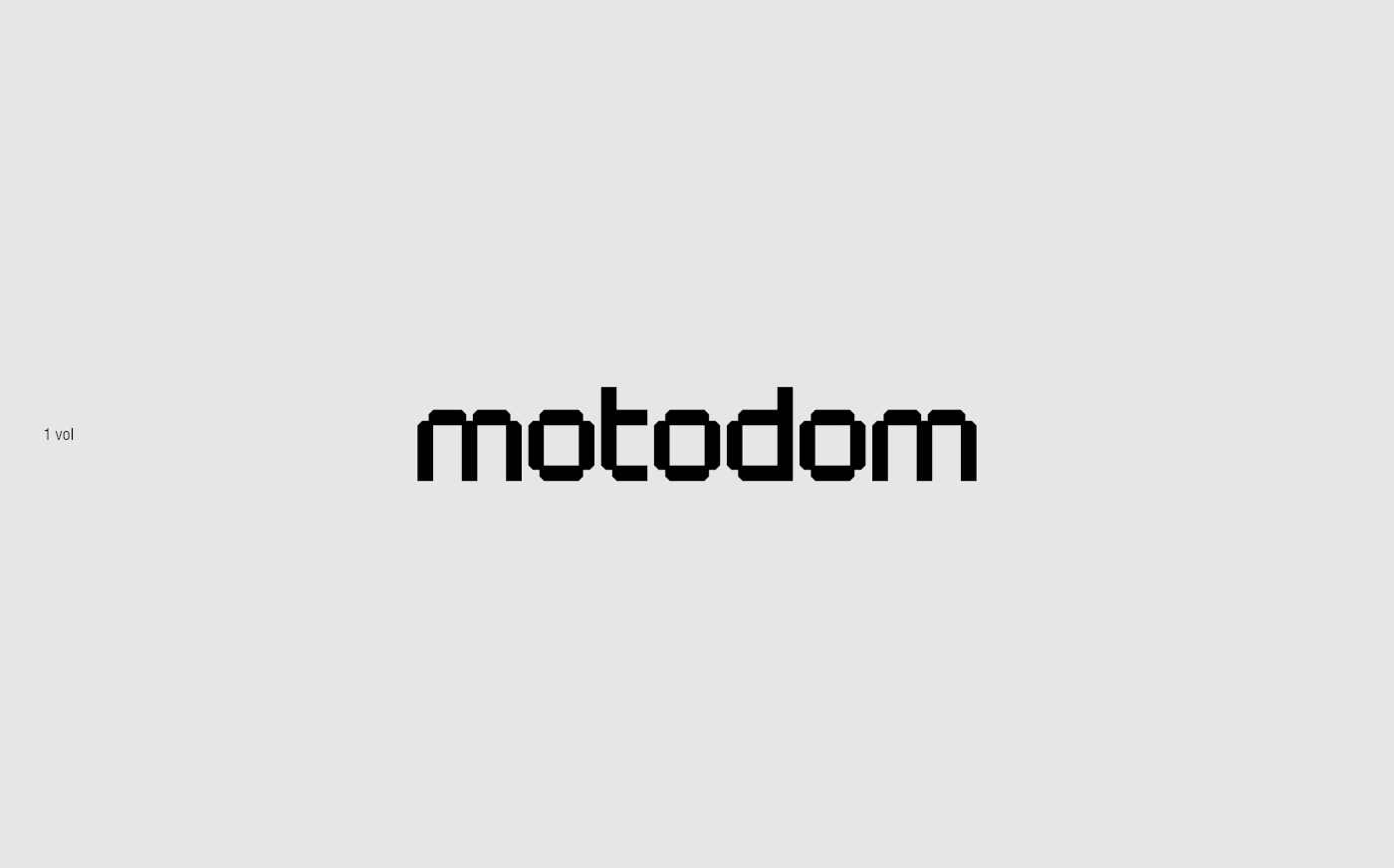
03 / Then the process of working out different logo options began
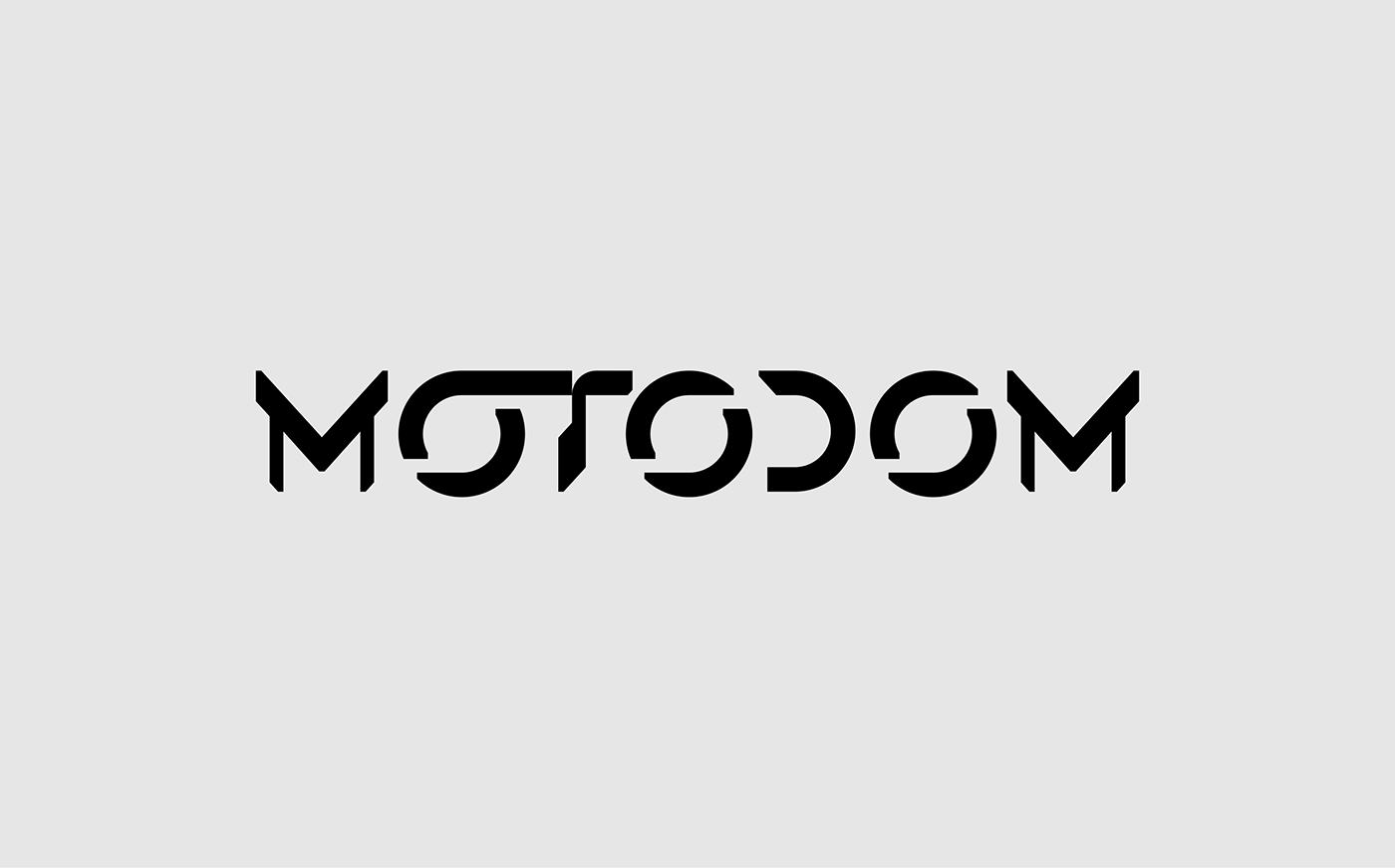
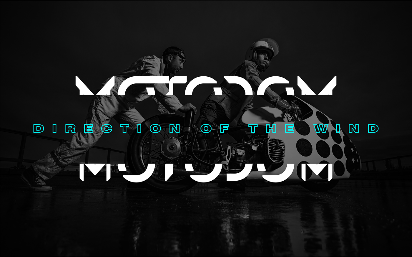
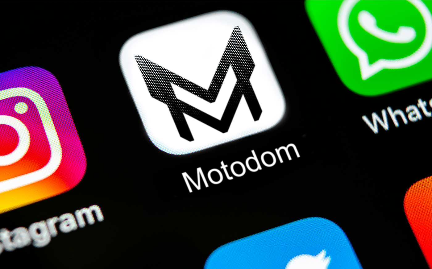
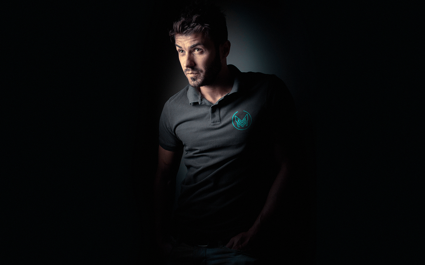
04 / Final logo version agreed by the customer
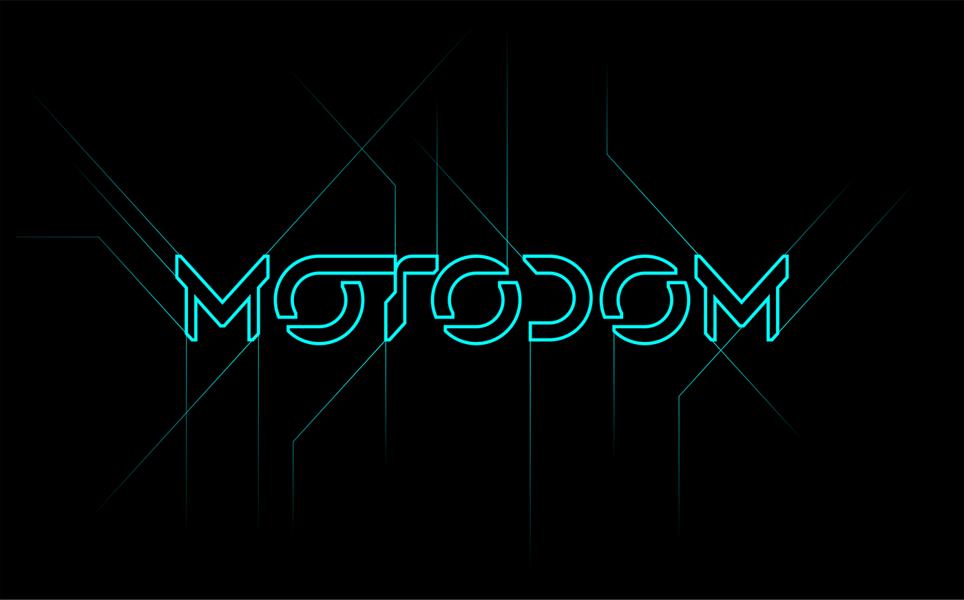
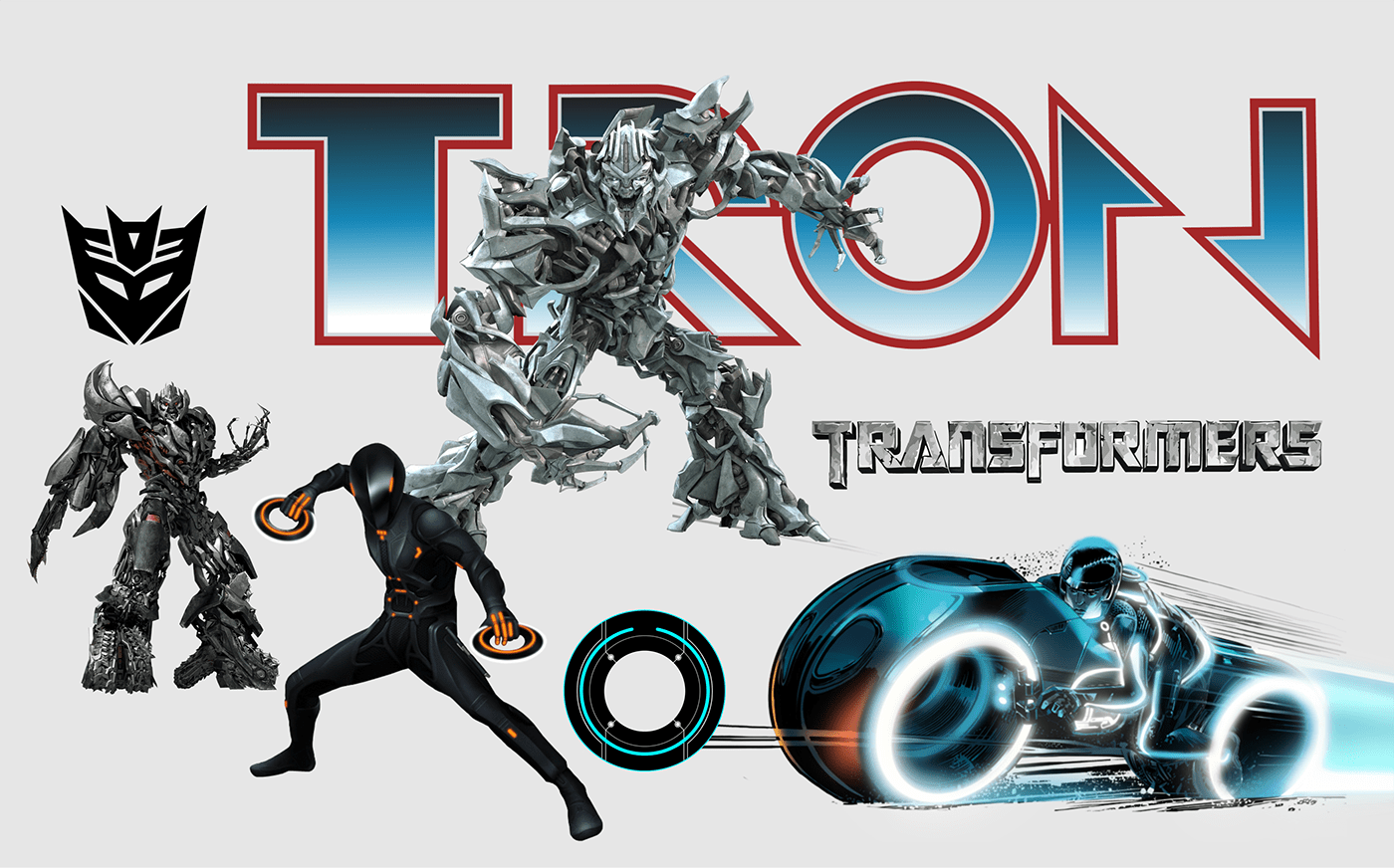
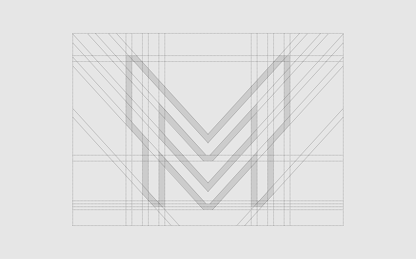
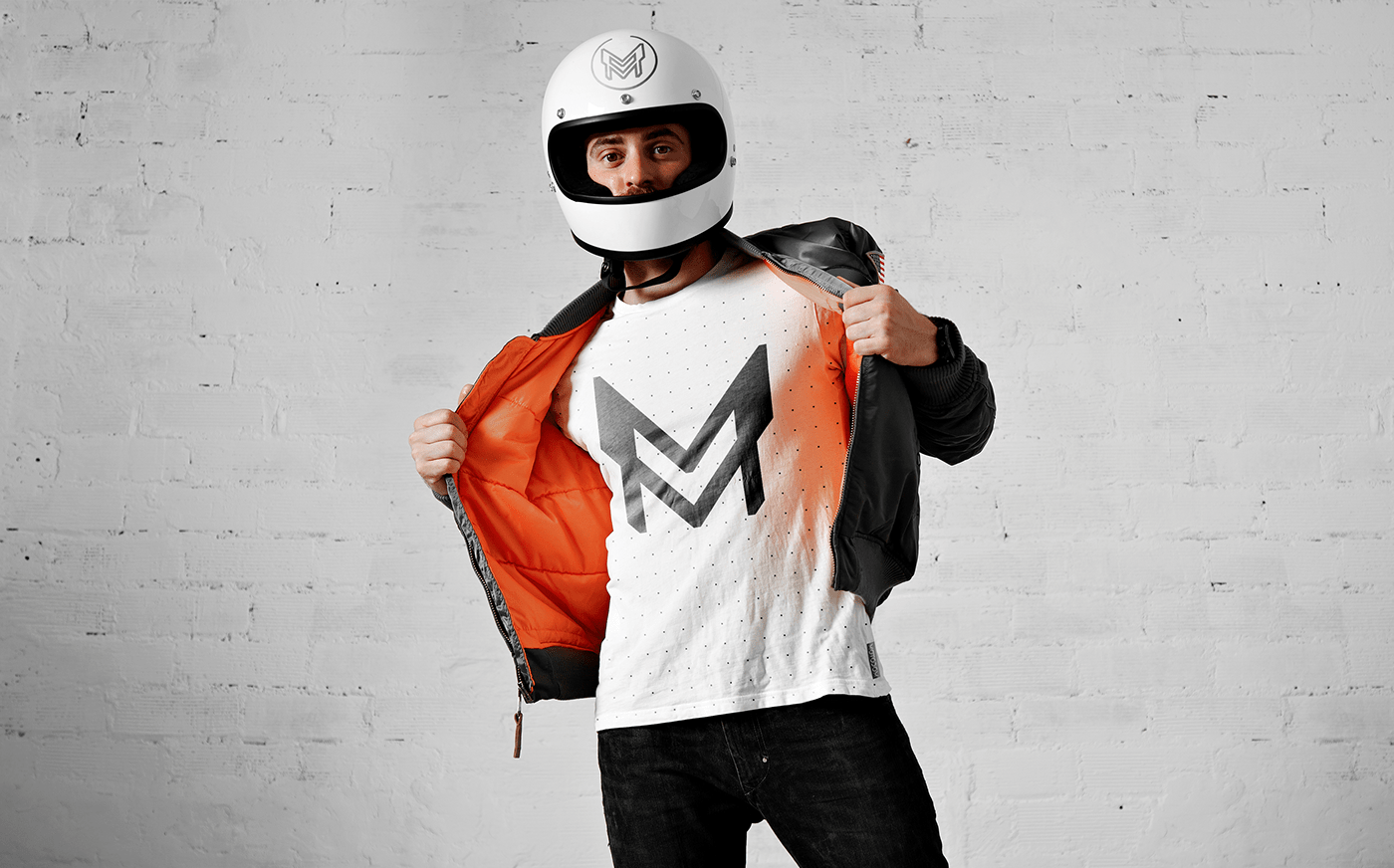
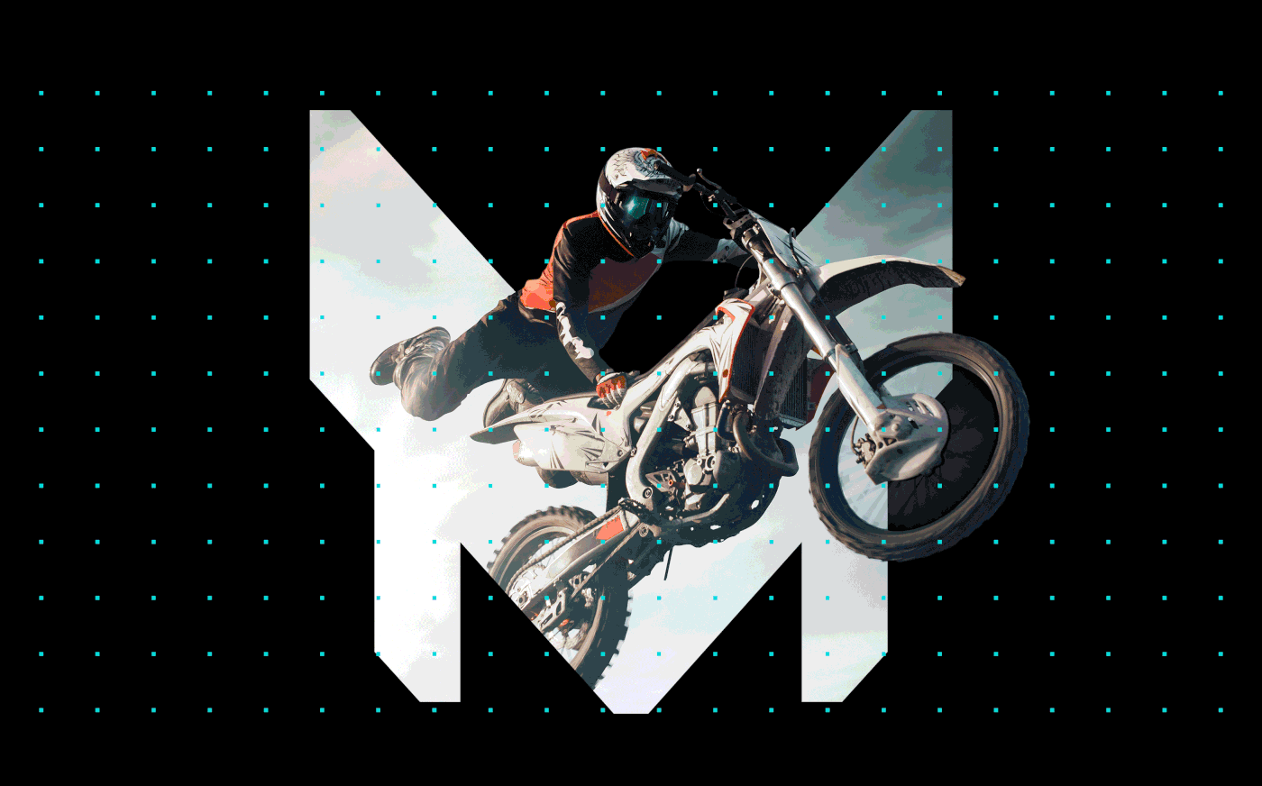
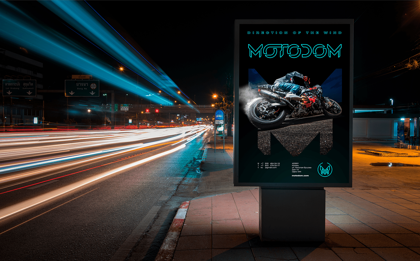
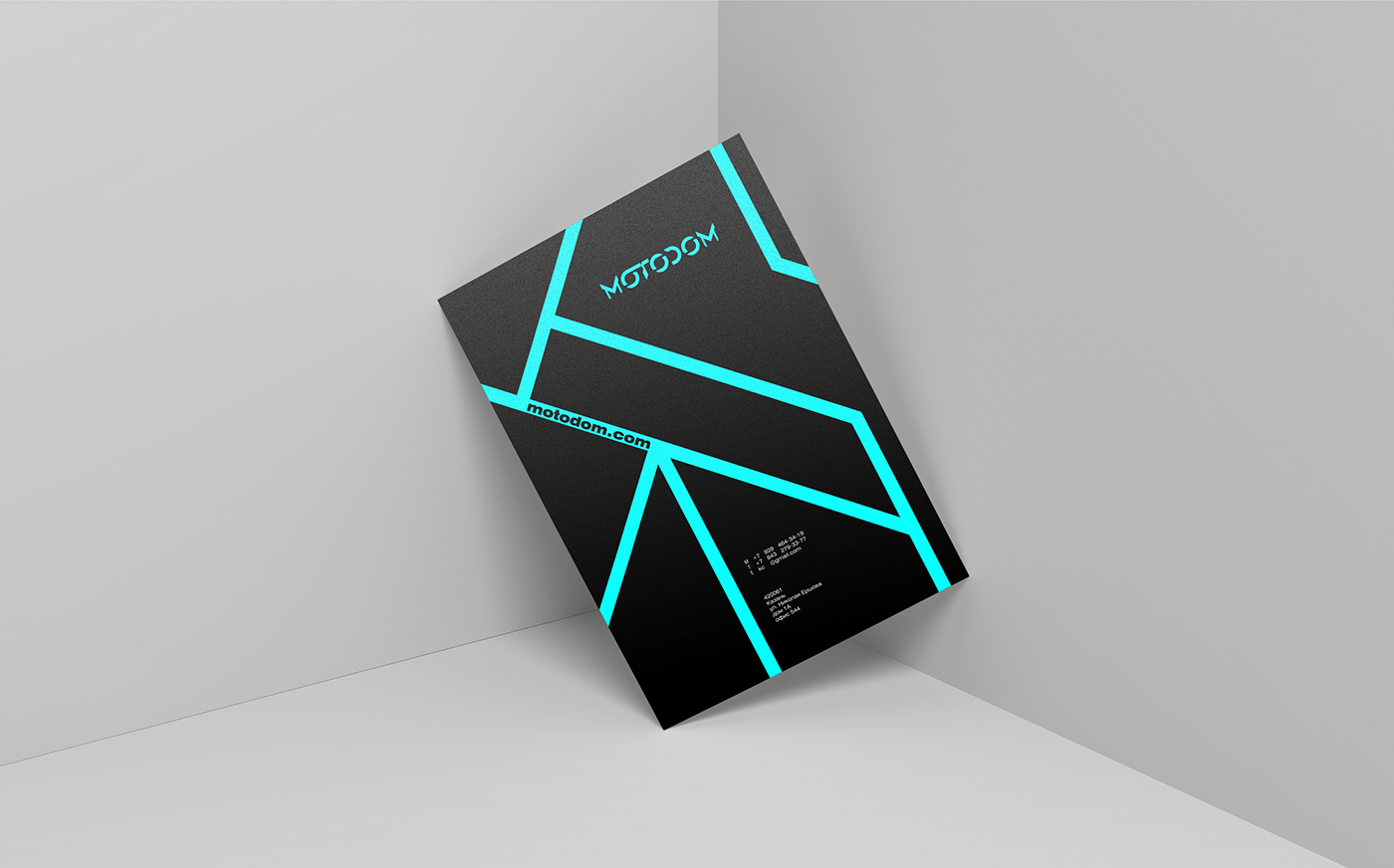
05 / The sign was based on the letter M and the general style of innovative technologies, as well as the film TRON LEGACY
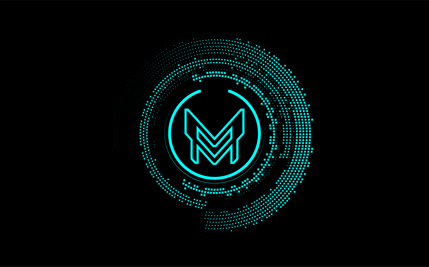
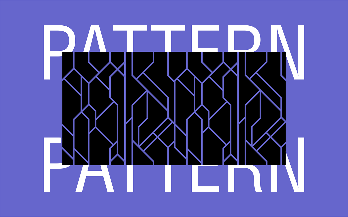
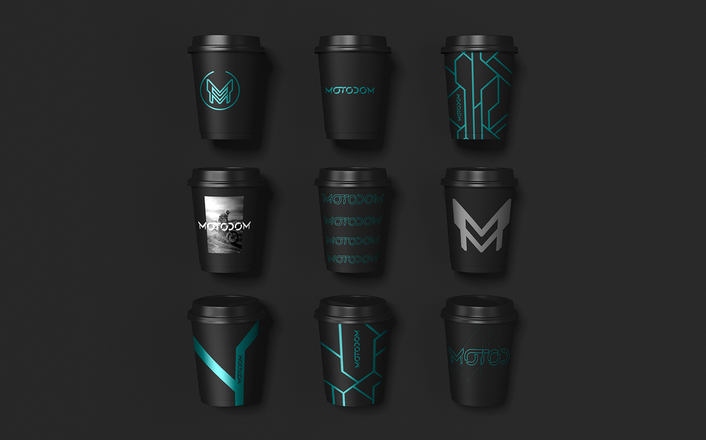
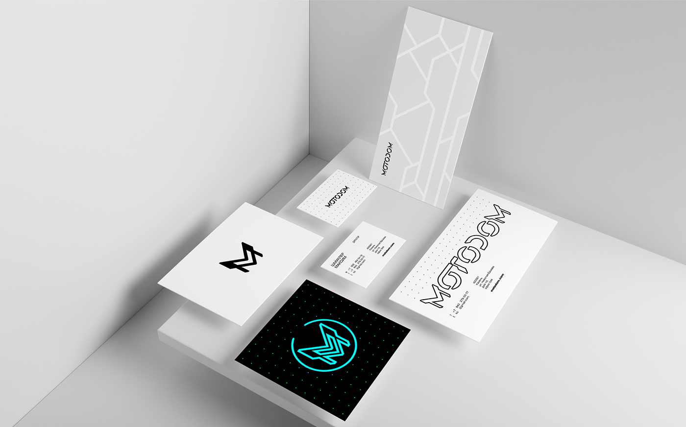
06 / The pattern is based on the motorcycle protector and the chipboard pattern
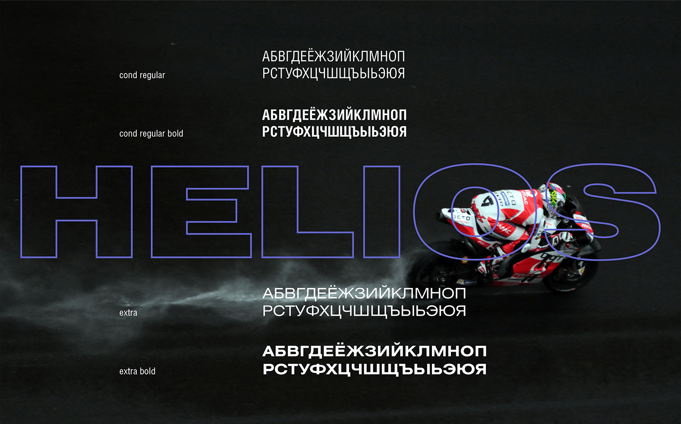
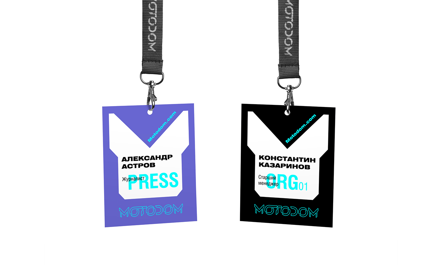
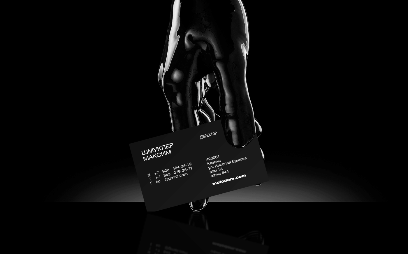
07 / The brand font was chosen in super contrast. From the cond regular to the extra bold
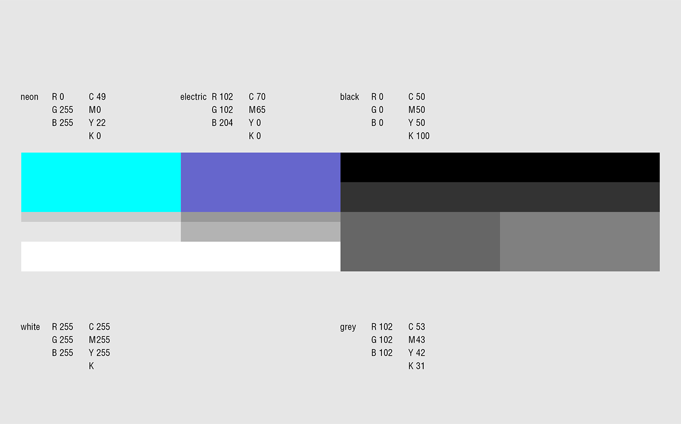
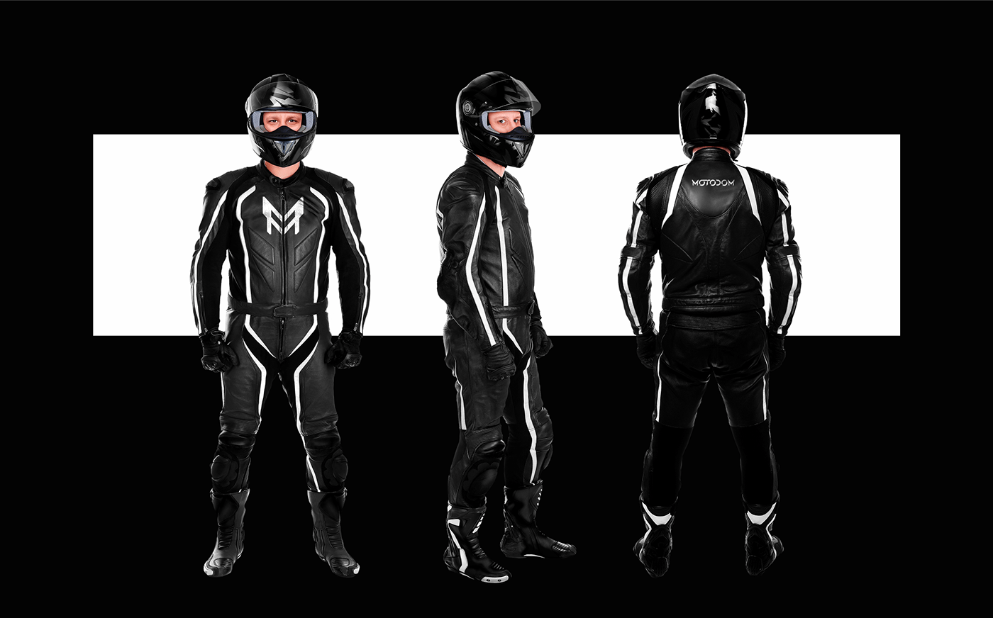
08 / As a result, we got a visual language that mutually complements and supports through composition, color and style-forming graphics
09 / A laconic and memorable slogan was also created


THANK YOU FOR WATCHING
